
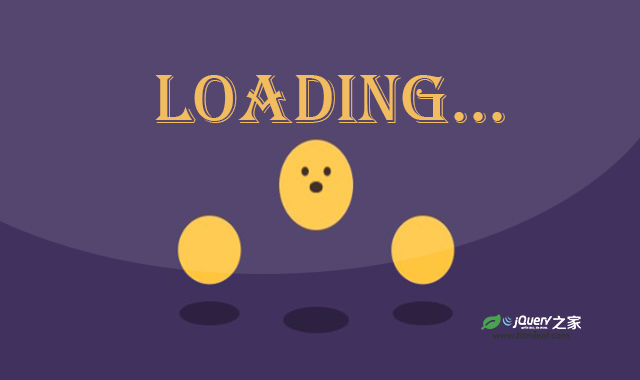

这是一款纯CSS创意弹跳loading动画特效。该特效使用CSS的animation来制作3个弹跳的小球,通过控制不同的keyframes,得到非常炫酷的效果。
使用方法
HTML代码
<div class="loader loader--1">
    <div class="dot">

    </div>
    <div class="shadow"></div>
</div>
<div class="loader loader--2">
    <div class="dot">
        <div class="face">
            <div class="eyes"></div>
            <div class="mouth"></div>
        </div>
    </div>
    <div class="shadow"></div>
</div>
<div class="loader loader--3">
    <div class="dot">

    </div>
    <div class="shadow"></div>
</div>
CSS代码
:root {
    --animation-time: 1s;
    --animation-time-double: 2s;
}

*,
*::before,
*::after {
    box-sizing: border-box;
    padding: 0;
    margin: 0;
}

html {
    font-size: 62.5%;
}

body {
    min-height: 60vh;
    display: grid;
    grid-template-columns: 12rem 12rem 12rem;
    column-gap: 1rem;
    place-items: center;
    justify-content: center;
    background-color: #41315e;
}

.loader {
    font-size: 1rem;
}

.loader--1,
.loader--3 {
    transform: scale(.8);
}

.loader--2 * {
    animation-delay: .2s;
}

.dot {
    position: relative;
    background-color: rgb(255, 197, 62);
    width: 10em;
    height: 10em;
    z-index: 5;
    border-radius: 50%;
    overflow: hidden;
    transform-origin: bottom;
    animation-duration: var(--animation-time);
    animation-iteration-count: infinite;
    animation-name: bounce;
    animation-timing-function: ease;
}

.loader--2 .face {
    animation-duration: var(--animation-time-double);
    animation-iteration-count: infinite;
    animation-name: face;
    animation-timing-function: ease;
}

.eyes {
    position: absolute;
    top: 3em;
    left: 3em;
    background-color: rgb(42, 25, 15);
    height: 1em;
    width: 1em;
    border-radius: 50%;
    box-shadow: 3em 0 0 rgb(42, 25, 15);
}

.mouth {
    position: absolute;
    background-color: rgb(42, 25, 15);
    height: .5em;
    width: 2em;
    left: 4em;
    top: 5em;
    animation-duration: var(--animation-time-double);
    animation-iteration-count: infinite;
    animation-name: mouth;
    animation-timing-function: ease;
}

.shadow {
    width: 10em;
    height: 4em;
    border-radius: 50%;
    background-color: rgba(0, 0, 0, 0.322);
    margin-top: -2em;
    animation-duration: var(--animation-time);
    animation-iteration-count: infinite;
    animation-name: shadow;
    animation-timing-function: ease;
}

@keyframes bounce {
    0% {
        transform: scale(1, 1) translateY(0);
    }

    10% {
        transform: scale(1.1, .9) translateY(0);
    }

    50% {
        transform: scale(.9, 1.1) translateY(-10em);
    }

    100% {
        transform: scale(1, 1) translateY(0);
    }
}

@keyframes shadow {
    0% {
        transform: scale(1, 1)
    }

    10% {
        transform: scale(1.1)
    }

    50% {
        transform: scale(.8)
    }

    100% {
        transform: scale(1, 1)
    }
}

@keyframes mouth {
    0% {
        border-radius: 0%;
        transform: scale(1, 1)
    }

    50% {
        border-radius: 0%;
        transform: scale(1, 1)
    }

    75% {
        border-radius: 50%;
        transform: scale(.9, 2.5)
    }

    100% {
        border-radius: 0%;
        transform: scale(1, 1)
    }
}

@keyframes face {
    0% {
        transform: scaleY(1) translateY(0);
        opacity: 1
    }

    5% {
        transform: scaleY(1) translateY(0);
        opacity: 1
    }

    15% {
        transform: scaleY(.8) translateY(-10em);
        opacity: 1
    }

    17% {
        transform: scaleY(.8) translateY(-10em);
        opacity: 0
    }

    22% {
        transform: scaleY(.8) translateY(10em);
        opacity: 0
    }

    25% {
        transform: scaleY(.8) translateY(10em);
        opacity: 1
    }

    50% {
        transform: scaleY(1) translateY(0);
        opacity: 1
    }

    100% {
        transform: scaleY(1) translateY(0);
        opacity: 1
    }
}
codepen网址:https://codepen.io/dui77/pen/WNmqjRN


