
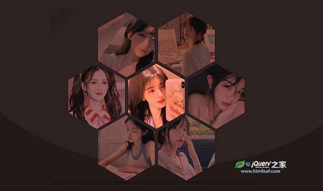

这是一款纯CSS蜂巢式图片画廊效果。该CSS蜂巢式图片画廊通过CSS网格布局,将图片以蜂巢的六边形进行布局,非常炫酷。
使用方法
HTML代码
<div class="container" style="--n-rows: 3; --n-cols: 6">
  <style>.hex-cell:nth-of-type(5n + 1) { grid-column-start: 2 }</style>
  <div class="hex-cell"><img src="./img/1.jpg"/></div>
  <div class="hex-cell"><img src="./img/2.jpg"/></div>
  <div class="hex-cell"><img src="./img/3.jpg"/></div>
  <div class="hex-cell"><img src="./img/4.jpg"/></div>
  <div class="hex-cell"><img src="./img/5.jpg"/></div>
  <div class="hex-cell"><img src="./img/6.jpg"/></div>
  <div class="hex-cell"><img src="./img/7.jpg"/></div>
</div>
CSS代码
.container {
  --l: calc(100vw/var(--n-cols));
  --hl: calc(.5*var(--l));
  --ri: calc(.5*1.73205*var(--l));
  box-sizing: border-box;
  display: grid;
  place-content: center;
  grid-template: repeat(var(--n-rows), var(--l))/repeat(var(--n-cols), var(--ri));
  grid-gap: var(--hl) 0;
  overflow: hidden;
  margin: 0;
  padding: var(--hl) 0;
  height: 100vh;
  background: #262626;
  filter: drop-shadow(2px 2px 5px);
}
@media (orientation: landscape) {
  .container {
    --l: calc(100vh/(var(--n-rows) + 3));
  }
}

.hex-cell {
  overflow: hidden;
  grid-column-end: span 2;
  margin: calc(-1*var(--hl)) 0;
  transform: scale(0.95);
  clip-path: polygon(50% 0, 100% 25%, 100% 75%, 50% 100%, 0 75%, 0 25%);
}

img {
  --hl: 0;
  width: 100%;
  height: 100%;
  object-fit: cover;
  transform: scale(calc(1 + .2*var(--hl)));
  filter: brightness(calc(.6*(1 + var(--hl))));
  transition: .7s;
}
img:hover {
  --hl: 1;
}


