
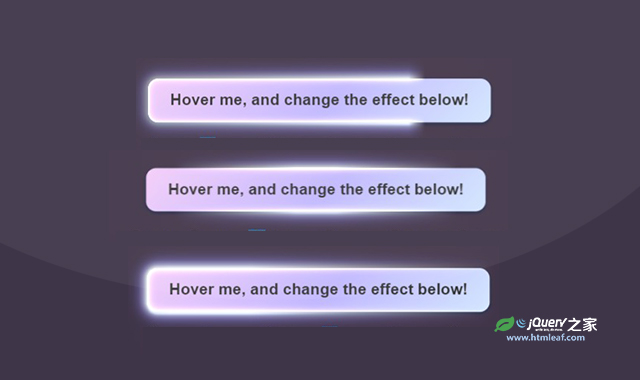

这是一款纯CSS超酷按钮发光特效,该特效使用CSS代码制作了6种非常炫酷的按钮流光效果,通过简单的复制代码,即可使用在任何你需要的地方。
使用方法
HTML代码
<button class="" data-effect="flicker">
    <span class="text">Hover me, and change the effect below!</span>
    <span class="shimmer"></span>
</button>
CSS代码
:root {
    --shimmer-hue-1: 213deg;
    --shimmer-sat-1: 95%;
    --shimmer-lit-1: 91%;
    --shimmer-hue-2: 248deg;
    --shimmer-sat-2: 100%;
    --shimmer-lit-2: 86%;
    --shimmer-hue-3: 293deg;
    --shimmer-sat-3: 78%;
    --shimmer-lit-3: 89%;

    --glow-hue: 222deg;
    --shadow-hue: 180deg;
    --spring-easing: linear(
    0, 0.002, 0.01 0.9%, 0.038 1.8%, 0.156, 0.312 5.8%, 0.789 11.1%, 1.015 14.2%,
    1.096, 1.157, 1.199, 1.224 20.3%, 1.231, 1.231, 1.226, 1.214 24.6%,
    1.176 26.9%, 1.057 32.6%, 1.007 35.5%, 0.984, 0.968, 0.956, 0.949 42%,
    0.946 44.1%, 0.95 46.5%, 0.998 57.2%, 1.007, 1.011 63.3%, 1.012 68.3%,
    0.998 84%, 1
  );
    --spring-duration: 1.33s;
}
@property --mask {
    syntax: "";
    inherits: false;
    initial-value: 33deg;
}

@-webkit-keyframes spin {
    0% {
        --mask: 0deg;
    }
    100% {
        --mask: 360deg;
    }
}

@keyframes spin {
    0% {
        --mask: 0deg;
    }
    100% {
        --mask: 360deg;
    }
}

@-webkit-keyframes wipe {
    0% {
        -webkit-mask-position: 200% center;
                mask-position: 200% center;
    }
    100% {
        -webkit-mask-position: 0% center;
                mask-position: 0% center;
    }
}

@keyframes wipe {
    0% {
        -webkit-mask-position: 200% center;
                mask-position: 200% center;
    }
    100% {
        -webkit-mask-position: 0% center;
                mask-position: 0% center;
    }
}

@-webkit-keyframes pulse {
    0%, 90%, 100% {
        opacity: 0;
    }
    20% {
        opacity: 1;
    }
}

@keyframes pulse {
    0%, 90%, 100% {
        opacity: 0;
    }
    20% {
        opacity: 1;
    }
}

@-webkit-keyframes pulse2 {
    0% {
        opacity: 0;
    }
    8% {
        opacity: 1;
    }
    14% {
        opacity: 0;
    }
    20% {
        opacity: 1;
    }
    100% {
        opacity: 0;
    }
}

@keyframes pulse2 {
    0% {
        opacity: 0;
    }
    8% {
        opacity: 1;
    }
    14% {
        opacity: 0;
    }
    20% {
        opacity: 1;
    }
    100% {
        opacity: 0;
    }
}

@-webkit-keyframes flicker {
  0% { opacity:0.1; -webkit-mask-image:none; mask-image:none;}
  1% { opacity:1; }
  2% { opacity:0.5; }
  3% { opacity:0.1; }
  4% { opacity:0.7; }
  5% { opacity:1; }
  7% { opacity:0.7;
    -webkit-mask-image: linear-gradient(
        90deg, transparent 15%, black 45%, black 55%, transparent 85%
    );
            mask-image: linear-gradient(
        90deg, transparent 15%, black 45%, black 55%, transparent 85%
    ); }
  8% { opacity:0.1; }
  10% { opacity:0.4; }
  13% { opacity:1; }
  15% { opacity:0.1;
    -webkit-mask-image: linear-gradient(
        45deg, rgba(0,0,0,0.4) 25%, transparent 45%, black 65%, black 90%, transparent 100%
    );
            mask-image: linear-gradient(
        45deg, rgba(0,0,0,0.4) 25%, transparent 45%, black 65%, black 90%, transparent 100%
    );}
  17% { opacity:0.8;}
  19% { opacity:0.3; }
  21.5% { opacity:0; }
  23% { opacity:1; }
  39% { opacity:0.7; }
  45% { opacity:0.2; }
  49% { opacity:0.9; }
  52% { opacity:0.7;}
  53.5% { opacity:0.2;
    -webkit-mask-image: linear-gradient(
        90deg, black 15%, black 45%, rgba(0,0,0,0.4) 75%, transparent 85%
    );
            mask-image: linear-gradient(
        90deg, black 15%, black 45%, rgba(0,0,0,0.4) 75%, transparent 85%
    );}
  57% { opacity:0.8; }
  63% { opacity:1; }
  75% { opacity:.85; }
  77% { opacity:1; }
  80% { opacity:.9; }
  82% { opacity:.95; }
  83% { opacity:.85; }
  86% { opacity:1; }
  89% { opacity:.85; }
  91% { opacity:1; }
  92% { opacity:.9; }
  100% { opacity:1; }
}

@keyframes flicker {
  0% { opacity:0.1; -webkit-mask-image:none; mask-image:none;}
  1% { opacity:1; }
  2% { opacity:0.5; }
  3% { opacity:0.1; }
  4% { opacity:0.7; }
  5% { opacity:1; }
  7% { opacity:0.7;
    -webkit-mask-image: linear-gradient(
        90deg, transparent 15%, black 45%, black 55%, transparent 85%
    );
            mask-image: linear-gradient(
        90deg, transparent 15%, black 45%, black 55%, transparent 85%
    ); }
  8% { opacity:0.1; }
  10% { opacity:0.4; }
  13% { opacity:1; }
  15% { opacity:0.1;
    -webkit-mask-image: linear-gradient(
        45deg, rgba(0,0,0,0.4) 25%, transparent 45%, black 65%, black 90%, transparent 100%
    );
            mask-image: linear-gradient(
        45deg, rgba(0,0,0,0.4) 25%, transparent 45%, black 65%, black 90%, transparent 100%
    );}
  17% { opacity:0.8;}
  19% { opacity:0.3; }
  21.5% { opacity:0; }
  23% { opacity:1; }
  39% { opacity:0.7; }
  45% { opacity:0.2; }
  49% { opacity:0.9; }
  52% { opacity:0.7;}
  53.5% { opacity:0.2;
    -webkit-mask-image: linear-gradient(
        90deg, black 15%, black 45%, rgba(0,0,0,0.4) 75%, transparent 85%
    );
            mask-image: linear-gradient(
        90deg, black 15%, black 45%, rgba(0,0,0,0.4) 75%, transparent 85%
    );}
  57% { opacity:0.8; }
  63% { opacity:1; }
  75% { opacity:.85; }
  77% { opacity:1; }
  80% { opacity:.9; }
  82% { opacity:.95; }
  83% { opacity:.85; }
  86% { opacity:1; }
  89% { opacity:.85; }
  91% { opacity:1; }
  92% { opacity:.9; }
  100% { opacity:1; }
}

@-webkit-keyframes shine {
    0% {
        opacity: 0;
    }
    15% {
        opacity: 1;
    }
    55% {
        opacity: 1;
    }
    100% {
        opacity: 0;
    }
}

@keyframes shine {
    0% {
        opacity: 0;
    }
    15% {
        opacity: 1;
    }
    55% {
        opacity: 1;
    }
    100% {
        opacity: 0;
    }
}
@-webkit-keyframes text {
    0% {
        background-position: 100% center;
    }
    100% {
        background-position: -100% center;
    }
}
@keyframes text {
    0% {
        background-position: 100% center;
    }
    100% {
        background-position: -100% center;
    }
}

.dark button {
    color: var(--bg);
    font-weight: 600;
    font-size: 1.2em;
    background-image: linear-gradient(
        315deg,
        hsl(var(--shimmer-hue-1),var(--shimmer-sat-1),var(--shimmer-lit-1)) 0.00%,
        hsl(var(--shimmer-hue-2),var(--shimmer-sat-2),var(--shimmer-lit-2)) 47%,
        hsl(var(--shimmer-hue-3),var(--shimmer-sat-3),var(--shimmer-lit-3)) 100.00%
    );
    padding: .8em 1.4em;
    position: relative;
    isolation: isolate;
    box-shadow: 0 2px 3px 1px hsl(var(--glow-hue) 50% 20% / 50%);
    border: none;
    outline: none;
    border-radius: 0.66em;
    scale: 1;
    transition: all var(--spring-duration) var(--spring-easing);
    text-transform: unset;
}

.shimmer {
    position: absolute;
    inset: -40px;
    border-radius: inherit;
    mix-blend-mode: color-dodge;
    mix-blend-mode: plus-lighter;
    pointer-events: none;
}

.shimmer::before,
.shimmer::after {
    transition: all 0.5s ease;
    opacity: 0;
    content: "";
    border-radius: inherit;
    position: absolute;
    inset: 40px;
}
.shimmer::before {
    box-shadow: 0 0 3px 2px hsl(var(--shimmer-hue-1) 20% 95%),
        0 0 7px 4px hsl(var(--shimmer-hue-1) 20% 80%),
        0 0 13px 8px hsl(var(--shimmer-hue-2) 40% 60%),
        0 0 22px 6px hsl(var(--shimmer-hue-2) 20% 40%);
    z-index: -1;
}
.shimmer::after {
    box-shadow: inset 0 0 0 1px hsl(var(--shimmer-hue-2) 70% 95%),
        inset 0 0 3px 1px hsl(var(--shimmer-hue-2) 100% 80%),
        inset 0 0 9px 1px hsl(var(--shimmer-hue-2) 100% 70%);
    z-index: 2;
}
button[disabled] {
    background: rgb(76 76 92);
    background-image: none;
}
button:hover:not(:active):not([disabled]) {
    scale: 1.1;
    transition-duration: calc(var(--spring-duration)*0.5);
}
button:active:not([disabled]) {
    scale: 1.05;
    transition-duration: calc(var(--spring-duration)*0.5);
}
button:focus .shimmer,
button:active .shimmer {
    -webkit-animation-play-state: paused!important;
            animation-play-state: paused!important;
    -webkit-mask-image: none!important;
            mask-image: none!important;
}
button:hover:not([disabled]),
button:hover:not([disabled]) .shimmer::before,
button:hover:not([disabled]) .shimmer::after {
    opacity: 1;
}


button .text {
/*    color: transparent;*/
    -webkit-background-clip: text;
            background-clip: text;
    background-color: var(--bg);
    background-image: linear-gradient(120deg, transparent, hsla(var(--shimmer-hue-1),100%,80%,0.66) 40%, hsla(var(--shimmer-hue-2),100%,90%,.9) 50%, transparent 52%);
    background-repeat: no-repeat;
    background-size: 300% 300%;
    background-position: center 200%;
}

button:not([disabled]):hover .text {
    -webkit-animation: text .66s ease-in-out 1;
            animation: text .66s ease-in-out 1;
}

button:not([disabled]) .shimmer::before,
button:not([disabled]) .shimmer::after {
    opacity: 1;
}
button:not([disabled]) .shimmer {
    -webkit-mask-image: conic-gradient(
        from var(--mask, 0deg),
        transparent 0%,
        transparent 10%,
        black 36%,
        black 45%,
        transparent 50%,
        transparent 60%,
        black 85%,
        black 95%,
        transparent 100%
    );
            mask-image: conic-gradient(
        from var(--mask, 0deg),
        transparent 0%,
        transparent 10%,
        black 36%,
        black 45%,
        transparent 50%,
        transparent 60%,
        black 85%,
        black 95%,
        transparent 100%
    );
    -webkit-mask-size: cover;
            mask-size: cover;
    -webkit-animation: spin 3s linear infinite both -0.5s;
            animation: spin 3s linear infinite both -0.5s;
}
button:not([disabled])[data-effect=wipe] .shimmer {
    -webkit-mask-image: linear-gradient(
        90deg, transparent 20%, black 88%, transparent 90%
    );
            mask-image: linear-gradient(
        90deg, transparent 20%, black 88%, transparent 90%
    );
    -webkit-mask-size: 200% 200%;
            mask-size: 200% 200%;
    -webkit-mask-position: center;
            mask-position: center;
    -webkit-animation: wipe 1.5s linear infinite both -0.5s;
            animation: wipe 1.5s linear infinite both -0.5s;
}
button:not([disabled])[data-effect=wave] .shimmer {
    -webkit-mask-image: linear-gradient(
        90deg, transparent 15%, black 45%, black 55%, transparent 85%
    );
            mask-image: linear-gradient(
        90deg, transparent 15%, black 45%, black 55%, transparent 85%
    );
    -webkit-mask-size: 200% 200%;
            mask-size: 200% 200%;
    -webkit-mask-position: center;
            mask-position: center;
    -webkit-animation: wipe 3s linear infinite both -0.5s;
            animation: wipe 3s linear infinite both -0.5s;
}
button:not([disabled])[data-effect=throb] .shimmer {
    -webkit-mask-image: none;
            mask-image: none;
    -webkit-animation: pulse 3s ease infinite both  -0.5s;
            animation: pulse 3s ease infinite both  -0.5s;
}
button:not([disabled])[data-effect=pulse] .shimmer {
    -webkit-mask-image: none;
            mask-image: none;
    -webkit-animation: pulse2 3s ease infinite both  -0.5s;
            animation: pulse2 3s ease infinite both  -0.5s;
}
button:not([disabled])[data-effect=flicker] .shimmer {
    -webkit-mask-image: none;
            mask-image: none;
    -webkit-animation: flicker 3.33s ease infinite both  -0.5s;
            animation: flicker 3.33s ease infinite both  -0.5s;
}


