
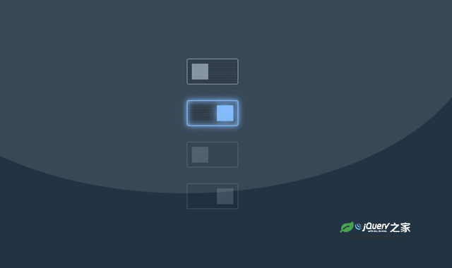

这是一款纯CSS炫酷Neno样式开关按钮。该开关按钮的创意来自于Neno,它通过线条的运动来形成由线条组合为矩形的效果,看起来非常炫酷。
使用方法
HTML代码
.container {
  margin: 0;
  min-height: 60vh;
  display: flex;
  align-items: center;
  justify-content: center;
  flex-direction: column;
  background: #234;
  gap: 1rem;
}

@property --color {
  syntax: '<color>';
  initial-value: #789;
  inherits: true;
}

@keyframes slideRight {
    0% { background-position:   0% 0%,   0% 11%,   0% 22%,   0% 33%,   0% 44%,   0% 55%,   0% 66%,   0% 77%,   0% 86%,   0% 100%; }
   10% { background-position: 100% 0%,   0% 11%,   0% 22%,   0% 33%,   0% 44%,   0% 55%,   0% 66%,   0% 77%,   0% 86%,   0% 100%; }
   20% { background-position: 100% 0%, 100% 11%,   0% 22%,   0% 33%,   0% 44%,   0% 55%,   0% 66%,   0% 77%,   0% 86%,   0% 100%; }
   30% { background-position: 100% 0%, 100% 11%, 100% 22%,   0% 33%,   0% 44%,   0% 55%,   0% 66%,   0% 77%,   0% 86%,   0% 100%; }
   40% { background-position: 100% 0%, 100% 11%, 100% 22%, 100% 33%,   0% 44%,   0% 55%,   0% 66%,   0% 77%,   0% 86%,   0% 100%; }
   50% { background-position: 100% 0%, 100% 11%, 100% 22%, 100% 33%, 100% 44%,   0% 55%,   0% 66%,   0% 77%,   0% 86%,   0% 100%; }
   60% { background-position: 100% 0%, 100% 11%, 100% 22%, 100% 33%, 100% 44%, 100% 55%,   0% 66%,   0% 77%,   0% 86%,   0% 100%; }
   70% { background-position: 100% 0%, 100% 11%, 100% 22%, 100% 33%, 100% 44%, 100% 55%, 100% 66%,   0% 77%,   0% 86%,   0% 100%; }
   80% { background-position: 100% 0%, 100% 11%, 100% 22%, 100% 33%, 100% 44%, 100% 55%, 100% 66%, 100% 77%,   0% 86%,   0% 100%; }
   90% { background-position: 100% 0%, 100% 11%, 100% 22%, 100% 33%, 100% 44%, 100% 55%, 100% 66%, 100% 77%, 100% 86%,   0% 100%; }
  100% { background-position: 100% 0%, 100% 11%, 100% 22%, 100% 33%, 100% 44%, 100% 55%, 100% 66%, 100% 77%, 100% 86%, 100% 100%; }
}

@keyframes slideLeft {
    0% { background-position:   0% 0%,   0% 11%,   0% 22%,   0% 33%,   0% 44%,   0% 55%,   0% 66%,   0% 77%,   0% 86%,   0% 100%; }
   10% { background-position: 100% 0%,   0% 11%,   0% 22%,   0% 33%,   0% 44%,   0% 55%,   0% 66%,   0% 77%,   0% 86%,   0% 100%; }
   20% { background-position: 100% 0%, 100% 11%,   0% 22%,   0% 33%,   0% 44%,   0% 55%,   0% 66%,   0% 77%,   0% 86%,   0% 100%; }
   30% { background-position: 100% 0%, 100% 11%, 100% 22%,   0% 33%,   0% 44%,   0% 55%,   0% 66%,   0% 77%,   0% 86%,   0% 100%; }
   40% { background-position: 100% 0%, 100% 11%, 100% 22%, 100% 33%,   0% 44%,   0% 55%,   0% 66%,   0% 77%,   0% 86%,   0% 100%; }
   50% { background-position: 100% 0%, 100% 11%, 100% 22%, 100% 33%, 100% 44%,   0% 55%,   0% 66%,   0% 77%,   0% 86%,   0% 100%; }
   60% { background-position: 100% 0%, 100% 11%, 100% 22%, 100% 33%, 100% 44%, 100% 55%,   0% 66%,   0% 77%,   0% 86%,   0% 100%; }
   70% { background-position: 100% 0%, 100% 11%, 100% 22%, 100% 33%, 100% 44%, 100% 55%, 100% 66%,   0% 77%,   0% 86%,   0% 100%; }
   80% { background-position: 100% 0%, 100% 11%, 100% 22%, 100% 33%, 100% 44%, 100% 55%, 100% 66%, 100% 77%,   0% 86%,   0% 100%; }
   90% { background-position: 100% 0%, 100% 11%, 100% 22%, 100% 33%, 100% 44%, 100% 55%, 100% 66%, 100% 77%, 100% 86%,   0% 100%; }
  100% { background-position: 100% 0%, 100% 11%, 100% 22%, 100% 33%, 100% 44%, 100% 55%, 100% 66%, 100% 77%, 100% 86%, 100% 100%; }
}

.silky-smooth {
  --color: #789;
  --time: 1s;
  appearance: none;
  font-size: 1.5rem;
  width: 3em;
  aspect-ratio: 2;
  border: 0.05em solid var(--color);
  border-radius: 0.1em;
  background: repeating-linear-gradient(#0002 0 5%, #0004 0 10%);
  transition: --color 0.5s, box-shadow 0.5s;
  position: relative;
  box-shadow: 0 0 0em var(--color), inset 0 0 0em var(--color);

  &::before {
    content: "";
    position: absolute;
    width: 85%;
    height: 70%;
    background:
      linear-gradient(var(--color) 0 0) 0 0 / 40% 15%,
      linear-gradient(var(--color) 0 0) 0 10% / 40% 15%,
      linear-gradient(var(--color) 0 0) 0 20% / 40% 15%,
      linear-gradient(var(--color) 0 0) 0 30% / 40% 15%,
      linear-gradient(var(--color) 0 0) 0 40% / 40% 15%,
      linear-gradient(var(--color) 0 0) 0 50% / 40% 15%,
      linear-gradient(var(--color) 0 0) 0 60% / 40% 15%,
      linear-gradient(var(--color) 0 0) 0 70% / 40% 15%,
      linear-gradient(var(--color) 0 0) 0 80% / 40% 15%,
      linear-gradient(var(--color) 0 0) 0 100% / 40% 15%;
    background-repeat: no-repeat;
    top: 50%;
    left: 7.5%;
    transform: translateY(-50%);
    animation: slideLeft var(--time) linear forwards reverse;
    transition: filter 0.5s;
    filter: drop-shadow(0 0 0 var(--color));
    border: 1px solid #0000;
    box-sizing: border-box;
  }

  &:hover {
    --color: #58b;
    box-shadow: 0 0 0.1em var(--color), inset 0 0 0.1em var(--color);

    &::before {
      filter: drop-shadow(0 0 0.1em var(--color));
    }
  }

  &:checked {
    --color: #76b3fa;
    box-shadow: 0 0 0.35em var(--color), inset 0 0 0.35em var(--color);

    &::before {
      animation: slideRight var(--time) forwards;
      filter: drop-shadow(0 0 0.25em var(--color));
    }
  }

  &[disabled] {
    --color: #789 !important;
    opacity: 0.33;

    &, &::before {
      box-shadow: none !important;
      filter: none;
      animation-play-state: paused;
      animation-delay: calc(var(--time) * -1);
    }
  }
}

@media print {
  .silky-smooth {
    &, &::before, &::after {
      -webkit-print-color-adjust: exact;
      print-color-adjust: exact;
    }
  }
}

@media (prefers-reduced-motion) {
  .silky-smooth {
    &, &::before, &::after {
      transition-duration: 0s !important;
      animation-duration: 0s !important;
    }
  }
}
CSS代码
<input type="checkbox" role="switch" class="silky-smooth" />
<input type="checkbox" role="switch" class="silky-smooth" checked />
<input type="checkbox" role="switch" class="silky-smooth" disabled />
<input type="checkbox" role="switch" class="silky-smooth" checked disabled />


