
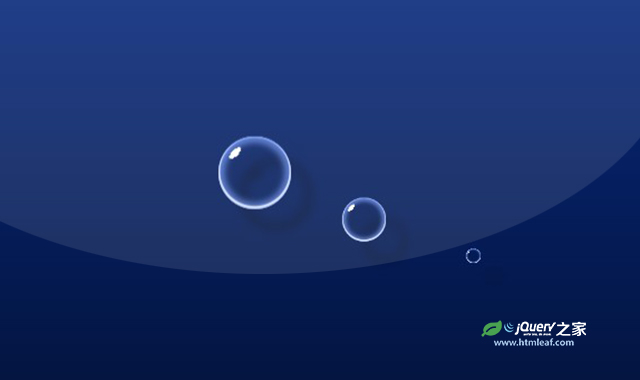

这是一款逼真的CSS气泡动画效果。该动画使用CSS来制作气泡的高光和阴影,以及向上运动的动画效果,整体气泡非常逼真,看起来非常炫酷。
使用方法
HTML代码
<div class="pl">
    <div class="pl__bubble">
        <div class="pl__bubble-drop"></div>
        <div class="pl__bubble-drop"></div>
        <div class="pl__bubble-drop"></div>
        <div class="pl__bubble-drop"></div>
        <div class="pl__bubble-drop"></div>
        <div class="pl__bubble-drop"></div>
        <div class="pl__bubble-drop"></div>
    </div>
</div>
CSS代码
* {
  border: 0;
  box-sizing: border-box;
  margin: 0;
  padding: 0;
}

:root {
  --hue: 223;
  --trans-dur: 0.3s;
  font-size: calc(16px + (24 - 16) * (100vw - 320px) / (2560 - 320));
}

.container {
  background: linear-gradient(hsl(var(--hue), 90%, 30%), hsl(var(--hue), 90%, 10%));
  color: hsl(var(--hue), 90%, 90%);
  display: flex;
  font: 1em/1.5 sans-serif;
  height: 60vh;
  min-height: 15em;
  transition: background-color var(--trans-dur), color var(--trans-dur);
}

.pl {
  display: flex;
  justify-content: space-between;
  align-items: center;
  filter: drop-shadow(0.9em 0.9em 4px rgba(0, 0, 0, 0.4));
  margin: auto;
  width: 12em;
  height: 12em;
}
.pl__bubble {
  position: relative;
  width: 3em;
  height: 3em;
}
.pl__bubble-drop {
  width: 0.125em;
  height: 0.5em;
  transform: translate(-50%, -3em);
}
.pl__bubble-drop, .pl__bubble-drop:before {
  transform-origin: 50% 0;
}
.pl__bubble-drop:nth-child(2) {
  transform: translate(-50%, -3em) rotate(51.4285714286deg);
}
.pl__bubble-drop:nth-child(3) {
  transform: translate(-50%, -3em) rotate(102.8571428571deg);
}
.pl__bubble-drop:nth-child(4) {
  transform: translate(-50%, -3em) rotate(154.2857142857deg);
}
.pl__bubble-drop:nth-child(5) {
  transform: translate(-50%, -3em) rotate(205.7142857143deg);
}
.pl__bubble-drop:nth-child(6) {
  transform: translate(-50%, -3em) rotate(257.1428571429deg);
}
.pl__bubble-drop:nth-child(7) {
  transform: translate(-50%, -3em) rotate(308.5714285714deg);
}
.pl__bubble:before, .pl__bubble:after, .pl__bubble-drop {
  position: absolute;
}
.pl__bubble:before, .pl__bubble:after, .pl__bubble-drop:before {
  animation: bubble-rise-before 1.5s linear infinite;
}
.pl__bubble:before, .pl__bubble:after {
  border-radius: 50%;
}
.pl__bubble:after, .pl__bubble-drop {
  top: 50%;
  left: 50%;
}
.pl__bubble:before {
  box-shadow: 0 -0.0625em 0 0.0625em hsl(var(--hue), 90%, 90%) inset, 0 0 0 0.0625em hsl(var(--hue), 90%, 70%) inset, 0 0 0.25em 0.25em hsla(var(--hue), 90%, 70%, 0.7) inset;
  transform: translate(0, 4.5em) scale(0);
}
.pl__bubble:after {
  animation-name: bubble-rise-after;
  background-image: radial-gradient(25% 10% at 50% 5%, white 48%, rgba(255, 255, 255, 0) 50%);
  width: 87.5%;
  height: 87.5%;
  transform: translate(-50%, -50%) translate(0, 4.5em) rotate(-45deg) scale(0);
}
.pl__bubble:before, .pl__bubble-drop:before {
  width: 100%;
  height: 100%;
}
.pl__bubble-drop:before {
  animation-name: bubble-drop;
  background-color: hsl(var(--hue), 90%, 80%);
  border-radius: 0.0625em;
  transform: translateY(0) scaleY(0);
  transform-origin: 50% 0;
}
.pl__bubble:before, .pl__bubble:after, .pl__bubble-drop:before {
  content: "";
  display: block;
}
.pl__bubble:nth-child(2):before, .pl__bubble:nth-child(2):after, .pl__bubble:nth-child(2) .pl__bubble-drop:before {
  animation-delay: 0.15s;
}
.pl__bubble:nth-child(3):before, .pl__bubble:nth-child(3):after, .pl__bubble:nth-child(3) .pl__bubble-drop:before {
  animation-delay: 0.3s;
}

/* Animations */
@keyframes bubble-rise-before {
  from {
    animation-timing-function: cubic-bezier(0.12, 0, 0.39, 0);
    transform: translate(0, 4.5em) scale(0);
  }
  30% {
    animation-timing-function: cubic-bezier(0.61, 1, 0.88, 1);
    transform: translate(0, 0.75em) scale(1);
  }
  60% {
    animation-timing-function: cubic-bezier(0.12, 0, 0.39, 0);
    opacity: 1;
    transform: translate(0, -3em) scale(1);
  }
  70%, to {
    opacity: 0;
    transform: translate(0, -3em) scale(0.25);
  }
}
@keyframes bubble-rise-after {
  from {
    animation-timing-function: cubic-bezier(0.12, 0, 0.39, 0);
    transform: translate(-50%, -50%) translate(0, 4.5em) rotate(-45deg) scale(0);
  }
  30% {
    animation-timing-function: cubic-bezier(0.61, 1, 0.88, 1);
    transform: translate(-50%, -50%) translate(0, 0.75em) rotate(-45deg) scale(1);
  }
  60% {
    animation-timing-function: cubic-bezier(0.12, 0, 0.39, 0);
    opacity: 1;
    transform: translate(-50%, -50%) translate(0, -3em) rotate(-45deg) scale(1);
  }
  70%, to {
    opacity: 0;
    transform: translate(-50%, -50%) translate(0, -3em) rotate(-45deg) scale(0.25);
  }
}
@keyframes bubble-drop {
  from {
    animation-timing-function: steps(1, end);
    visibility: hidden;
    transform: translateY(0) scaleY(1);
  }
  65% {
    animation-timing-function: cubic-bezier(0.33, 1, 0.68, 1);
    visibility: visible;
    transform: translateY(0) scaleY(1);
  }
  80%, to {
    transform: translateY(400%) scaleY(0);
  }
}


