
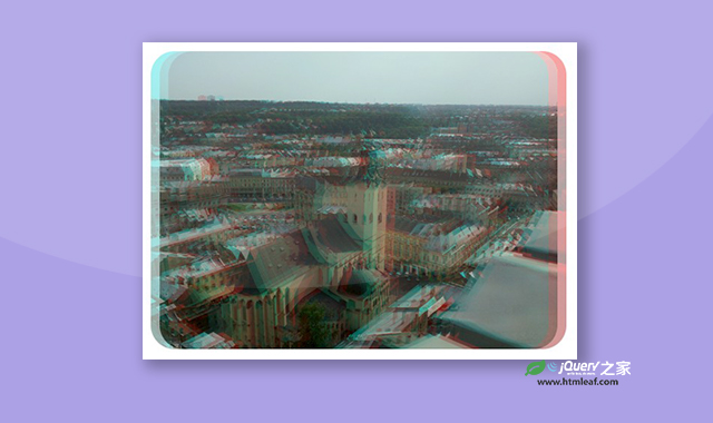

这是一款CSS和SVG制作RGB分离抖动效果。该CSS和SVG制作的RGB分离抖动效果通过CSS控制图片的filter属性,利用SVG,制作出非常炫酷的效果。
使用方法
HTML代码
<img src="demo.jpg">

<svg style="position: fixed; z-index: -10000;">
    <defs>
        <filter id="anaglyph">
            <feOffset result="offOut" in="SourceGraphic" dx="20" dy="0">
                <animate attributeName="dx" dur="5s" values=" 0; 25;0; -25; 0" repeatCount="indefinite"></animate>
            </feOffset>
            <feOffset result="off2Out" in="SourceGraphic" dx="-20" dy="0">
                <animate attributeName="dx" dur="5s" values=" 0; -25;0; 25; 0" repeatCount="indefinite"></animate>
            </feOffset>
            <feColorMatrix result="matrixOut" in="offOut" type="matrix" values="0 0 0 0 0 0 1 0 0 0 0 0 1 0 0 0 0 0 0.4 0" />
            <feColorMatrix result="matrix2Out" in="off2Out" type="matrix" values="1 0 0 0 0 0 0 0 0 0 0 0 0 0 0 0 0 0 0.4 0" />
            <feBlend result="blend1" in="matrix2Out" in2="SourceGraphic" mode="normal" />
            <feBlend in="matrixOut" in2="blend1" mode="normal" />
        </filter>
    </defs>
</svg>
CSS代码
img {
  aspect-ratio: 1;
  max-width: 100%;
  height: auto;
  filter: url("#anaglyph");
  border-radius: var(--radius);
}

main {
  overflow: hidden;
  border-radius: var(--radius);
}

:root {
  --radius: 2rem;
}

* {
  box-sizing: border-box;
}

body {
  background-color: #041827;
  color: white;
  display: grid;
  place-items: center;
  min-height: 100vh;
  min-height: 100dvh;
  padding: 0;
  margin: 0;
}
codepen网址:https://codepen.io/rodzyk/pen/dyQMGdb


