
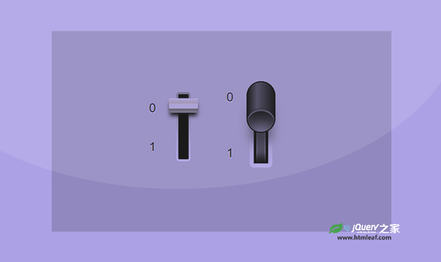

这是一款纯CSS创意开关按钮。该纯CSS创意开关按钮使用CSS线性渐变和伪元素,制作出上下拨动的开关按钮效果,非常炫酷。
使用方法
HTML代码
<div class="switch">
    <!-- <input class="sr-only" id="switch" type="range" min="0" max="1" step="1" value="0" /> -->
    <input class="sr-only" id="switch" type="checkbox" role="switch" />
    <label for="switch">
        <span class="sr-only">Switch it</span>
    </label>
</div>
<div class="switch switch--lg">
    <!-- <input class="sr-only" id="switch" type="range" min="0" max="1" step="1" value="0" /> -->
    <input class="sr-only" id="big-switch" type="checkbox" role="switch" />
    <label for="big-switch">
        <span></span>
        <span class="sr-only">Switch it</span>
    </label>
</div>
CSS代码
:root {
    --bg: hsl(60, 1%, 84%);
    --gradient-start: hsl(40, 8%, 64%);
    --ease: linear(
    0, 0.0036 9.62%, 0.0185 16.66%,
    0.0489 23.03%, 0.0962 28.86%,
    0.1705 34.93%, 0.269 40.66%,
    0.3867 45.89%, 0.5833 52.95%,
    0.683 57.05%, 0.7829 62.14%,
    0.8621 67.46%, 0.8991 70.68%,
    0.9299 74.03%, 0.9545 77.52%,
    0.9735 81.21%, 0.9865 85%,
    0.9949 89.15%, 1
  );
}

*,
*:after,
*:before {
    box-sizing: border-box;
}

body {
    display: grid;
    place-items: center;
    justify-content: center;
    grid-template-columns: 150px 150px;
    min-height: 50vh;
    background: var(--bg);
    font-family:  "SF Pro Text", "SF Pro Icons", "AOS Icons", "Helvetica Neue", Helvetica, Arial, sans-serif, system-ui;
}

.sr-only {
    position: absolute;
    width: 1px;
    height: 1px;
    padding: 0;
    margin: -1px;
    overflow: hidden;
    clip: rect(0, 0, 0, 0);
    white-space: nowrap;
    border-width: 0;
}

.switch {
    width: 28px;
    height: 134px;
    background: red;
    border-radius: 6px;
    border: 4px solid transparent;
    background: linear-gradient(black, black) padding-box, linear-gradient(var(--gradient-start), white) border-box;
    position: relative;
    container-type: size;
}

.switch::before,
.switch::after {
    content: "0";
    color: hsl(0 0% 8%);
    position: absolute;
    top: 10cqh;
    left: 50%;
    font-size: 1.5rem;
    translate: -500% 0;
    text-shadow: 0 2px white;
}

.switch::after {
    content: "1";
    top: 70cqh;
}

.switch label {
    position: absolute;
    inset: 0;
    cursor: pointer;
}

.switch label::after {
    content: "";
    position: absolute;
    top: 6cqh;
    left: 50%;
    translate: -50% 0;
    width: 56px;
    height: 28px;
    background:
        /*  Top of switch   */
        linear-gradient(hsl(48, 36%, 96%), hsl(48, 37%, 80%)) 0 0 / 100% 10px no-repeat,
        linear-gradient(hsl(45, 31%, 93%), hsl(45, 31%, 93%)) 0 10px / 100% 10px no-repeat,
        linear-gradient(hsl(55, 10%, 46%), hsl(55, 10%, 66%)) 0 20px / 100% 10px no-repeat,
        hsl(55, 10%, 66%);
    border-radius: 2px;
    box-shadow: 0 8px 8px -2px black;
}

@media(prefers-reduced-motion: no-preference) {
  .switch--lg label > span:first-of-type::before,
  .switch--lg label > span:first-of-type::after,
    .switch--lg label > span:first-of-type,
    .switch label::after {
        transition: translate 0.25s var(--ease);
    }
}

:checked + label::after {
    translate: -50% calc(88cqh - 100%);
}

.switch:has(input:focus-visible) {
    outline: 2px solid var(--gradient-start);
    outline-offset: 2px;
}

.switch--lg {
    width: 44px;
    height: 158px;
    border-width: 8px;
    border-radius: 8px;
}

.switch--lg label {
/*  mask: linear-gradient(transparent, white, transparent);*/
    background:
        linear-gradient(black, transparent 22px calc(100% - 22px), black) 50% 50% / 100% 100% no-repeat,
        linear-gradient(hsl(0 0% 0% / 0.5), transparent, hsl(0 0% 0% / 0.5)) 50% 50% / 14px 100% no-repeat,
        linear-gradient(hsl(0, 0%, 51%), hsl(0, 0%, 51%)) 50% 50% / 18px 100% no-repeat;
}
.switch--lg::before {
    top: 0;
}
.switch--lg::after {
    top: 76cqh;
}

.switch--lg label::after {
    display: none;
}

.switch--lg :checked + label > span:first-of-type {
    translate: -50% calc(110cqh - 100%);
}

.switch--lg label > span:first-of-type {
  overflow: hidden;
    height: 100px;
    width: 56px;
    background:
        linear-gradient(90deg, transparent, hsl(0 0% 100% / 0.35) 35%, transparent)
        hsl(0 0% 4%);
    border-radius: 100px;
    display: inline-block;
    position: absolute;
    left: 50%;
    translate: -50% -12cqh;
    border: 2px solid hsl(0 0% 0%);
    box-shadow: 0 30px 20px -8px hsl(0 0% 0% / 0.5);
}

.switch--lg label > span:first-of-type::after {
    content: "";
    position: absolute;
    bottom: 0;
    border-radius: 100%;
    width: 100%;
    aspect-ratio: 1 / 0.85;
    background:
        radial-gradient(circle at 50% 100%, hsl(0 0% 100% / 0.25), transparent 50%),
        linear-gradient(hsl(0 0% 2%), hsl(0 0% 40%)),
        hsl(0 0% 8%);
    box-shadow:
        0 -2px hsl(0 0% 0% / 0.25),
        0 4px hsl(0 0% 100% / 0.35) inset;
  translate: 0 0;
}

.switch--lg :checked + label > span:first-of-type::before {
  translate: 0 0;
}
.switch--lg :checked + label > span:first-of-type::after {
  translate: 0 calc(100% + 4px);
}

.switch--lg label > span:first-of-type::before {
    content: "";
    position: absolute;
    top: 0;
  rotate: 0deg;
  translate: 0 calc(-100% - 4px);
    border-radius: 100%;
    width: 100%;
    aspect-ratio: 1 / 0.85;
    background:
        radial-gradient(circle at 50% 0%, hsl(0 0% 100% / 0.25), transparent 50%),
        linear-gradient(hsl(0 0% 40%), hsl(0 0% 2%)),
        hsl(0 0% 8%);
    box-shadow:
        0 2px hsl(0 0% 0% / 0.25),
        0 -4px hsl(0 0% 100% / 0.15) inset;
}
codepen网址:https://codepen.io/jh3y/pen/GRegoaL


