
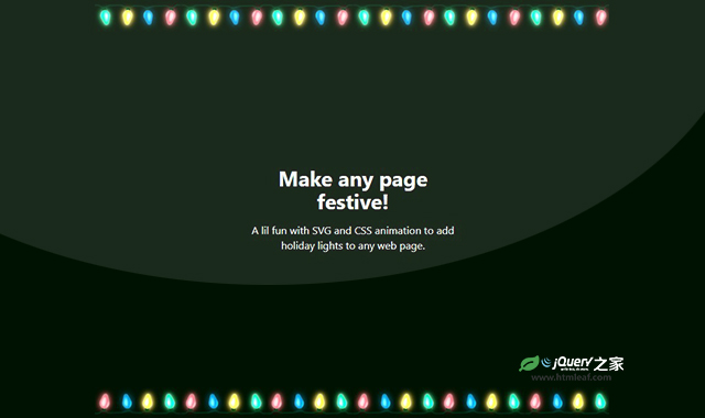

这是一款CSS和SVG广告牌灯光闪烁效果。该CSS和SVG广告牌灯光闪烁效果使用SVG来制作小灯泡,组合为广告牌的灯光闪烁效果,非常炫酷。
使用方法
HTML代码
<main>
<div class="lights top">
    <svg viewBox="0 0 161 54">
        <use xlink:href="#holiday-lights" />
    </svg>
    <svg viewBox="0 0 161 54">
        <use xlink:href="#holiday-lights" />
    </svg>
    <svg viewBox="0 0 161 54">
        <use xlink:href="#holiday-lights" />
    </svg>
    <svg viewBox="0 0 161 54">
        <use xlink:href="#holiday-lights" />
    </svg>
    <svg viewBox="0 0 161 54">
        <use xlink:href="#holiday-lights" />
    </svg>
    <svg viewBox="0 0 161 54">
        <use xlink:href="#holiday-lights" />
    </svg>
</div>
<div class="lights bottom">
    <svg viewBox="0 0 161 54">
        <use xlink:href="#holiday-lights" />
    </svg>
    <svg viewBox="0 0 161 54">
        <use xlink:href="#holiday-lights" />
    </svg>
    <svg viewBox="0 0 161 54">
        <use xlink:href="#holiday-lights" />
    </svg>
    <svg viewBox="0 0 161 54">
        <use xlink:href="#holiday-lights" />
    </svg>
    <svg viewBox="0 0 161 54">
        <use xlink:href="#holiday-lights" />
    </svg>
    <svg viewBox="0 0 161 54">
        <use xlink:href="#holiday-lights" />
    </svg>
</div>

<div class="content">
    <h1>Make any page festive!</h1>

    <p>
        A lil fun with SVG and CSS animation to add holiday lights to any web page.
    </p>
</div>
</main>
......
CSS代码
@keyframes lights {
	0% {
		opacity: 0;
	}
	30% {
		opacity: 0;
	}
	40% {
		opacity: 1;
	}
	90% {
		opacity: 1;
	}
	100% {
		opacity: 0;
	}
}

.lit {
	animation: 2s linear infinite lights;

	&.yellow {
		animation-delay: 0.5s;
	}

	&.blue {
		animation-delay: 1s;
	}

	&.red {
		animation-delay: 1.5s;
	}
}

.lights {
	align-items: top;
	display: grid;
	grid-template-columns: repeat(auto-fit, minmax(0, 1fr));
	position: absolute;
	inset-inline: 0;

	&.top {
		top: 0;
	}

	&.bottom {
		bottom: 0;
		rotate: 180deg;
	}

	& svg {
		display: block;
		width: 100%;
	}

	& svg:nth-child(2) ~ svg {
		display: none;

		@media (min-width: 400px) {
			display: block;
		}
	}

	& svg:nth-child(3) ~ svg {
		display: none;

		@media (min-width: 500px) {
			display: block;
		}
	}

	& svg:nth-child(4) ~ svg {
		display: none;

		@media (min-width: 600px) {
			display: block;
		}
	}
}

#lights-def {
	display: block;
	width: 0;
	height: 0;
	overflow: hidden;
}

/* other styles to make this look a bit nicer */

* {
	box-sizing: border-box;
}

body {
	background: oklch(15.4% 0.057 148.24) !important;
	color: oklch(97% 0.057 148.24);
	font-family: -apple-system, BlinkMacSystemFont, "Segoe UI", Roboto, Helvetica,
		Arial, sans-serif, "Apple Color Emoji", "Segoe UI Emoji", "Segoe UI Symbol";
	margin: 0;
}

main {
	display: grid;
	margin-block: 2rem;
	min-height: calc(100dvh - 4rem);
	padding: 4rem 2rem;
	place-content: center;
	position: relative;

	& :is(h1, p) {
		line-height: 1.1;
		margin: 0;
	}

	& p {
		line-height: 1.45;
		margin-block-start: 1rem;
	}
}

.content {
	margin-inline: auto;
	max-width: 40ch;
	text-align: center;
}


