
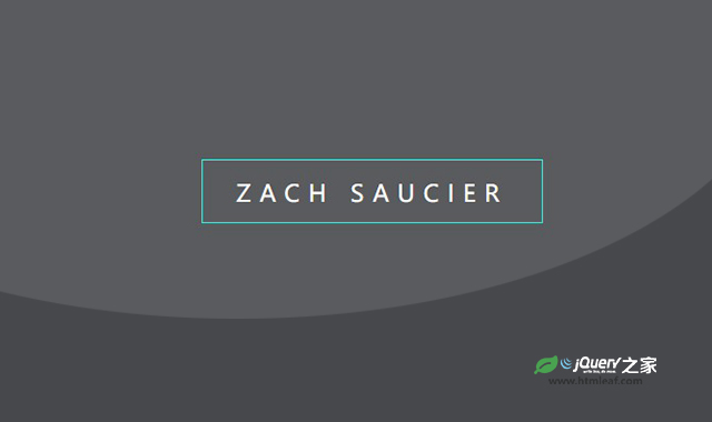

这是一款HTML5基于SVG的边框动画特效。该边框动画特效中,当鼠标滑过文字时,文字底部的线条以动画的方式,形成一个文字边框,效果非常炫酷。
使用方法
HTML代码
<div class="svg-wrapper">
  <svg height="60" width="320" xmlns="http://www.w3.org/2000/svg">
    <rect class="shape" height="60" width="320" />
    <div class="text">ZACH SAUCIER</div>
  </svg>
</div>
CSS代码
html,
body {
    background: rgb(20, 20, 20);
    text-align: center;
    height: 100%;
    overflow: hidden;
}

.container {
    height: 600px;
    width: 100%;
}

.svg-wrapper {
    position: relative;
    top: 50%;
    transform: translateY(-50%);
    margin: 0 auto;
    width: 320px;
}

.shape {
    stroke-dasharray: 140 540;
    stroke-dashoffset: -474;
    stroke-width: 8px;
    fill: transparent;
    stroke: #19f6e8;
    border-bottom: 5px solid black;
    transition: stroke-width 1s, stroke-dashoffset 1s, stroke-dasharray 1s;
}

.text {
    font-family: 'Roboto Condensed';
    font-size: 22px;
    line-height: 32px;
    letter-spacing: 8px;
    color: #fff;
    top: -48px;
    position: relative;
}

.svg-wrapper:hover .shape {
    stroke-width: 2px;
    stroke-dashoffset: 0;
    stroke-dasharray: 760;
}


