
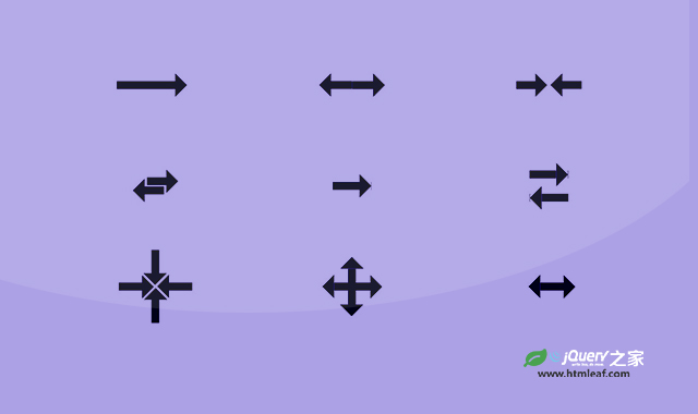

这是一款使用纯CSS制作的箭头动画效果。该效果中共有10种不同得的箭头动画,可以直接复制代码使用,非常方便。
使用方法
HTML代码
<div class="arrow-1"></div>
<div class="arrow-2"></div>
<div class="arrow-3"></div>
<div class="arrow-4"></div>
<div class="arrow-5"></div>
<div class="arrow-6"></div>
<div class="arrow-7"></div>
<div class="arrow-8"></div>
<div class="arrow-9"></div>
<div class="arrow-10"></div>
CSS代码
.arrow-1 {
  width:100px;
  height:30px;
  display: flex;
}
.arrow-1:before {
  content: "";
  background: currentColor;
  width:15px;
  clip-path: polygon(0 10px,calc(100% - 15px) 10px,calc(100% - 15px) 0,100% 50%,calc(100% - 15px) 100%,calc(100% - 15px) calc(100% - 10px),0 calc(100% - 10px));
  animation: a1 1.5s infinite linear;
}
@keyframes a1 {
  90%,100%{flex-grow: 1}
}

.arrow-2 {
  width:100px;
  height:30px;
  display: flex;
  justify-content: center;
}
.arrow-2:before,
.arrow-2:after {
  content: "";
  background: currentColor;
  width:15px;
  clip-path: polygon(0 10px,calc(100% - 15px) 10px,calc(100% - 15px) 0,100% 50%,calc(100% - 15px) 100%,calc(100% - 15px) calc(100% - 10px),0 calc(100% - 10px));
  animation: a2 1s infinite linear;
}

.arrow-2:before {
  transform: scaleX(-1);
}
@keyframes a2 {
  90%,100%{flex-grow: .5}
}


.arrow-3 {
  width:100px;
  height:30px;
  display: flex;
}
.arrow-3:before,
.arrow-3:after {
  content: "";
  flex: 1;
  margin: 0 5px;
  background: currentColor;
  clip-path: polygon(0 10px,calc(100% - 15px) 10px,calc(100% - 15px) 0,100% 50%,calc(100% - 15px) 100%,calc(100% - 15px) calc(100% - 10px),0 calc(100% - 10px));
  animation: a3 .5s infinite alternate;
}

.arrow-3:after {
  --s:-1;
}
@keyframes a3 {
  0%  {transform: scaleX(var(--s,1)) translate(-4px)}
  100%{transform: scaleX(var(--s,1)) translate( 4px)}
}

.arrow-4 {
  width:40px;
  height:30px;
  display:grid;
}
.arrow-4:before,
.arrow-4:after {
  content: "";
  grid-area: 1/1;
  background: currentColor;
  clip-path: polygon(0 10px,calc(100% - 15px) 10px,calc(100% - 15px) 0,100% 50%,calc(100% - 15px) 100%,calc(100% - 15px) calc(100% - 10px),0 calc(100% - 10px));
  animation: a4 .5s infinite alternate;
}

.arrow-4:after {
  --s:-1;
}
@keyframes a4 {
  0%  {transform: scale(var(--s,1)) translate(12px,-6px) translate(4px)}
  100%{transform: scale(var(--s,1)) translate(12px,-6px) translate(-4px)}
}

.arrow-5 {
  width:50px;
  height:30px;
  display: grid;
  overflow: hidden;
}
.arrow-5:before,
.arrow-5:after {
  content: "";
  grid-area: 1/1;
  background: currentColor;
  clip-path: polygon(0 10px,calc(100% - 15px) 10px,calc(100% - 15px) 0,100% 50%,calc(100% - 15px) 100%,calc(100% - 15px) calc(100% - 10px),0 calc(100% - 10px));
  animation: a5 1s infinite;
  transform: translate(calc(0% + var(--s,0%)));
}

.arrow-5:after {
  --s:-100%;
}

@keyframes a5 {
  80%,100%{transform: translate(calc(100% + var(--s,0%)))}
}

.arrow-6 {
  width:50px;
  height:60px;
  display: grid;
}
.arrow-6:before,
.arrow-6:after {
  content: "";
  background:
    linear-gradient(90deg,currentColor calc(100% - 15px),#0000 0) 0 50%/100% 10px,
    conic-gradient(from -136deg at 15px 50%,#0000 ,currentColor 1deg 90deg,#0000 91deg) 35px 0/100% 100%;
  background-repeat: repeat-x;
  animation: a6 1s infinite;
}
.arrow-6:after {
  transform: scaleX(-1);
}

@keyframes a6 {
  80%,100%{background-position: 50px 50%,85px 0}
}

.arrow-7 {
  width:110px;
  height:30px;
  display: flex;
  background:
    linear-gradient(currentColor 0 0) left /30px 10px,
    linear-gradient(currentColor 0 0) right/30px 10px,
    conic-gradient(from -136deg at             15px  50%,#0000 ,currentColor 1deg 90deg,#0000 91deg) 30px              0/100% 100%,
    conic-gradient(from   44deg at calc(100% - 15px) 50%,#0000 ,currentColor 1deg 90deg,#0000 91deg) calc(100% - 30px) 0/100% 100%;
  background-repeat: no-repeat;
  animation: a7 .5s infinite alternate;
}
.arrow-7:before {
  content: "";
  flex: 1;
  background: inherit;
  transform: rotate(90deg);
}

@keyframes a7 {
  90%,100%{width:93px}
}

.arrow-8 {
  width:30px;
  height:30px;
  display: flex;
  background:
    linear-gradient(currentColor 0 0) center/calc(100% - 30px) 10px,
    conic-gradient(from -136deg at right,#0000 ,currentColor 1deg 90deg,#0000 91deg) right/15px 100%,
    conic-gradient(from   44deg at left ,#0000 ,currentColor 1deg 90deg,#0000 91deg) left /15px 100%;
  background-repeat: no-repeat;
  animation: a8 .5s infinite alternate;
}
.arrow-8:before {
  content: "";
  flex: 1;
  background: inherit;
  transform: rotate(90deg);
}

@keyframes a8 {
  90%,100%{width:80px}
}

.arrow-9 {
  width:60px;
  height:30px;
  display: flex;
  background:
    linear-gradient(currentColor 0 0) center/calc(100% - 30px) 10px,
    conic-gradient(from -136deg at right,#0000 ,currentColor 1deg 90deg,#0000 91deg) right/15px 100%,
    conic-gradient(from   44deg at left ,#0000 ,currentColor 1deg 90deg,#0000 91deg) left /15px 100%;
  background-repeat: no-repeat;
  animation: a9 .5s infinite linear alternate;
}

@keyframes a9 {
  0%   {transform: translate(-30px)}
  100% {transform: translate( 30px)}
}

.arrow-10 {
  width:30px;
  height:60px;
  padding-top: 60px;
  display: grid;
  background:
    linear-gradient(currentColor 0 0) bottom/10px calc(100% - 15px),
    conic-gradient(from 134deg at top,#0000 ,currentColor 1deg 90deg,#0000 91deg) top/100% 15px;
  background-origin: content-box;
  background-repeat: no-repeat;
  animation: a10-0 2s infinite;
}
.arrow-10:before,
.arrow-10:after {
  content: "";
  grid-area: 1/1;
  background:inherit;
  background-size: 10px calc(100% - 25px),100% 25px;
  animation: a10-1 2s infinite;
}
.arrow-10:after {
  background-size: 10px calc(100% - 30px),100% 30px;
  animation: a10-2 2s infinite;
}
@keyframes a10-0 {
  25%,100% {padding-top:0px}
}

@keyframes a10-1 {
  0%,25%   {margin:60px -10px 0}
  50%,100% {margin:8px  -10px 0}
}
@keyframes a10-2 {
  0%,50%   {margin:60px -15px 0}
  75%,100% {margin:20px -15px 0}
}
codepen网址:https://codepen.io/t_afif/pen/wvdvYPJ


