
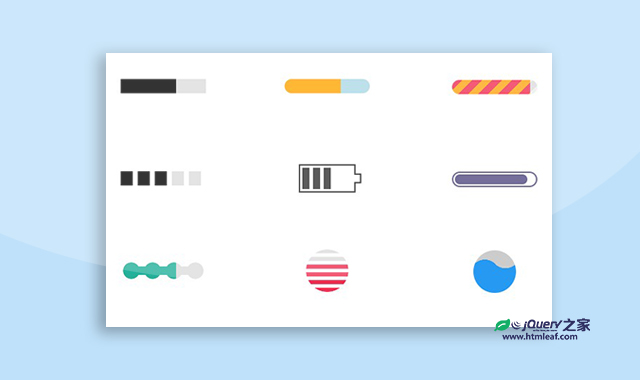

这是一款纯CSS制作的炫酷的进度条设计效果。该纯CSS进度条设计共有十种不同的效果,它们 分别使用不同的CSS keyframes动画来实现,非常炫酷。
使用方法
HTML代码
<div class="container">
    <div class="progress-1"></div>
    <div class="progress-2"></div>
    <div class="progress-3"></div>
    <div class="progress-4"></div>
    <div class="progress-5"></div>
    <div class="progress-6"></div>
    <div class="progress-7"></div>
    <div class="progress-8"></div>
    <div class="progress-9"></div>
    <div class="progress-10"></div>
</div>
CSS代码
.progress-1 {
  width:120px;
  height:20px;
  background:
   linear-gradient(#000 0 0) 0/0% no-repeat
   #ddd;
  animation:p1 2s infinite linear;
}
@keyframes p1 {
    100% {background-size:100%}
}

.progress-2 {
  width:120px;
  height:20px;
  border-radius: 20px;
  background:
   linear-gradient(orange 0 0) 0/0% no-repeat
   lightblue;
  animation:p2 2s infinite steps(10);
}
@keyframes p2 {
    100% {background-size:110%}
}

.progress-3 {
  width:120px;
  height:20px;
  border-radius: 20px;
  background:
   repeating-linear-gradient(135deg,#f03355 0 10px,#ffa516 0 20px) 0/0%   no-repeat,
   repeating-linear-gradient(135deg,#ddd    0 10px,#eee    0 20px) 0/100%;
  animation:p3 2s infinite;
}
@keyframes p3 {
    100% {background-size:100%}
}

.progress-4 {
  width:120px;
  height:20px;
  -webkit-mask:linear-gradient(90deg,#000 70%,#0000 0) 0/20%;
  background:
   linear-gradient(#000 0 0) 0/0% no-repeat
   #ddd;
  animation:p4 2s infinite steps(6);
}
@keyframes p4 {
    100% {background-size:120%}
}

.progress-5 {
  width:80px;
  height:40px;
  border:2px solid currentColor;
  border-right-color: transparent;
  padding:3px;
  background:
    repeating-linear-gradient(90deg,currentColor 0 10px,#0000 0 15px)
    0/0% no-repeat content-box content-box;
  position: relative;
  animation:p4 2s infinite steps(6);
}
.progress-5::before {
  content:"";
  position: absolute;
  top:-2px;
  bottom:-2px;
  left:100%;
  width:10px;
  background:
    linear-gradient(
        #0000   calc(50% - 7px),currentColor 0 calc(50% - 5px),
        #0000 0 calc(50% + 5px),currentColor 0 calc(50% + 7px),#0000 0) left /100% 100%,
    linear-gradient(currentColor calc(50% - 5px),#0000        0 calc(50% + 5px),currentColor 0) left /2px 100%,
    linear-gradient(#0000        calc(50% - 5px),currentColor 0 calc(50% + 5px),#0000        0) right/2px 100%;
  background-repeat:no-repeat;
}
@keyframes p5 {
    100% {background-size:120%}
}

.progress-6 {
  width:120px;
  height:22px;
  border-radius: 20px;
  color:#514b82;
  border:2px solid;
  position: relative;
}
.progress-6::before {
  content:"";
  position: absolute;
  margin:2px;
  inset:0 100% 0 0;
  border-radius: inherit;
  background:currentColor;
  animation:p6 2s infinite;
}
@keyframes p6 {
    100% {inset:0}
}

.progress-7 {
  width:120px;
  height:24px;
  -webkit-mask:
    radial-gradient(circle closest-side,#000 94%,#0000) 0 0/25% 100%,
    linear-gradient(#000 0 0) center/calc(100% - 12px) calc(100% - 12px) no-repeat;
  background:
   linear-gradient(#25b09b 0 0) 0/0% no-repeat
   #ddd;
  animation:p7 2s infinite linear;
}
@keyframes p7 {
    100% {background-size:100%}
}

.progress-8 {
  width:60px;
  height:60px;
  border-radius: 50%;
  -webkit-mask:linear-gradient(0deg,#000 55%,#0000 0) bottom/100% 18.18%;
  background:
   linear-gradient(#f03355 0 0) bottom/100% 0% no-repeat
   #ddd;
  animation:p8 2s infinite steps(7);
}
@keyframes p8 {
    100% {background-size:100% 115%}
}


.progress-9 {
  --r1: 154%;
  --r2: 68.5%;
  width:60px;
  height:60px;
  border-radius: 50%;
  background:
    radial-gradient(var(--r1) var(--r2) at top   ,#0000 79.5%,#269af2 80%),
    radial-gradient(var(--r1) var(--r2) at bottom,#269af2 79.5%,#0000 80%),
    radial-gradient(var(--r1) var(--r2) at top   ,#0000 79.5%,#269af2 80%),
    #ccc;
  background-size: 50.5% 220%;
  background-position: -100% 0%,0% 0%,100% 0%;
  background-repeat:no-repeat;
  animation:p9 2s infinite linear;
}
@keyframes p9 {
    33%  {background-position:    0% 33% ,100% 33% ,200% 33% }
    66%  {background-position: -100%  66%,0%   66% ,100% 66% }
    100% {background-position:    0% 100%,100% 100%,200% 100%}
}


.progress-10 {
  width:120px;
  height:60px;
  border-radius:200px 200px 0 0;
  -webkit-mask:repeating-radial-gradient(farthest-side at bottom ,#0000 0,#000 1px 12%,#0000 calc(12% + 1px) 20%);
  background:
   radial-gradient(farthest-side at bottom,#514b82 0 95%,#0000 0) bottom/0% 0% no-repeat
   #ddd;
  animation:p10 2s infinite steps(6);
}
@keyframes p10 {
    100% {background-size:120% 120%}
}
codepen网址:https://codepen.io/t_afif/pen/bGqEBgL


