
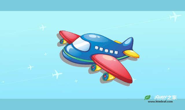

这是一款css3飞机飞过天空背景动画特效。该特效通过css制作蓝色的天空背景,然后通过css animation 帧动画使多张飞机背景图片移动,产生大量飞机飞过天空的动画效果。
使用方法
HTML代码
<div class="pen-container">
    <div class="plane plane-1">
        <i></i>
    </div>

    <div class="plane plane-2">
        <i></i>
    </div>

    <div class="plane plane-3">
        <i></i>
    </div>

    <div class="plane plane-4">
        <i></i>
    </div>

    <div class="plane plane-5">
        <i></i>
    </div>

    <div class="plane plane-6">
        <i></i>
    </div>

    <div class="plane plane-7">
        <i></i>
    </div>

    <div class="plane plane-8">
        <i></i>
    </div>

    <div class="plane plane-9">
        <i></i>
    </div>

    <div class="plane plane-10">
        <i></i>
    </div>
</div>
CSS代码
.pen-container {
    background-color: white;
    overflow-x: hidden;
    width: 100%;
    height: 100%;
    min-height: calc(100vh - 80px);
    position: relative;
}

.pen-container::after {
    background: linear-gradient(359deg, #b7bca4 26.23%, #3d94b2 87.37%);
    content: "";
    position: absolute;
    top: 0;
    left: 0;
    opacity: 0.4;
    height: 100%;
    width: 100%;
}

.plane {
    left: 0;
    position: absolute;
    transform: rotate(-10deg);
    width: 100%;
    z-index: 1;
}

.plane i {
    animation: motion linear infinite;
    background-image: url("../images/plane@2x.png");
    background-repeat: no-repeat;
    background-size: 100%;
    position: absolute;
    right: 0;
    transition: 0.4s ease-out;
}

.plane-1 {
    top: 90px;
}

.plane-1 i {
    height: 67px;
    width: 1171px;
    animation-duration: 50s;
    animation-delay: -10s;
}

.plane-2 {
    top: 320px;
}

.plane-2 i {
    height: 58px;
    width: 1007px;
    animation-duration: 60s;
    animation-delay: -4s;
}

.plane-3 {
    top: 30px;
}

.plane-3 i {
    height: 40px;
    width: 693px;
    animation-duration: 75s;
    animation-delay: -33s;
}

.plane-4 {
    top: 261px;
}

.plane-4 i {
    height: 34px;
    width: 594px;
    animation-duration: 85s;
    animation-delay: -50s;
}

.plane-5 {
    top: 449px;
}

.plane-5 i {
    height: 31px;
    width: 528px;
    animation-duration: 100s;
    animation-delay: -33s;
}

.plane-6 {
    top: 204px;
}

.plane-6 i {
    height: 21px;
    width: 363px;
    animation-duration: 110s;
    animation-delay: -2s;
}

.plane-7 {
    top: 0;
}

.plane-7 i {
    height: 21px;
    width: 363px;
    animation-duration: 125s;
    animation-delay: 10s;
}

.plane-8 {
    top: 401px;
}

.plane-8 i {
    height: 18px;
    width: 313px;
    animation-duration: 140s;
    animation-delay: -60s;
}

.plane-9 {
    top: 331px;
}

.plane-9 i {
    height: 14px;
    width: 231px;
    animation-duration: 150s;
    animation-delay: -20s;
}

.plane-10 {
    top: 430px;
}

.plane-10 i {
    height: 12px;
    width: 197px;
    animation-duration: 160s;
}

@keyframes motion {
    0% {
        opacity: 1;
        transform: translateX(-101vw);
    }

    97% {
        opacity: 1;
    }

    98% {
        opacity: 0;
    }

    100% {
        opacity: 0;
        transform: translateX(calc(0% + 100px));
    }
}


