
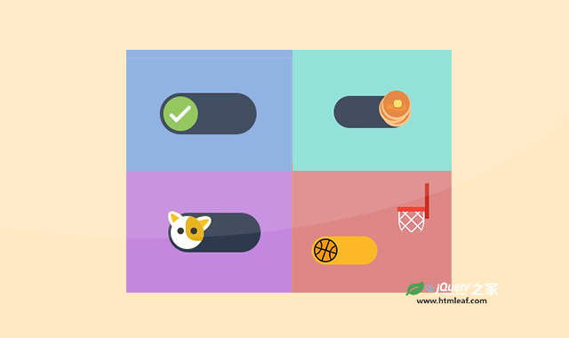

这是一款超酷CSS3开关按钮动画特效合辑。该CSS3开关按钮动画公有8种不同的开关按钮效果,他们都是用纯CSS制作动画,效果非常有创意。
使用方法
HTML代码
<div class="toggle-wrapper">
    <div class="toggle normal">
        <input id="normal" type="checkbox" />
        <label class="toggle-item" for="normal"></label>
    </div>
    <div class="name">Normal</div>
</div>
<div class="toggle-wrapper">
    <div class="toggle transparent">
        <input id="transparent" type="checkbox" />
        <label class="toggle-item" for="transparent"></label>
    </div>
    <div class="name">Transparent</div>
</div>
<div class="toggle-wrapper">
    <div class="toggle checkcross">
        <input id="checkcross" type="checkbox" />
        <label class="toggle-item" for="checkcross">
            <div class="check"></div>
        </label>
    </div>
    <div class="name">Yes & No</div>
</div>
<div class="toggle-wrapper">
    <div class="toggle">
        <input id="gravity" type="checkbox" />
        <label class="toggle-item" for="gravity"></label>
    </div>
    <div class="name">Gravity</div>
</div>
<div class="toggle-wrapper">
    <div class="toggle pancake-stack">
        <input id="pancake" type="checkbox" />
        <label class="toggle-item" for="pancake">
            <div class="pancakes">
                <div class="pancake"></div>
                <div class="pancake"></div>
                <div class="pancake"></div>
                <div class="butter"></div>
            </div>
        </label>
    </div>
    <div class="name">Pancake Stacks</div>
</div>
<div class="toggle-wrapper">
    <div class="toggle dog-rollover">
        <input id="doggo" type="checkbox" />
        <label class="toggle-item" for="doggo">
            <div class="dog">
                <div class="ear"></div>
                <div class="ear right"></div>
                <div class="face">
                    <div class="eyes"></div>
                    <div class="mouth"></div>
                </div>
            </div>
        </label>
    </div>
    <div class="name">Doggo Wants a Treat</div>
</div>
<div class="toggle-wrapper">
    <div class="toggle basketball-hoop">
        <input id="hoop" type="checkbox" />
        <label class="toggle-item" for="hoop">
            <div class="ball__wrapper">
                <div class="ball"></div>
            </div>
            <div class="hoop"></div>
        </label>
    </div>
    <div class="name">Kobe Bryant Tribute</div>
</div>
<div class="toggle-wrapper">
    <div class="toggle beer-pong">
        <input id="beer-pong" type="checkbox" />
        <label class="toggle-item" for="beer-pong"></label>
        <div class="cup">
            <div class="lid"></div>
        </div>
    </div>
    <div class="name">Beer Pong</div>
</div>
CSS代码
body {
    background: #2e394d;

}

* {
    box-sizing: border-box;
}

*:before,
*:after {
    content: "";
    position: absolute;
}

input {
    height: 40px;
    left: 0;
    opacity: 0;
    position: absolute;
    top: 0;
    width: 40px;
}

.container {
    display: flex;
    flex-wrap: wrap;
    justify-content: center;
    align-items: center;
}

.toggle-wrapper {
    flex: 1 1 calc(100% / 3);
    min-height: 50vh;
    display: flex;
    align-items: center;
    justify-content: center;
    overflow: hidden;
    position: relative;
}

@media (max-width: 960px) {
    .toggle-wrapper {
        flex: 1 1 calc(100% / 2);
    }
}

@media (max-width: 700px) {
    .toggle-wrapper {
        flex: 1 1 100%;
    }
}

.toggle-wrapper:nth-child(1) {
    background: #dec387;
}

.toggle-wrapper:nth-child(2) {
    background: #de8797;
}

.toggle-wrapper:nth-child(3) {
    background: #87aade;
}

.toggle-wrapper:nth-child(4) {
    background: #c5de87;
}

.toggle-wrapper:nth-child(5) {
    background: #87ded2;
}

.toggle-wrapper:nth-child(6) {
    background: #c487de;
}

.toggle-wrapper:nth-child(7) {
    background: #de8787;
}

.toggle-wrapper:nth-child(7) .toggle {
    transform: translate(-40px, 40px);
}

.toggle-wrapper:nth-child(8) {
    background: #decf87;
}

.toggle-wrapper:nth-child(8) .toggle {
    transform: translate(-40px, 40px);
}

.name {
    width: 80%;
    position: absolute;
    font: 500 14px "Rubik", sans-serif;
    letter-spacing: 0.5px;
    text-transform: uppercase;
    text-shadow: 0 1px 1px rgba(0, 0, 0, 0.4);
    bottom: 15px;
    right: 15px;
    text-align: right;
}

.toggle {
    position: relative;
    display: inline-block;
}

label.toggle-item {
    width: 7em;
    background: #2e394d;
    height: 3em;
    display: inline-block;
    border-radius: 50px;
    margin: 40px;
    position: relative;
    transition: all 0.3s ease;
    transform-origin: 20% center;
    cursor: pointer;
}

label.toggle-item:before {
    display: block;
    transition: all 0.2s ease;
    width: 2.3em;
    height: 2.3em;
    top: 0.25em;
    left: 0.25em;
    border-radius: 2em;
    border: 2px solid #88cf8f;
    transition: 0.3s ease;
}

.normal label {
    background: #af4c4c;
    border: 0.5px solid rgba(117, 117, 117, 0.31);
    box-shadow: inset 0px 0px 4px 0px rgba(0, 0, 0, 0.2), 0 -3px 4px rgba(0, 0, 0, 0.15);
}

.normal label:before {
    border: none;
    width: 2.5em;
    height: 2.5em;
    box-shadow: inset 0.5px -1px 1px rgba(0, 0, 0, 0.35);
    background: #fff;
    transform: rotate(-25deg);
}

.normal label:after {
    background: transparent;
    height: calc(100% + 8px);
    border-radius: 30px;
    top: -5px;
    width: calc(100% + 8px);
    left: -4px;
    z-index: 0;
    box-shadow: inset 0px 2px 4px -2px rgba(0, 0, 0, 0.2), 0px 1px 2px 0px rgba(151, 151, 151, 0.2);
}

#normal:checked + label {
    background: #4caf50;
}

#normal:checked + label:before {
    left: 67px;
}

.transparent label {
    background: transparent;
    border: 3px solid #fff;
    height: 3.35em;
}

.transparent label:before {
    border: 3px solid #fff;
    width: 2em;
    height: 2em;
    top: 0.3em;
    left: 0.3em;
    background: #fff;
}

#transparent:checked + label:before {
    transform: translateX(59px);
}

.checkcross label:before {
    content: none;
}

.checkcross .check {
    border-radius: 50%;
    width: 2.5em;
    height: 2.5em;
    position: absolute;
    background: #8BC34A;
    transition: 0.4s ease;
    top: 4.5px;
    left: 4.5px;
}

.checkcross .check:before,
.checkcross .check:after {
    height: 4px;
    border-radius: 10px;
    background: #fff;
    transition: 0.4s ease;
}

.checkcross .check:before {
    width: 25px;
    transform: rotate(-45deg) translate(-6px, 20px);
}

.checkcross .check:after {
    width: 10px;
    transform: rotate(45deg) translate(20px, 11px);
}

#checkcross:checked + label .check {
    left: 68px;
    transform: rotate(360deg);
    background: #c34a4a;
}

#checkcross:checked + label .check:before {
    width: 27px;
    transform: rotate(-45deg) translate(-8px, 18px);
}

#checkcross:checked + label .check:after {
    width: 27px;
    transform: rotate(45deg) translate(18px, 8px);
}

#gravity:checked + label {
    transform: rotate(90deg);
}

#gravity:checked + label:before {
    transform: translateX(67px);
    transition-delay: 0.2s;
    transition: 0.6s cubic-bezier(0.895, 0.03, 0.685, 0.22) 0.2s;
}

.beer-pong label:before {
    background: #f9f9f9;
    box-shadow: inset 0 -3px 0 0 #c6c5c5;
    border: none;
    width: 2.5em;
    height: 2.5em;
    top: 0.25em;
    left: 0.25em;
}

.beer-pong .cup {
    top: -3%;
    right: -118px;
    border-top: 90px solid #f44336;
    border-left: 15px solid transparent;
    border-right: 15px solid transparent;
    height: 3px;
    position: absolute;
    width: 80px;
    transform-origin: bottom right;
    transition: 0.2s cubic-bezier(0.42, 0.5, 0.58, 1);
}

.beer-pong .cup:before {
    box-shadow: 0 -10px 0 0px rgba(39, 39, 39, 0.1), 0px -20px 0 0px rgba(39, 39, 39, 0.1);
    border-radius: 3px;
    overflow: hidden;
    background: rgba(39, 39, 39, 0.1);
    width: 120%;
    left: -5px;
    height: 4px;
    top: -40px;
}

.beer-pong .cup .lid {
    position: absolute;
    width: 95px;
    height: 8px;
    border-radius: 20px;
    background: #efefef;
    bottom: 86px;
    left: -23px;
}

.beer-pong .cup .lid:after {
    background: #efefef;
    width: 48px;
    height: 5px;
    left: 50%;
    margin-left: -24px;
    top: 94px;
    border-radius: 0 0 3px 3px;
}

#beer-pong:checked ~ .cup {
    animation: 0.2s linear cup 1s forwards;
}

#beer-pong:checked + label:before {
    animation: 2s linear bounce-off forwards;
}

@keyframes cup {
    0% {
        transform: none;
    }

    50% {
        transform: rotate(75deg) translate(10px, 15px);
    }

    90% {
        transform: rotate(70deg) translate(10px, 15px);
    }

    100% {
        transform: rotate(75deg) translate(10px, 15px);
    }
}

@keyframes bounce-off {
    0% {
        transform: translateY(0);
    }

    10%,
    25% {
        transform: translate(-20px, -80px);
    }

    50% {
        transform: rotate(163deg);
        transform-origin: 100px -12px;
    }

    70% {
        transform: rotate(0) translate(-3px, -8px);
        transform-origin: 100px -12px;
    }

    75% {
        transform: translate(20px, -8px);
    }

    80% {
        transform: translate(30px, 0px);
    }

    85% {
        transform: translate(40px, -3px);
    }

    87% {
        transform: translate(46px, 0px);
    }

    90% {
        transform: translate(52px, -1px);
    }

    95% {
        transform: translate(60px, 0px);
    }

    100% {
        transform: translate(64px, 0px);
    }
}

.dog-rollover label:before {
    content: none;
}

.dog-rollover label .dog {
    display: inline-block;
    position: absolute;
    width: 2.5em;
    height: 2.5em;
    top: 0.25em;
    left: 0.2em;
    transition: 0.6s ease;
}

.dog-rollover label .eyes {
    position: absolute;
    width: 8px;
    height: 8px;
    background: #222;
    border-radius: 50%;
    transform: translate(8px, 14px);
    box-shadow: 16px 0 0 #222, 22px -4px 0 12px #e4ac04;
}

.dog-rollover label .ear {
    width: 18px;
    height: 20px;
    position: absolute;
    left: -4px;
    bottom: 80%;
    background: #f9bb00;
    margin-bottom: -5px;
    border-radius: 50% 50% 0 0/100% 100% 0 0;
    box-shadow: inset 4px 0 0 0px #ffffff, inset -4px 0 0 0px #ffffff;
    transform: rotate(-40deg);
}

.dog-rollover label .ear.right {
    transform: rotate(60deg) scaleX(-1);
    left: auto;
    transform-origin: center bottom;
    transition: 0.4s ease-in-out;
    right: 0px;
}

.dog-rollover label .face {
    overflow: hidden;
    border-radius: 50%;
    width: 2.5em;
    height: 2.5em;
    position: absolute;
    background: #fff;
    z-index: 8;
}

.dog-rollover label .mouth {
    position: absolute;
    background: #222;
    width: 14px;
    height: 7px;
    left: 50%;
    margin-left: -7px;
    bottom: 12px;
    border-radius: 2px 2px 20px 20px;
    bottom: 8px;
    transform: scale(0);
    transition: 0.1s ease;
}

.dog-rollover label .mouth:before {
    width: 8px;
    height: 8px;
    background: #ec788d;
    border-radius: 0 0 50% 50%;
    transform: translate(3px, 5px);
}

.dog-rollover label:before {
    border-color: white;
    background: white;
}

#doggo:checked ~ .cup {
    animation: 0.2s linear cup 1s forwards;
}

#doggo:checked + label .dog {
    left: 68px;
    transform: rotate(360deg);
}

#doggo:checked + label .mouth {
    transform: scale(1);
    transition-delay: 0.7s;
}

#doggo:checked + label .ear.right {
    transform: scaleX(-1) rotate(-35deg);
    transition-delay: 0.6s;
}

.basketball-hoop label {
    background: #fdb827;
}

.basketball-hoop label:before {
    content: none;
}

.basketball-hoop .ball {
    border-radius: 50%;
    width: 2.5em;
    height: 2.5em;
    position: absolute;
    background: #FF9800;
    border: 2px solid black;
    transition: 0.4s ease;
    top: 4px;
    left: 4px;
    background-image: radial-gradient(circle at -5px 10px, transparent 15px, black 15px, black 17px, transparent 17px), radial-gradient(circle at 41px 25px, transparent 15px, black 15px, black 17px, transparent 17px), linear-gradient(110deg, transparent 22px, black 22px, black 24px, transparent 24px), linear-gradient(18deg, transparent 22px, black 22px, black 24px, transparent 24px);
}

.basketball-hoop .ball__wrapper {
    transition: 0.4s ease;
    width: 195%;
    height: 200%;
    transform-origin: 50% -2%;
}

.basketball-hoop .hoop {
    top: -50px;
    right: -84px;
    width: 50px;
    background: #f44336;
    height: 8px;
    position: absolute;
}

.basketball-hoop .hoop:before {
    position: absolute;
    right: -4px;
    width: 7px;
    height: 60px;
    background: #cd2e22;
    top: -40px;
}

.basketball-hoop .hoop:after {
    width: 40px;
    height: 35px;
    background: repeating-linear-gradient(45deg, transparent, transparent 13px, white 13px, white 15px), repeating-linear-gradient(-45deg, transparent, transparent 13px, white 13px, white 15px);
    top: 8px;
    border-radius: 0 0 20% 20%/40% 40% 60% 60%;
    border: 2px solid #fff;
    border-width: 0 2px;
    left: 2px;
    z-index: 20;
}

#hoop:checked + label {
    background: #542583;
    transition-delay: 1.35s;
}

#hoop:checked + label .ball__wrapper {
    animation: 1.5s linear ball-wrapper forwards;
}

#hoop:checked + label .ball {
    animation: 1.5s linear ball forwards;
}

@keyframes ball {
    0% {
        transform: none;
    }

    40% {
        transform: rotate(-150deg);
    }

    48% {
        transform: rotate(-150deg) translateY(92px);
    }

    52% {
        transform: rotate(-150deg) translate(-10px, 80px);
    }

    56% {
        transform: rotate(-150deg) translate(-25px, 91px);
    }

    60% {
        transform: rotate(-150deg) translate(-35px, 86px);
    }

    65% {
        transform: rotate(-150deg) translate(-45px, 91px);
    }

    70% {
        transform: rotate(-150deg) translate(-50px, 87px);
    }

    75% {
        transform: rotate(-150deg) translate(-60px, 91px);
    }

    80% {
        transform: rotate(-150deg) translate(-65px, 88px);
    }

    85% {
        transform: rotate(-150deg) translate(-70px, 91px);
    }

    90% {
        transform: rotate(-150deg) translate(-75px, 90px);
    }

    95% {
        transform: rotate(-150deg) translate(-80px, 90px);
    }

    100% {
        transform: rotate(-150deg) translate(-82px, 91px);
    }
}

@keyframes ball-wrapper {
    0% {
        transform: none;
    }

    40%,
    100% {
        transform: rotate(150deg);
    }
}

.pancake-stack label:before {
    content: none;
}

.pancake-stack .pancakes {
    transition: 0.6s cubic-bezier(0.175, 0.885, 0.32, 1.275);
}

.pancake-stack .pancake {
    background: #e27c31;
    border-radius: 50%;
    width: 2.5em;
    height: 2.5em;
    position: absolute;
    transition: 0.4s ease;
    top: 2px;
    left: 4px;
    box-shadow: 0 2px 0 2px #fbbe7c;
}

.pancake-stack .pancake:nth-child(2) {
    left: 0;
    top: -3px;
    transform: scale(0);
    transition: 0.2s ease 0.2s;
}

.pancake-stack .pancake:nth-child(3) {
    top: -8px;
    transform: scale(0);
    transition: 0.2s ease 0.2s;
}

.pancake-stack .pancake:nth-child(3):before,
.pancake-stack .pancake:nth-child(3):after {
    background: #ef8927;
    border-radius: 20px;
    width: 50%;
    height: 20%;
}

.pancake-stack .pancake:nth-child(3):before {
    top: 20px;
    left: 5px;
}

.pancake-stack .pancake:nth-child(3):after {
    top: 22px;
    right: 5px;
}

.pancake-stack .butter {
    width: 12px;
    height: 11px;
    background: #fbdb60;
    top: 6px;
    left: 20px;
    position: absolute;
    border-radius: 4px;
    box-shadow: 0 1px 0 1px #d67823;
    transform: scale(0);
    transition: 0.2s ease;
}

#pancake:checked + label .pancakes {
    transform: translateX(70px);
}

#pancake:checked + label .pancake:nth-child(2) {
    transform: scale(1);
    transition-delay: 0.2s;
}

#pancake:checked + label .pancake:nth-child(3) {
    transform: scale(1);
    transition-delay: 0.4s;
}

#pancake:checked + label .butter {
    transform: scale(1);
    transition-delay: 0.6s;
}

.footer {
    flex-wrap: wrap;
    padding: 5rem 5rem 3rem;
    text-align: center;
    min-height: 20vh;
    display: flex;
    font: 14px/1.7 "Rubik";
    color: #fff;
    align-items: center;
    justify-content: center;
}

.footer a {
    text-decoration: none;
    color: #fff;
    padding: 3px 0;
    border-bottom: 1px dashed;
}

.footer a:hover {
    border-bottom: 1px solid;
}

footer {
    margin-top: 1.5rem;
}

footer a {
    text-decoration: none;
    display: inline-block;
    width: 45px;
    height: 45px;
    border-radius: 50%;
    background: transparent;
    border: 1px dashed #fff;
    color: #fff;
    margin: 5px;
}

footer a:hover {
    background: rgba(255, 255, 255, 0.1);
}

footer a .icons {
    margin-top: 8px;
    display: inline-block;
    font-size: 20px;
}

footer a .icons:before {
    position: relative;
}
codepen网址:https://codepen.io/oliviale/pen/xxboXzo


