
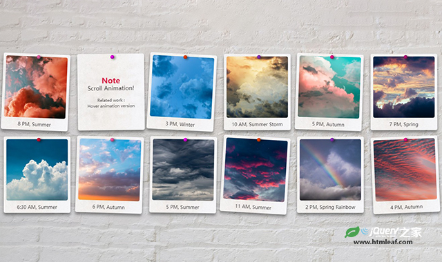

这是一款js和css3照片墙滚动摇摆动画效果。该特效中,通过HTML和CSS代码制作照片墙样式,并通过简单的JS代码使页面在滚动时,照片图片产生左右摇摆的动画特效,非常炫酷。
使用方法
HTML代码
<main>
    <div id="gallery">
        <figure>
            <img src="./images/1.jpg">
            <figcaption>8 PM, Summer</figcaption>
        </figure>
        <figure>
            <img src="./images/2.jpg">
            <figcaption>3 PM, Winter</figcaption>
        </figure>
        <figure>
            <img src="./images/3.jpg">
            <figcaption>10 AM, Summer Storm</figcaption>
        </figure>
        <figure>
            <img src="./images/4.jpg">
            <figcaption>5 PM, Autumn</figcaption>
        </figure>
        <figure>
            <img src="./images/5.jpg">
            <figcaption>7 PM, Spring</figcaption>
        </figure>
        <figure>
            <img src="./images/6.jpg">
            <figcaption>6:30 AM, Summer</figcaption>
        </figure>
        <figure>
            <img src="./images/7.jpg">
            <figcaption>6 PM, Autumn</figcaption>
        </figure>
        <figure>
            <img src="./images/8.jpg">
            <figcaption>5 PM, Summer</figcaption>
        </figure>
        <figure>
            <img src="./images/10.jpg">
            <figcaption>11 AM, Summer</figcaption>
        </figure>
        <figure>
            <img src="./images/9.jpg">
            <figcaption>2 PM, Spring Rainbow</figcaption>
        </figure>
        <figure>
            <img src="./images/11.jpg">
            <figcaption>4 PM, Autumn</figcaption>
        </figure>
    </div>
    </main>
CSS代码
:root {
    --adjust-size: 0px;
}

* {
    margin: 0;
    padding: 0;
    box-sizing: border-box;
}

html,
body {
    overscroll-behavior-x: none;
    overscroll-behavior-y: none;
}

body {
    position: relative;
    color: #222;
    font-family: "Kalam", sans-serif;
    min-height: 100vh;
    overflow-x: hidden;
    background-image: url("../images/bg.jpg");
    background-size: cover;
}

main {
    position: relative;
    display: flex;
    justify-content: center;
    align-items: center;
    max-width: 100vw;
    min-height: 100vh;
    overflow-x: hidden;
}

p {
    line-height: 1;
}

a {
    color: crimson;
    text-decoration: none;
}

img {
    -moz-user-select: none;
    -webkit-user-select: none;
    -ms-user-select: none;
    user-select: none;
    pointer-events: none;
}

#gallery {
    position: relative;
    left: calc(-1 * var(--adjust-size));
    display: grid;
    grid-template-columns: repeat(auto-fit, minmax(150px, 1fr));
    gap: 20px;
    max-width: 100vw;
    padding: 20px;
    -webkit-perspective: 0;
    perspective: 0;
}

#gallery figure:nth-child(7n) {
    --duration: 1s;
    --pin-color: crimson;
}

#gallery figure:nth-child(7n + 1) {
    --duration: 1.8s;
    --pin-color: hotpink;
}

#gallery figure:nth-child(7n + 2) {
    --duration: 1.3s;
    --pin-color: magenta;
}

#gallery figure:nth-child(7n + 3) {
    --duration: 1.5s;
    --pin-color: orangered;
}

#gallery figure:nth-child(7n + 4) {
    --duration: 1.1s;
    --pin-color: darkorchid;
}

#gallery figure:nth-child(7n + 5) {
    --duration: 1.6s;
    --pin-color: deeppink;
}

#gallery figure:nth-child(7n + 6) {
    --duration: 1.2s;
    --pin-color: mediumvioletred;
}

#gallery figure:nth-child(3n) {
    --angle: 3deg;
}

#gallery figure:nth-child(3n + 1) {
    --angle: -3.3deg;
}

#gallery figure:nth-child(3n + 2) {
    --angle: 2.4deg;
}

#gallery figure:nth-child(odd) {
    --direction: alternate;
}

#gallery figure:nth-child(even) {
    --direction: alternate-reverse;
}

#gallery figure {
    --angle: 3deg;
    --count: 5;
    --duration: 1s;
    --delay: calc(-0.5 * var(--duration));
    --direction: alternate;
    --pin-color: red;

    position: relative;
    display: inline-block;
    margin: var(--adjust-size);
    padding: 0.5rem;
    border-radius: 5px;
    box-shadow: 0 7px 8px rgba(0, 0, 0, 0.4);
    width: 100%;
    height: auto;
    text-align: center;
    background-color: ghostwhite;
    background-image: url("../images/bg2.jpg");
    background-size: cover;
    background-position: center;
    background-blend-mode: multiply;

    transform-origin: center 0.22rem;
    will-change: transform;
    break-inside: avoid;
    overflow: hidden;
    outline: 1px solid transparent;
    -webkit-backface-visibility: hidden;
    backface-visibility: hidden;
}

#gallery.active figure {
    animation-duration: var(--duration), 1.5s;
    animation-delay: var(--delay),
        calc(var(--delay) + var(--duration) * var(--count));
    animation-timing-function: ease-in-out;
    animation-iteration-count: var(--count), 1;
    animation-direction: var(--direction), normal;
    animation-fill-mode: both;
    animation-name: swing, swingEnd;
}

#gallery figure:after {
    position: absolute;
    top: 0.22rem;
    left: 50%;
    width: 0.7rem;
    height: 0.7rem;
    content: "";
    background: var(--pin-color);
    border-radius: 50%;
    box-shadow: -0.1rem -0.1rem 0.3rem 0.02rem rgba(0, 0, 0, 0.5) inset;
    filter: drop-shadow(0.3rem 0.15rem 0.2rem rgba(0, 0, 0, 0.5));
    transform: translateZ(0);
    z-index: 2;
}

figure img {
    aspect-ratio: 1 /1;
    width: 100%;
    object-fit: cover;
    display: block;
    border-radius: 5px;
    margin-bottom: 10px;
    z-index: 1;
}

figure figcaption {
    font-size: 14px;
    font-weight: 400;
    z-index: 1;
}

figure h2 {
    color: crimson;
    font-size: 22px;
}

figure p {
    font-size: 17px;
}

figure small {
    font-size: 12px;
}

figure > div {
    width: 100%;
    height: 100%;
    position: relative;
    display: flex;
    justify-content: center;
    align-items: center;
}

@keyframes swing {
    0% {
        transform: rotate3d(0, 0, 1, calc(-1 * var(--angle)));
    }

    100% {
        transform: rotate3d(0, 0, 1, var(--angle));
    }
}

@keyframes swingEnd {
    to {
        transform: rotate3d(0, 0, 1, 0deg);
    }
}

#info {
    position: relative;
    text-align: center;
    z-index: 1;
}

#info a {
    font-size: 1.1rem;
}

@media (min-width: 800px) {
    #gallery {
        grid-template-columns: repeat(auto-fit, minmax(180px, 1fr));
    }
}
JS代码
(function() {
    window.onload = () => {
        const obj = document.querySelector("#gallery");
        const time = 10000;

        function animStart() {
            if (obj.classList.contains("active") == false) {
                obj.classList.add("active");
                setTimeout(() => {
                    animEnd();
                }, time);
            }
        }

        function animEnd() {
            obj.classList.remove("active");
            obj.offsetWidth;
        }
        document.addEventListener("scroll", function() {
            // scroll or scrollend
            animStart();
        });
        window.addEventListener("resize", animStart);
        animStart();
    };
})();
codepen网址:https://codepen.io/wakana-k/pen/WNLrWMm


