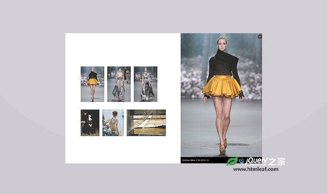
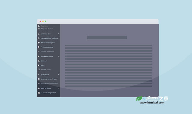
本教程将和大家分享Google Nexus 7网站的滑动侧边栏的制作方法。这个侧边栏的效果非常好,当我们用鼠标hover特定的按钮时,会有一排侧边栏图标出现,再用鼠标hover这些图标时,整个侧边栏将出现。第一个侧边框项是一个搜索框,但它的样式和其它的项是一样的,鼠标点击它是能输入搜索的文本。
我们将使用无序列表的嵌套和CSS transitions来完成它。我们使用JavaScript来切换侧边栏打开的样式和完成鼠标hover、click事件。我们还要将它做成响应式的,以适应各种屏幕。
HTML结构:
这个侧边栏效果将包含两个部分。第一部分是顶部的主菜单,第二部分是侧边栏。我们给底部的主菜单一个classgn-menu-main,它里面还会包含一个nav。
第一个li元素中包含了一个a元素,用它来做侧边栏的hover按钮。
<ul id="gn-menu" class="gn-menu-main">
    <li class="gn-trigger">
        <a class="gn-icon gn-icon-menu"><span>Menu</span></a>
        <nav class="gn-menu-wrapper">
            <!-- ... -->
        </nav>
    </li>
    <li><a href="http://www.htmleaf.com/">Htmleaf</a></li>
    <li><!-- ... --></li>
    <!-- ... -->
</ul>
在nav元素中,我们还要添加一个divwrapper,用它来隐藏浏览器的滚动条。侧边栏子菜单的核心是一个无序列表,我们给它一个classgn-menu,它包含一些子项,其中的一些子项中可能还包含子项。第一个子项是一个搜索框。
<div class="gn-scroller">
    <ul class="gn-menu">
        <li class="gn-search-item">
            <input placeholder="Search" type="search" class="gn-search">
            <a class="gn-icon gn-icon-search"><span>Search</span></a>
        </li>
        <li>
            <a class="gn-icon gn-icon-download">Downloads</a>
            <ul class="gn-submenu">
                <li><a class="gn-icon gn-icon-illustrator">Vector Illustrations</a></li>
                <li><a class="gn-icon gn-icon-photoshop">Photoshop files</a></li>
            </ul>
        </li>
        <li><a class="gn-icon gn-icon-cog">Settings</a></li>
        <li><!-- ... --></li>
        <!-- ... -->
    </ul>
</div><!-- /gn-scroller -->
CSS样式:
首先将所有元素和伪元素的box-sizing都设置为border-box。
*,
*:after,
*::before {
    box-sizing: border-box;
}
左上角的导航按钮需要一个图标,我们使用IcoMoon的字体图标。
@font-face {
    font-weight: normal;
    font-style: normal;
    font-family: 'ecoicons';
    src: url("../fonts/ecoicons/ecoicons.eot");
    src: url("../fonts/ecoicons/ecoicons.eot?#iefix") format("embedded-opentype"), url("../fonts/ecoicons/ecoicons.woff") format("woff"), url("../fonts/ecoicons/ecoicons.ttf") format("truetype"), url("../fonts/ecoicons/ecoicons.svg#ecoicons") format("svg");
}
后面我们将使用伪元素把字体图标添加到a元素上。
我们先给列表定义样式。
.gn-menu-main,
.gn-menu-main ul {
    margin: 0;
    padding: 0;
    background: white;
    color: #5f6f81;
    list-style: none;
    text-transform: none;
    font-weight: 300;
    font-family: 'Lato', Arial, sans-serif;
    line-height: 60px;
}
现在来指定主菜单的样式。它是固定在页面顶部的,我们给它60像素的高度。
.gn-menu-main {
    position: fixed;
    top: 0;
    left: 0;
    width: 100%;
    height: 60px;
    font-size: 13px;
}
所有的链接按钮的通用样式如下:
.gn-menu-main a {
    display: block;
    height: 100%;
    color: #5f6f81;
    text-decoration: none;
    cursor: pointer;
}
为链接按钮的hover添加一些反色。侧边栏的第一个子项是一个搜索框,我们需要指定它的hover样式。搜索框上将不会有a元素,所以我们直接在li元素上定义hover。
.no-touch .gn-menu-main a:hover,
.no-touch .gn-menu li.gn-search-item:hover,
.no-touch .gn-menu li.gn-search-item:hover a {
    background: #5f6f81;
    color: white;
}
列表的所有子项都将左浮动并且有一条右边框。
.gn-menu-main > li {
    display: block;
    float: left;
    height: 100%;
    border-right: 1px solid #c6d0da;
    text-align: center;
}
第一排的列表项的文字是隐藏的,并且用伪元素为它添加字体图标。我们设置user-select为none,它的宽度和主菜单按钮的宽度相同。
.gn-menu-main li.gn-trigger {
    position: relative;
    width: 60px;
    user-select: none;
}
主菜单上的最后一个元素将右浮动。
.gn-menu-main > li:last-child {
    float: right;
    border-right: none;
    border-left: 1px solid #c6d0da;
}
为主菜单上的按钮添加一些padding。
.gn-menu-main > li > a {
    padding: 0 30px;
    text-transform: uppercase;
    letter-spacing: 1px;
    font-weight: bold;
}
我们用micro clearfix hack来清除浮动。
.gn-menu-main:after {
    display: table;
    clear: both;
    content: '';
}
现在让我们来处理一下侧边栏。这里为什么需要一个wrapper呢?如果你不介意在侧边栏上有一条滚动条,你可以简单的设置侧边栏的overflow-y属性为scroll。这里我们用一个小技巧来隐藏它,将wraaper设置为overflow hidden,然后给滚动条的wraaper一个稍大的宽度和100%的高度。滚动条将被隐藏。我们的菜单将延伸到它所需要的高度,并且可以滚动。
通常我们想隐藏侧边栏是给它一个等于宽度负值,仔细想想,为什么不使用2D translate来隐藏它呢?
.gn-menu-wrapper {
    position: fixed;
    top: 60px;
    bottom: 0;
    left: 0;
    overflow: hidden;
    width: 60px; /* will be transitioned to 340px */
    border-top: 1px solid #c6d0da;
    background: white;
    transform: translateX(-60px); /* will be transitioned to 0px */
    transition: transform 0.3s, width 0.3s;
}

.gn-scroller {
    position: absolute;
    overflow-y: scroll;
    width: 370px;
    height: 100%;
}

.gn-menu {
    border-bottom: 1px solid #c6d0da;
    text-align: left;
    font-size: 18px;
}
现在为列表项添加一些box-shadow,使它们分开一些,这将避免两条线重合的情况出现。
.gn-submenu li {
    overflow: hidden;
    height: 0;
    transition: height 0.3s;
}
为列表子项添加transition,并设置它们的初始高度为0。
.gn-submenu li {
    overflow: hidden;
    height: 0;
    transition: height 0.3s;
}
子菜单的颜色要比父菜单的颜色要明亮一些。
.gn-submenu li a {
    color: #c1c9d1
}
现在我们为搜索框指定样式。我们想做得和Google Nexus页面上一样,所以我们给它一个透明的背景色,并把它的占位符做得和其它子菜单的样式一样。
input.gn-search {
    position: relative;
    z-index: 10;
    padding-left: 60px;
    outline: none;
    border: none;
    background: transparent;
    color: #5f6f81;
    font-weight: 300;
    font-family: 'Lato', Arial, sans-serif;
    cursor: pointer;
}

/* placeholder */

.gn-search::-webkit-input-placeholder {
    color: #5f6f81
}

.gn-search:-moz-placeholder {
    color: #5f6f81
}

.gn-search::-moz-placeholder {
    color: #5f6f81
}

.gn-search:-ms-input-placeholder {
    color: #5f6f81
}
多数浏览器都会在用户点击了输入框时隐藏占位符,Chrome浏览器却不会这样,所以我们使用一点小技巧,当用户点击输入框时,通过设置占位符的颜色为透明来达到同样的效果。
.gn-search:focus::-webkit-input-placeholder,
.no-touch .gn-menu li.gn-search-item:hover .gn-search:focus::-webkit-input-placeholder {
    color: transparent
}

input.gn-search:focus {
    cursor: text
}
当鼠标hover搜索框时,搜索框的颜色应该和其它子项被hover时一样,颜色由白色变为较深的颜色。
.no-touch .gn-menu li.gn-search-item:hover input.gn-search {
    color: white
}
占位符文本也做同样的设置。
/* placeholder */

.no-touch .gn-menu li.gn-search-item:hover .gn-search::-webkit-input-placeholder {
    color: white
}

.no-touch .gn-menu li.gn-search-item:hover .gn-search:-moz-placeholder {
    color: white
}

.no-touch .gn-menu li.gn-search-item:hover .gn-search::-moz-placeholder {
    color: white
}

.no-touch .gn-menu li.gn-search-item:hover .gn-search:-ms-input-placeholder {
    color: white
}
现在让我们用 ::before伪元素为每一个子项添加图标。我们将它们设置为inline-block,并给60px的宽度。为了使用字体图标,我们重置了它们的字体。
.gn-icon::before {
    display: inline-block;
    width: 60px;
    text-align: center;
    text-transform: none;
    font-weight: normal;
    font-style: normal;
    font-variant: normal;
    font-family: 'ecoicons';
    line-height: 1;
    speak: none;
    -webkit-font-smoothing: antialiased;
}
下面是定义字体图标的代码。
.gn-icon-help::before {
    content: "\e000"
}

.gn-icon-cog::before {
    content: "\e006"
}

.gn-icon-search::before {
    content: "\e005"
}

.gn-icon-download::before {
    content: "\e007"
}

.gn-icon-photoshop::before {
    content: "\e001"
}

.gn-icon-illustrator::before {
    content: "\e002"
}

.gn-icon-archive::before {
    content: "\e00d"
}

.gn-icon-article::before {
    content: "\e003"
}

.gn-icon-pictures::before {
    content: "\e008"
}

.gn-icon-videos::before {
    content: "\e009"
}
通常,我们需要在图标旁显示一些文字,但有时我们仅需要显示图标。但我们又不希望出现一个空的a元素,而锚文本仍然在HTML上,所以我们将它们用span包围起来,这样我们就可以只简单的设置宽和高为0,overflow为hidden来隐藏它们。为何不使用display: none?隐藏内容就像是inaccessible to screen readers,所以你要确定是不是要“erase”它们。
.gn-icon span {
    width: 0;
    height: 0;
    display: block;
    overflow: hidden;
}
现在来设置主菜单中的样式。这里我们没有使用字体图标。我们使用box shadow来创建三条竖线来分割它们。
.gn-icon-menu::before {
    margin-left: -15px;
    vertical-align: -2px;
    width: 30px;
    height: 3px;
    background: #5f6f81;
    box-shadow: 0 3px white, 0 -6px #5f6f81, 0 -9px white, 0 -12px #5f6f81;
    content: '';
}
当鼠标hover的时候,设置box shadow为反色。
.no-touch .gn-icon-menu:hover::before,
.no-touch .gn-icon-menu.gn-selected:hover::before {
    background: white;
    box-shadow: 0 3px #5f6f81, 0 -6px white, 0 -9px #5f6f81, 0 -12px white;
}
当它被选中,我们设置它的颜色更蓝一些。
.gn-icon-menu.gn-selected::before {
    background: #5993cd;
    box-shadow: 0 3px white, 0 -6px #5993cd, 0 -9px white, 0 -12px #5993cd;
}
最后我们需要定义两个样式,一是侧边栏打开时只显示图标,二是整个侧边栏。当我们hover主菜单按钮时,只显示一排图标按钮,我们把这个class定义为gn-open-part,另一个样式是gn-open-all,当我们用鼠标点击主菜单按钮或hover子菜单图标按钮时,整个侧边栏将出现。
.gn-menu-wrapper.gn-open-all,
.gn-menu-wrapper.gn-open-part {
    transform: translateX(0px);
}
如果想打开侧边栏,需要设置它的宽度。
.gn-menu-wrapper.gn-open-all {
    width: 340px;
}
打开的侧边栏子项的高度要和字体图标按钮的高度相同。
.gn-menu-wrapper.gn-open-all .gn-submenu li {
    height: 60px;
}
最后,我们将它设置为响应式的,以适应所有的屏幕。
现在,我们已经设置好所有的样式,我们将使用JavaScript来打开关闭侧边栏。
JAVASCRIPT
我们逍遥的效果是,当我们hover主菜单按钮时,想先让一排图标按钮出现。当我们点击了主菜单按钮或是Hover子菜单图标,才让这个侧边栏出现。当再次点击主菜单按钮或是屏幕的其它地方,侧边栏消失。
我们先定义一些元素和初始化一些变量。bodyClickFn函数定义了当侧边栏打开时我们点击屏幕的其它地方所触发的事件。我们还应该注意触摸事件。
_init : function() {
    this.trigger = this.el.querySelector( 'a.gn-icon-menu' );
    this.menu = this.el.querySelector( 'nav.gn-menu-wrapper' );
    this.isMenuOpen = false;
    this.eventtype = mobilecheck() ? 'touchstart' : 'click';
    this._initEvents();

    var self = this;
    this.bodyClickFn = function() {
        self._closeMenu();
        this.removeEventListener( self.eventtype, self.bodyClickFn );
    };
}
当鼠标hover主菜单按钮时,我们希望菜单的第一部分出现。当鼠标离开主菜单按钮时,希望它们消失。
this.trigger.addEventListener( 'mouseover', function(ev) { self._openIconMenu(); } );
this.trigger.addEventListener( 'mouseout', function(ev) { self._closeIconMenu(); } );
当侧边栏按钮菜单出现,用鼠标hover它们将使整个侧边栏出现。点击侧边栏外的任何地方,侧边栏消失。我们需要为它们各自绑定事件。
this.menu.addEventListener( 'mouseover', function(ev) {
    self._openMenu();
    document.addEventListener( self.eventtype, self.bodyClickFn );
} );
最后,我们希望点击主菜单按钮时,侧边栏消失或出现。同样需要为它们各自绑定事件。
this.trigger.addEventListener( this.eventtype, function( ev ) {
    ev.stopPropagation();
    ev.preventDefault();
    if( self.isMenuOpen ) {
        self._closeMenu();
        document.removeEventListener( self.eventtype, self.bodyClickFn );
    }
    else {
        self._openMenu();
        document.addEventListener( self.eventtype, self.bodyClickFn );
    }
} );
另外,如果鼠标点击在侧边栏上,我们不希望它消失。
this.menu.addEventListener( this.eventtype, function(ev) { ev.stopPropagation(); } );
_initEvents函数定义了打开或关闭侧边栏的方法。
_initEvents : function() {
    var self = this;

    if( !mobilecheck() ) {
        this.trigger.addEventListener( 'mouseover', function(ev) { self._openIconMenu(); } );
        this.trigger.addEventListener( 'mouseout', function(ev) { self._closeIconMenu(); } );

        this.menu.addEventListener( 'mouseover', function(ev) {
            self._openMenu();
            document.addEventListener( self.eventtype, self.bodyClickFn );
        } );
    }
    this.trigger.addEventListener( this.eventtype, function( ev ) {
        ev.stopPropagation();
        ev.preventDefault();
        if( self.isMenuOpen ) {
            self._closeMenu();
            document.removeEventListener( self.eventtype, self.bodyClickFn );
        }
        else {
            self._openMenu();
            document.addEventListener( self.eventtype, self.bodyClickFn );
        }
    } );
    this.menu.addEventListener( this.eventtype, function(ev) { ev.stopPropagation(); } );
},
_openIconMenu : function() {
    classie.add( this.menu, 'gn-open-part' );
},
_closeIconMenu : function() {
    classie.remove( this.menu, 'gn-open-part' );
},
_openMenu : function() {
    if( this.isMenuOpen ) return;
    classie.add( this.trigger, 'gn-selected' );
    this.isMenuOpen = true;
    classie.add( this.menu, 'gn-open-all' );
    this._closeIconMenu();
},
_closeMenu : function() {
    if( !this.isMenuOpen ) return;
    classie.remove( this.trigger, 'gn-selected' );
    this.isMenuOpen = false;
    classie.remove( this.menu, 'gn-open-all' );
    this._closeIconMenu();
}
到这里,本教程就结束了,希望它对你有所帮助!