
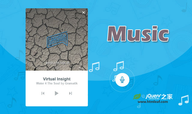

这是一款仿Shazam音乐网站的按钮变形为音乐播放器的特效。该特效使用Snap.svg来制作动画,开始时只有一个按钮,当用户点击了该按钮后,按钮变形为圆形,并且出现一些音乐符号飘到按钮里面,最后按钮变形为音乐播放器界面。
该特效主要实现按钮平滑过渡到圆形,然后在平滑过渡到音乐播放器的效果,并没有真正实现音乐播放功能。
使用方法
HTML结构
在该特效的HTML结构中,使用一个div.component作为包裹容器,在这个div上,使用data-path-start属性来记录动画的开始路径(初始化按钮),使用data-path-listen来记录圆形路径(圆形按钮)和使用data-path-player来记录音乐播放器的矩形路径。
在包裹容器中有一个SVG元素,它用于制作路径变形动画,它的大小被设置为和初始按钮的尺寸相同。另外还有一个<button>元素,它里面包含了初始按钮和圆形按钮。最后的div.player是音乐播放器界面。
<div class="component" data-path-start="..." data-path-listen="..." data-path-player="...">
  <!-- SVG with morphing paths and initial start button shape -->
  <svg class="morpher" width="300" height="500">
    <path class="morph__button" d="..."/>
  </svg>
  <!-- Initial start button that switches into the recording button -->
  <button class="button button--start">
    <span class="button__content button__content--start">Listen to this song</span>
    <span class="button__content button__content--listen"><span class="icon icon--microphone"></span></span>
  </button>
  <!-- Music player -->
  <div class="player player--hidden">
    <img class="player__cover" src="img/Gramatik.jpg" alt="Water 4 The Soul by Gramatik" />
    <div class="player__meta">
      <h3 class="player__track">Virtual Insight</h3>
      <h3 class="player__album">
        <span class="player__album-name">Water 4 The Soul</span> by <span class="player__artist">Gramatik</span>
      </h3>
      <div class="player__controls">
        <button class="player__control icon icon--skip-back" aria-label="Previous song"></button>
        <button class="player__control player__control--play icon icon--play" aria-label="Play"></button>
        <button class="player__control icon icon--skip-next" aria-label="Next song"></button>
      </div>
    </div>
    <button class="button button--close"><span class="icon icon--cross"></span></button>
  </div><!-- /player -->
</div><!-- /component -->
CSS样式
在CSS样式中,包裹容器的大小被设置为和SVG元素的大小相同,z-index设置为1是为了确保其它的页面元素在容器之上,而舞动的音符在它的下面。
.component {
  position: relative;
  z-index: 1;
  width: 300px;
  height: 500px;
  margin: 0 auto;
}
按钮的路径填充为白色。
.morph__button {
  fill: #fff;
}
接下来给按钮定义一些样式。.button样式是初始按钮,圆形按钮和音乐播放器上的关闭按钮的通用样式。
.button {
  font-weight: bold;
  position: absolute;
  bottom: 4px;
  left: 20px;
  width: calc(100% - 40px);
  height: 60px;
  padding: 0;
  text-align: center;
  color: #00a7e7;
  border: none;
  background: none;
  -webkit-transition: opacity 0.3s;
  transition: opacity 0.3s;
  -webkit-tap-highlight-color: rgba(0, 0, 0, 0);
}

.button:hover,
.button:focus {
  outline: none;
  color: #048abd;
}

.button--listen {
  pointer-events: none;
}

.button--close {
  z-index: 10;
  top: 0px;
  right: 0px;
  left: auto;
  width: 40px;
  height: 40px;
  padding: 10px;
  color: #fff;
}

.button--close:hover,
.button--close:focus {
  color: #ddd;
}

.button--hidden {
  pointer-events: none;
  opacity: 0;
}
最后一个class用于控制开始和圆形按钮的可见性。
按钮内容的通用样式如下:默认情况下,内容是隐藏的,添加transition过渡效果使其能平滑过渡。
.button__content {
  position: absolute;
  opacity: 0;
  -webkit-transition: -webkit-transform 0.4s, opacity 0.4s;
  transition: transform 0.4s, opacity 0.4s;
}
开始按钮的样式如下,其中timing函数有类似弹跳的动画过渡效果。
.button__content--start {
  top: 0;
  left: 0;
  width: 100%;
  padding: 1.2em;
  text-indent: 1px;
  letter-spacing: 1px;
  -webkit-transform: translate3d(0, -25px, 0);
  transform: translate3d(0, -25px, 0);
  -webkit-transition-timing-function: cubic-bezier(0.8, -0.6, 0.2, 1);
  transition-timing-function: cubic-bezier(0.8, -0.6, 0.2, 1);
}
圆形按钮内容的样式如下:元素的居中是通过设置50%的left值,然后通过元素一半宽度的负margin值来实现的。
.button__content--listen {
  font-size: 1.75em;
  line-height: 64px;
  bottom: 0;
  left: 50%;
  width: 60px;
  height: 60px;
  margin: 0 0 0 -30px;
  border-radius: 50%;
  -webkit-transform: translate3d(0, 25px, 0);
  transform: translate3d(0, 25px, 0);
  -webkit-transition-timing-function: cubic-bezier(0.8, 0, 0.2, 1);
  transition-timing-function: cubic-bezier(0.8, 0, 0.2, 1);
}
接下来是圆形按钮的辐射波效果。这里使用::before和::after伪元素,它们使用绝对定位,并被设置为圆形。
.button__content--listen::before,
.button__content--listen::after {
  content: '';
  position: absolute;
  left: 0;
  width: 100%;
  height: 100%;
  pointer-events: none;
  opacity: 0;
  border: 1px solid rgba(255, 255, 255, 0.2);
  border-radius: 50%;
}
这两个圆环将用于制作辐射波动画。
.button--animate .button__content--listen::before,
.button--animate .button__content--listen::after {
  -webkit-animation: anim-ripple 1.2s ease-out infinite forwards;
  animation: anim-ripple 1.2s ease-out infinite forwards;
}
为::after伪元素制作的圆环添加一些时间延迟。
.button--animate .button__content--listen::after {
  -webkit-animation-delay: 0.6s;
  animation-delay: 0.6s;
}
接下来定义keyframes帧动画。
@-webkit-keyframes anim-ripple {
  0% {
    opacity: 0;
    -webkit-transform: scale3d(3, 3, 1);
    transform: scale3d(3, 3, 1);
  }
  50% {
    opacity: 1;
  }
  100% {
    opacity: 0;
    -webkit-transform: scale3d(1, 1, 1);
    transform: scale3d(1, 1, 1);
  }
}

@keyframes anim-ripple {
  0% {
    opacity: 0;
    -webkit-transform: scale3d(3, 3, 1);
    transform: scale3d(3, 3, 1);
  }
  50% {
    opacity: 1;
  }
  100% {
    opacity: 0;
    -webkit-transform: scale3d(1, 1, 1);
    transform: scale3d(1, 1, 1);
  }
}
关于该特效的详细制作方法可以参考:Shazam-Like Morphing Button Effect


