


这是一款效果非常炫酷的HTML5 SVG汉堡包菜单按钮分段动画特效。该菜单按钮特效在用户点击汉堡包按钮时,按钮会分割为多段,并旋转变形为关闭按钮的状态。当再次点击该按钮时,它会逆向变形为汉堡包图标。
该特效是基于Segment.js插件(一款可以只绘制和动画某一段SVG路径的js插件)来制作的。
使用方法
绘制SVG路径
这是一个非常复杂的路径动画过程,如果我们一帧帧的来分析动画,就可以分别绘制出每一条路径。路径动画像下图的样子:
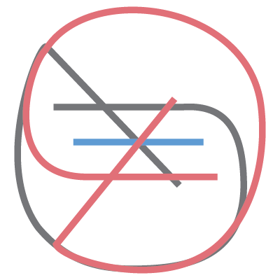
根据上面的图我们可以得到类似下面的SVG代码。
<svg width="100px" height="100px">
    <path d="M 30 40 L 70 40 C 90 40 90 75 60 85 A 40 40 0 0 1 20 20 L 80 80"></path>
    <path d="M 30 50 L 70 50"></path>
    <path d="M 70 60 L 30 60 C 10 60 10 20 40 15 A 40 38 0 1 1 20 80 L 80 20"></path>
</svg>
为了便于为菜单按钮添加样式及在JavaScript中调用,可以给SVG一个包裹元素,并设置其class和ID。
<!-- Wrapper -->
<div id="menu-icon-wrapper" class="menu-icon-wrapper">
    <!-- SVG element with paths -->
    <svg width="100px" height="100px">
        <path id="pathA" d="M 30 40 L 70 40 C 90 40 90 75 60 85 A 40 40 0 0 1 20 20 L 80 80"/>
        <path id="pathB" d="M 30 50 L 70 50"/>
        <path id="pathC" d="M 70 60 L 30 60 C 10 60 10 20 40 15 A 40 38 0 1 1 20 80 L 80 20"/>
    </svg>
    <!-- Trigger to perform the animations -->
    <button id="menu-icon-trigger" class="menu-icon-trigger"></button>
</div>
CSS样式
// The wrapper was defined with a fixed width and height
// Note, that the pointer-events property is set to 'none'.
// We don't need any pointer events in the entire element.
.menu-icon-wrapper{
    position: relative;
    display: inline-block;
    width: 34px;
    height: 34px;
    pointer-events: none;
    transition: 0.1s;
}

// To perform the scaled transform for the second demo
.menu-icon-wrapper.scaled{
    transform: scale(0.5);
}

// Adjusting the position of the SVG element
.menu-icon-wrapper svg{
    position: absolute;
    top: -33px;
    left: -33px;
}

// Defining the styles for the path elements
.menu-icon-wrapper svg path{
    stroke: #fff;
    stroke-width: 6px;
    stroke-linecap: round;
    fill: transparent;
}

// Setting the pointer-events property to 'auto',
// and allowing only events for the trigger element
.menu-icon-wrapper .menu-icon-trigger{
    position: relative;
    width: 100%;
    height: 100%;
    cursor: pointer;
    pointer-events: auto;
    background: none;
    border: none;
    margin: 0;
    padding: 0;
}
SVG动画
为了使汉堡包图标的上下两条线产生动画效果,首先需要初始化它的begin和end值。关于Segment.js的用法可以参考这里。
var pathA = document.getElementById('pathA'),
    pathC = document.getElementById('pathC'),
    segmentA = new Segment(pathA, 8, 32),
    segmentC = new Segment(pathC, 8, 32);
接下来是两个动画函数,它们用于上下两条线条的动画。第一个以线性方式动画路径,在其回调函数中调用第二个动画函数。
// Linear section, with a callback to the next
function inAC(s) { s.draw('80% - 24', '80%', 0.3, {delay: 0.1, callback: function(){ inAC2(s) }}); }

// Elastic section, using elastic-out easing function
function inAC2(s) { s.draw('100% - 54.5', '100% - 30.5', 0.6, {easing: ease.ease('elastic-out', 1, 0.3)}); }

// Running the animations
inAC(segmentA); // top bar
inAC(segmentC); // bottom bar
对于中间的线条只需要重复以上步骤。
// Initialize
var pathB = document.getElementById('pathB'),
    segmentB = new Segment(pathB, 8, 32);

// Expand the bar a bit
function inB(s) { s.draw(8 - 6, 32 + 6, 0.1, {callback: function(){ inB2(s) }}); }

// Reduce with a bounce effect
function inB2(s) { s.draw(8 + 12, 32 - 12, 0.3, {easing: ease.ease('bounce-out', 1, 0.3)}); }

// Run the animation
inB(segmentB);
以下是将按钮恢复到汉堡包状态的代码。
function outAC(s) { s.draw('90% - 24', '90%', 0.1, {easing: ease.ease('elastic-in', 1, 0.3), callback: function(){ outAC2(s) }}); }
function outAC2(s) { s.draw('20% - 24', '20%', 0.3, {callback: function(){ outAC3(s) }}); }
function outAC3(s) { s.draw(8, 32, 0.7, {easing: ease.ease('elastic-out', 1, 0.3)}); }

function outB(s) { s.draw(8, 32, 0.7, {delay: 0.1, easing: ease.ease('elastic-out', 2, 0.4)}); }

// Run the animations
outAC(segmentA);
outB(segmentB);
outAC(segmentC);
最后,为了在点击图标的时候开始执行动画,可以向下面这样设置事件监听。
var trigger = document.getElementById('menu-icon-trigger'),
    toCloseIcon = true;

trigger.onclick = function() {
    if (toCloseIcon) {
        inAC(segmentA);
        inB(segmentB);
        inAC(segmentC);
    } else {
        outAC(segmentA);
        outB(segmentB);
        outAC(segmentC);
    }
    toCloseIcon = !toCloseIcon;
};
浏览器兼容
上面的代码可以非常好的完成SVG汉堡包图标的动画,但是它们在各个浏览器中的表现有一些不一致。为了解决这个问题,可以简单的将SVG放大10倍,代码如下:
<svg width="1000px" height="1000px">
    <path id="pathA" d="M 300 400 L 700 400 C 900 400 900 750 600 850 A 400 400 0 0 1 200 200 L 800 800"></path>
    <path id="pathB" d="M 300 500 L 700 500"></path>
    <path id="pathC" d="M 700 600 L 300 600 C 100 600 100 200 400 150 A 400 380 0 1 1 200 800 L 800 200"></path>
</svg>
然后通过CSS来将SVG缩小10倍。
.menu-icon-wrapper svg {
    transform: scale(0.1);
    transform-origin: 0 0;
}


