
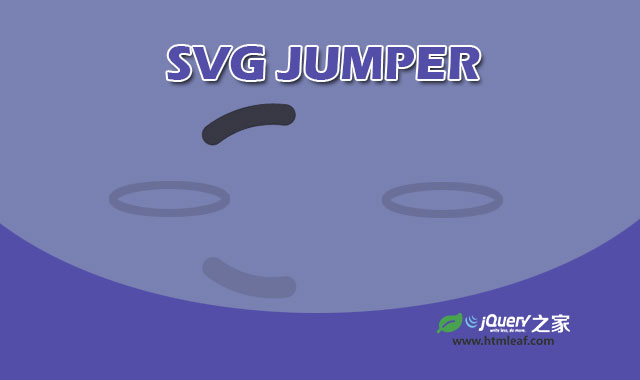

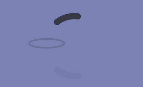
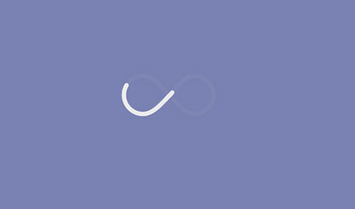
这是一款使用SVG和CSS3制作的非常有创意的无限循环动画特效。该无限循环动画特效共有两种效果,一种是模拟鱼儿跃起在落入水中的动画,一种是一条线绕无穷符号不断动画的特效。
这两种动画特效的灵感来自于《7种基于GSAP的SVG Loader加载动画特效》,是根据它里面的两种效果来制作的。因为那7种GSAP效果是要收费的,因此这里使用CSS3来模拟这些动画效果。
制作方法
这2个无限循环动画特效都是使用SVG和CSS3 animation动画来制作的。在第一种效果中,是一半圆形的条线不断跃起落下的动画。它的HTML结构使用一个<svg>来构建所有需要的元素。
<svg viewBox="0 0 200 200" preserveAspectRatio="xMidYMid meet">
  <path class="jumper" stroke-linecap="round" stroke-linejoin="round" d="M47.5,94.3c0-23.5,19.9-42.5,44.5-42.5s44.5,19,44.5,42.5"/>
  <g stroke="#2d2d2d" stroke-width="1">
    <ellipse class="circleL" fill="none" stroke-miterlimit="10" cx="47.2" cy="95.6" rx="10.7" ry="2.7" />
    <ellipse class="circleR" fill="none" stroke-miterlimit="10" cx="136.2" cy="95.6" rx="10.7" ry="2.7" />
  </g>
  <path class="jumper clone" stroke-linecap="round" stroke-linejoin="round" d="M47.5,94.3c0-23.5,19.9-42.5,44.5-42.5s44.5,19,44.5,42.5"/>
</svg>
svg的preserveAspectRatio被设置为xMidYMid meet,viewbox居于viewport居中。然后里面有两条路径<path>元素和一个组<g>元素。.jumper的路径时上面进行跳跃的半圆形线条。.jumper .clone则是它的倒影。组元素用于制作两个椭圆形的水波纹。
CSS样式
class 为.jumper的路径会执行名称为animJumper的动画,动画被设置为无限循环。
.jumper {
  fill: none;
  stroke: #383845;
  stroke-width: 10px;
  stroke-dashoffset: 0;
  stroke-dasharray: 0, 136.71884px;
  -webkit-animation: animJumper 1.3s linear infinite;
          animation: animJumper 1.3s linear infinite;
}
@-webkit-keyframes animJumper {
  8% {
    stroke-dasharray: 20.50783px, 136.71884px;
  }
  32% {
    stroke-dasharray: 41.01565px, 136.71884px;
    stroke-dashoffset: -47.85159px;
  }
  56% {
    stroke-dasharray: 20.50783px, 136.71884px;
    stroke-dashoffset: -116.21102px;
  }
  64% {
    stroke-dasharray: 0, 136.71884px;
    stroke-dashoffset: -136.71884px;
  }
}

@keyframes animJumper {
  8% {
    stroke-dasharray: 20.50783px, 136.71884px;
  }
  32% {
    stroke-dasharray: 41.01565px, 136.71884px;
    stroke-dashoffset: -47.85159px;
  }
  56% {
    stroke-dasharray: 20.50783px, 136.71884px;
    stroke-dashoffset: -116.21102px;
  }
  64% {
    stroke-dasharray: 0, 136.71884px;
    stroke-dashoffset: -136.71884px;
  }
}
半圆形的小线条的倒影使用translateY和scaleY将它放置在下面,并降低其透明,制作倒影效果。
.jumper.clone {
  opacity: 0.05;
  -webkit-transform: translateY(200px) scaleY(-1);
      -ms-transform: translateY(200px) scaleY(-1);
          transform: translateY(200px) scaleY(-1);
}
两个模拟水波扩散的椭圆使用animCircle来使其动画起来,同样设置为无限循环。
.circleL {
  opacity: 0;
  -webkit-transform-origin: 47.2px 95.6px;
      -ms-transform-origin: 47.2px 95.6px;
          transform-origin: 47.2px 95.6px;
  -webkit-animation: animCircle 1.3s infinite;
          animation: animCircle 1.3s infinite;
}

.circleR {
  opacity: 0;
  -webkit-transform-origin: 136.2px 95.6px;
      -ms-transform-origin: 136.2px 95.6px;
          transform-origin: 136.2px 95.6px;
  -webkit-animation: animCircle 1.3s 0.728s infinite;
          animation: animCircle 1.3s 0.728s infinite;
}
@-webkit-keyframes animCircle {
  0% {
    opacity: 1;
  }
  50% {
    -webkit-transform: scale(3);
            transform: scale(3);
    opacity: 0;
  }
  100% {
    opacity: 0;
  }
}
@keyframes animCircle {
  0% {
    opacity: 1;
  }
  50% {
    -webkit-transform: scale(3);
            transform: scale(3);
    opacity: 0;
  }
  100% {
    opacity: 0;
  }
}


