
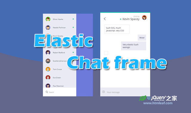

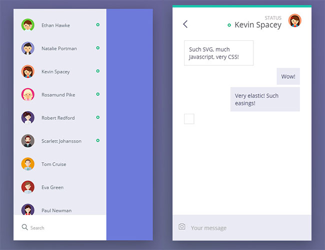
这是一款非常有创意的HTML5 SVG聊天框拖拽弹性摇摆动画特效。用户可以用鼠标点击或用手滑动聊天框上的指定区域,该区域会以非常有弹性的弹簧效果拉开聊天用户列表。点击一个用户头像后,又以相同的弹性特效切换到聊天界面,并且用户头像会移动到聊天界面的右上角。整个动画弹性十足,效果非常震撼。
使用方法
HTML结构
初始的拖动区域使用一个<svg>来制作。每一个chat__person是聊天列表中的一个用户,每一个chat__msgRow是一条聊天记录。
<div class="demo">
  <svg class="sidebar" viewBox="0 0 300 500">
    <path class="s-path" fill="#fff" d="M0,0 50,0 a0,250 0 1,1 0,500 L0,500" />
  </svg>
  <div class="static">
    <div class="static__text">Pull white sidebar to the right</div>
  </div>
  ....
  <div class="search">
      <img src="img/t8TeL1S.png" alt="" class="search__img" />
      <input type="text" class="search__input" placeholder="Search" />
  </div>
  </div>
  <div class="chat">
    <span class="chat__back"></span>
    <span class="chat__status">status</span>
    <div class="chat__person">
      <span class="chat__online active"></span>
      <span class="chat__name">Huehue Huehue</span>
    </div>
    <div class="chat__messages">
      <div class="chat__msgRow">
        <div class="chat__message mine">Such SVG, much Javascript, very CSS!</div>
      </div>
      ....
    </div>
    <input type="text" class="chat__input" placeholder="Your message" />
  </div>
</div>
CSS样式
在点击用户图像的时候,该特效使用了一些点击波特效,它是使用CSS3 animation动画来制作的。
.ripple {
  position: absolute;
  width: 10rem;
  height: 10rem;
  margin-left: -5rem;
  margin-top: -5rem;
  background: rgba(0, 0, 0, 0.4);
  -webkit-transform: scale(0);
      -ms-transform: scale(0);
          transform: scale(0);
  -webkit-animation: animRipple 0.3s;
          animation: animRipple 0.3s;
  border-radius: 50%;
}

@-webkit-keyframes animRipple {
  to {
    -webkit-transform: scale(2.5);
            transform: scale(2.5);
    opacity: 0;
  }
}

@keyframes animRipple {
  to {
    -webkit-transform: scale(2.5);
            transform: scale(2.5);
    opacity: 0;
  }
}
具体的jQuery代码请参考下载文件。


