
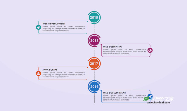

这是一款简单实用的CSS3垂直时间轴特效。该特效通过简单的HTML结构和CSS3代码,来生成炫酷的垂直时间轴效果。
使用方法
在HTML文件中引入。
<link href="css/font-awesome.min.css" rel="stylesheet">
HTML结构
<div class="container">
    <div class="row">
        <div class="col-md-12">
            <div class="main-timeline">
                <div class="timeline">
                    <a href="#" class="timeline-content">
                        <div class="timeline-year">
                            <span>2019</span>
                        </div>
                        <div class="timeline-icon">
                            <i class="fa fa-rocket"></i>
                        </div>
                        <h3 class="title">Web Development</h3>
                        <p class="description">
                            ......
                        </p>
                    </a>
                </div>
                <div class="timeline">
                    <a href="#" class="timeline-content">
                        <div class="timeline-year">
                            <span>2018</span>
                        </div>
                        <div class="timeline-icon">
                            <i class="fa fa-globe"></i>
                        </div>
                        <h3 class="title">Web Designing</h3>
                        <p class="description">
                            ......
                        </p>
                    </a>
                </div>
            </div>
        </div>
    </div>
</div>
CSS样式
.main-timeline{ font-family: 'Roboto', sans-serif; }
.main-timeline:after{
    content: '';
    display: block;
    clear: both;
}
.main-timeline:before{
    content: '';
    height: 100%;
    width: 2px;
    border: 2px dashed #000;
    transform: translateX(-50%);
    position: absolute;
    left: 50%;
    top: 30px;
}
.main-timeline .timeline{
    width: 50%;
    padding: 100px 70px 0 25px;
    margin: 0 50px 0 0;
    float: left;
    position: relative;
}
.main-timeline .timeline-content{
    padding: 15px 15px 15px 40px;
    border: 2px solid #00A79B;
    border-radius: 15px 0 15px 15px;
    display: block;
    position: relative;
}
.main-timeline .timeline-content:hover{ text-decoration: none; }
.main-timeline .timeline-content:after{
    content: '';
    background-color: #00A79B;
    height: 18px;
    width: 15px;
    position: absolute;
    right: -15px;
    top: -2px;
    clip-path: polygon(100% 0, 0 0, 0 100%);
}
.main-timeline .timeline-year{
    color: #fff;
    background-color: #00A79B;
    font-size: 32px;
    font-weight: 900;
    text-align: center;
    line-height: 98px;
    height: 100px;
    width: 100px;
    border-radius: 50%;
    position: absolute;
    right: -120px;
    top:-85px;
}
.main-timeline .timeline-year:after{
    content: '';
    height: 130px;
    width: 130px;
    border: 8px solid #00A79B;
    border-left-color: transparent;
    border-radius: 50%;
    transform: translateX(-50%) translateY(-50%) rotate(-20deg);
    position: absolute;
    left: 50%;
    top: 50%;
}
.main-timeline .timeline-icon{
    color: #fff;
    background-color: #00A79B;
    font-size: 35px;
    text-align: center;
    line-height: 50px;
    height: 50px;
    width: 50px;
    border-radius: 50%;
    transform: translateY(-50%);
    position: absolute;
    top: 50%;
    left: -25px;
    transition: all 0.3s;
}
.main-timeline .title{
    color: #222;
    font-size: 20px;
    font-weight: 900;
    text-transform: uppercase;
    letter-spacing: 1px;
    margin: 0 0 7px 0;
}
.main-timeline .description{
    color: #222;
    font-size: 15px;
    letter-spacing: 1px;
    text-align: justify;
    margin: 0 0 5px;
}
.main-timeline .timeline:nth-child(even){
    padding: 100px 25px 0 70px;
    margin: 0 0 0 50px;
    float: right;
}
.main-timeline .timeline:nth-child(even) .timeline-content{
    padding: 15px 40px 15px 15px;
    border-radius: 0 15px 15px 15px;
}
.main-timeline .timeline:nth-child(even) .timeline-content:after{
    transform: rotateY(180deg);
    right: auto;
    left: -15px;
}
.main-timeline .timeline:nth-child(even) .timeline-year{
    right: auto;
    left: -120px;
}
.main-timeline .timeline:nth-child(even) .timeline-year:after{
    transform: translateX(-50%) translateY(-50%) rotate(200deg);
}
.main-timeline .timeline:nth-child(even) .timeline-icon{
    left: auto;
    right: -25px;
}
.timeline:nth-child(4n+2) .timeline-content,
.timeline:nth-child(4n+2) .timeline-year:after{
    border-color: #9E005D;
}
.timeline:nth-child(4n+2) .timeline-year:after{ border-left-color: transparent; }
.timeline:nth-child(4n+2) .timeline-content:after,
.timeline:nth-child(4n+2) .timeline-icon,
.timeline:nth-child(4n+2) .timeline-year{
    background-color: #9E005D;
}
.timeline:nth-child(4n+3) .timeline-content,
.timeline:nth-child(4n+3) .timeline-year:after{
    border-color: #f24f0e;
}
.timeline:nth-child(4n+3) .timeline-year:after{ border-left-color: transparent; }
.timeline:nth-child(4n+3) .timeline-content:after,
.timeline:nth-child(4n+3) .timeline-icon,
.timeline:nth-child(4n+3) .timeline-year{
    background-color: #f24f0e;
}
.timeline:nth-child(4n+4) .timeline-content,
.timeline:nth-child(4n+4) .timeline-year:after{
    border-color: #0870C5;
}
.timeline:nth-child(4n+4) .timeline-year:after{ border-left-color: transparent; }
.timeline:nth-child(4n+4) .timeline-content:after,
.timeline:nth-child(4n+4) .timeline-icon,
.timeline:nth-child(4n+4) .timeline-year{
    background-color: #0870C5;
}
@media screen and (max-width:767px){
    .main-timeline:before{ display: none; }
    .main-timeline .timeline{
        width: 100%;
        padding-top: 80px;
        padding-right: 12px;
        margin-bottom: 20px;
    }
    .main-timeline .timeline:nth-child(even){
        padding-left: 10px;
        padding-top: 80px;
        margin-bottom: 20px;
    }
    .main-timeline .timeline-content,
    .main-timeline .main-timeline .timeline:nth-child(even) .timeline-content{
        background-color: #fff;
        padding-top: 25px;
    }
    .main-timeline .timeline-content:after{ display: none; }
    .main-timeline .timeline-year{
        font-size: 24px;
        line-height: 70px;
        height: 70px;
        width: 70px;
        right: 0;
        top: -65px;
    }
    .main-timeline .timeline-year:after{ display: none; }
    .main-timeline .timeline:nth-child(even) .timeline-year{ left: 3px; }
}
@media screen and (max-width:567px){
    .main-timeline .title{ font-size: 18px; }
}


