
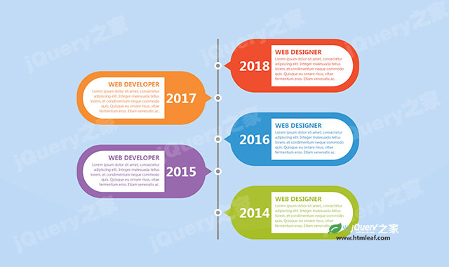

这是一款创意多彩CSS3垂直时间轴特效。该CSS3垂直时间轴通过CSS伪元素和css transform属性,制作椭圆形和箭头,并配以多彩的颜色,构建出漂亮的垂直时间轴效果。
使用方法
在页面中引入bootstrap.min.css文件。
<link rel="stylesheet" href="bootstrap.min.css" type="text/css">
HTML结构
该CSS3垂直时间轴的基本HTML结构如下:
<div class="container">
    <div class="row">
        <div class="col-md-12">
            <div class="main-timeline">
                <div class="timeline">
                    <a href="#" class="timeline-content">
                        <span class="year">2018</span>
                        <div class="inner-content">
                            <h3 class="title">Web Designer</h3>
                            <p class="description">
                                Lorem ipsum dolor sit amet...
                            </p>
                        </div>
                    </a>
                </div>
                <div class="timeline">
                    <a href="#" class="timeline-content">
                        <span class="year">2017</span>
                        <div class="inner-content">
                            <h3 class="title">Web Developer</h3>
                            <p class="description">
                                Lorem ipsum dolor sit amet...
                            </p>
                        </div>
                    </a>
                </div>
            </div>
        </div>
    </div>
</div>
CSS样式
然后为该CSS3垂直时间轴添加下面的CSS样式,对其进行效果的美化。
.main-timeline{
    overflow: hidden;
    position: relative;
}
.main-timeline:before{
    content: "";
    width: 7px;
    height: 100%;
    background: #909090;
    position: absolute;
    top: 0;
    left: 50%;
    transform: translateX(-50%);
}
.main-timeline .timeline{
    width: 50%;
    padding-left: 50px;
    float: right;
    position: relative;
}
.main-timeline .timeline:before{
    content: "";
    width: 30px;
    height: 30px;
    border-radius: 50%;
    background: #909090;
    border: 7px solid #fff;
    position: absolute;
    top: 50%;
    left: -15px;
    transform: translateY(-50%);
}
.main-timeline .timeline:after{
    content: "";
    display: block;
    border-right: 30px solid #ee4423;
    border-top: 20px solid transparent;
    border-bottom: 20px solid transparent;
    position: absolute;
    top: 50%;
    left: 24px;
    transform: translateY(-50%);
}
.main-timeline .timeline-content{
    display: block;
    padding: 25px;
    border-radius: 100px;
    background: #ee4423;
    position: relative;
}
.main-timeline .timeline-content:before,
.main-timeline .timeline-content:after{
    content: "";
    display: block;
    width: 100%;
    clear: both;
}
.main-timeline .timeline-content:hover{ text-decoration: none; }
.main-timeline .inner-content{
    width: 70%;
    float: right;
    padding: 15px 20px 15px 15px;
    background: #fff;
    border-radius: 0 100px 100px 0;
    color: #ee4423;
}
.main-timeline .year{
    display: inline-block;
    font-size: 50px;
    font-weight: 600;
    color: #fff;
    position: absolute;
    top: 50%;
    left: 7%;
    transform: translateY(-50%);
}
.main-timeline .title{
    font-size: 24px;
    font-weight: 600;
    text-transform: uppercase;
    margin: 0 0 5px 0;
}
.main-timeline .description{
    font-size: 14px;
    margin: 0 0 5px 0;
}
.main-timeline .timeline:nth-child(2n){ padding: 0 50px 0 0; }
.main-timeline .timeline:nth-child(2n):before,
.main-timeline .timeline:nth-child(2n) .year{
    left: auto;
    right: -15px;
}
.main-timeline .timeline:nth-child(2n) .year{ right: 7%; }
.main-timeline .timeline:nth-child(2n):after{
    border-right: none;
    border-left: 30px solid #ee4423;
    left: auto;
    right: 24px;
}
.main-timeline .timeline:nth-child(2n) .inner-content{
    float: none;
    border-radius: 100px 0 0 100px;
    text-align: right;
}
.main-timeline .timeline:nth-child(2){ margin-top: 130px; }
.main-timeline .timeline:nth-child(odd){ margin: -130px 0 0 0; }
.main-timeline .timeline:nth-child(even){ margin-bottom: 80px; }
.main-timeline .timeline:first-child,
.main-timeline .timeline:last-child:nth-child(even){ margin: 0; }
.main-timeline .timeline:nth-child(2n) .timeline-content{ background: #f68829; }
.main-timeline .timeline:nth-child(2n),
.main-timeline .timeline:nth-child(2n) .inner-content{ color: #f68829; }
.main-timeline .timeline:nth-child(2n):after{ border-left-color: #f68829; }
.main-timeline .timeline:nth-child(3n) .timeline-content{ background: #2991d0; }
.main-timeline .timeline:nth-child(3n),
.main-timeline .timeline:nth-child(3n) .inner-content{ color: #2991d0; }
.main-timeline .timeline:nth-child(3n):after{ border-right-color: #2991d0; }
.main-timeline .timeline:nth-child(4n) .timeline-content{ background: #9361aa; }
.main-timeline .timeline:nth-child(4n),
.main-timeline .timeline:nth-child(4n) .inner-content{ color: #9361aa; }
.main-timeline .timeline:nth-child(4n):after{ border-left-color: #9361aa; }
.main-timeline .timeline:nth-child(5n) .timeline-content{ background: #a7be26; }
.main-timeline .timeline:nth-child(5n),
.main-timeline .timeline:nth-child(5n) .inner-content{ color: #a7be26; }
.main-timeline .timeline:nth-child(5n):after{ border-right-color: #a7be26; }
@media only screen and (max-width: 1200px){
    .main-timeline .inner-content{ width: 80%; }
    .main-timeline .year{
        font-size: 45px;
        left: 10px;
        transform: translateY(-50%) rotate(-90deg);
    }
    .main-timeline .timeline:nth-child(2n) .year{ right: 10px; }
}
@media only screen and (max-width: 990px){
    .main-timeline .year{
        font-size: 40px;
        left: 0;
    }
    .main-timeline .timeline:nth-child(2n) .year{ right: 0; }
}
@media only screen and (max-width: 767px){
    .main-timeline:before,
    .main-timeline .timeline:before{
        left: 10px;
        transform: translateX(0);
    }
    .main-timeline .timeline:nth-child(2n):after{
        border-left: none;
        border-right: 30px solid #ee4423;
        right: auto;
        left: 24px;
    }
    .main-timeline .timeline,
    .main-timeline .timeline:nth-child(even),
    .main-timeline .timeline:nth-child(odd){
        width: 100%;
        float: none;
        margin: 0 0 30px 0;
    }
    .main-timeline .timeline:last-child{ margin-bottom: 0; }
    .main-timeline .timeline:nth-child(2n){ padding: 0 0 0 50px; }
    .main-timeline .timeline:before,
    .main-timeline .timeline:nth-child(2n):before{ left: -2px; }
    .main-timeline .inner-content{ width: 85%; }
    .main-timeline .timeline:nth-child(2n) .inner-content{
        float: right;
        border-radius: 0 100px 100px 0;
        text-align: left;
    }
    .main-timeline .timeline:nth-child(2n) .year{
        right: auto;
        left: 0;
    }
    .main-timeline .timeline:nth-child(2n):after{ border-right-color: #f68829; }
    .main-timeline .timeline:nth-child(3n):after{ border-left-color: #2991d0; }
    .main-timeline .timeline:nth-child(4n):after{ border-right-color: #9361aa; }
    .main-timeline .timeline:nth-child(5n):after{ border-left-color: #a7be26; }
}

@media only screen and (max-width: 479px){
    .main-timeline .timeline-content{ padding: 15px; }
    .main-timeline .inner-content{ width: 80%; }
    .main-timeline .year{ font-size: 30px; }
}


