
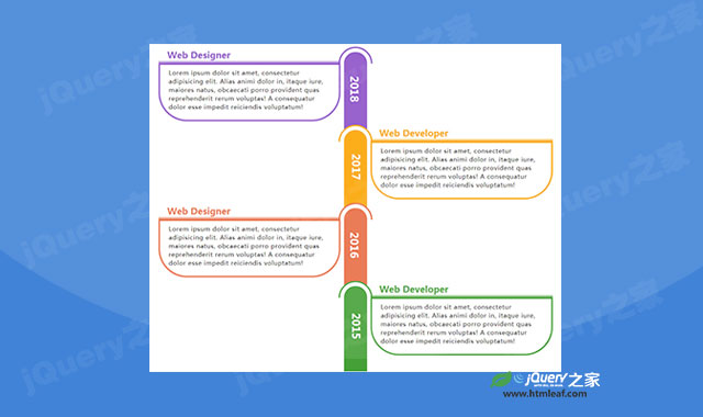

这是一款CSS3超酷响应式垂直时间轴特效。该垂直时间轴特效使用bootstrap网格进行布局,然后通过使用CSS代码来制作各种半圆形和弧线效果。
使用方法
在页面中引入bootstrap.min.css文件。
<link rel="stylesheet" type="text/css" href="css/bootstrap.min.css" />
HTML结构
该响应式垂直时间轴的基本HTML结构如下:
<div class="container">
<div class="row">
    <div class="col-md-12">
        <div class="main-timeline">
            <div class="timeline">
                <a href="#" class="timeline-content">
                    <span class="year">2018</span>
                    <h3 class="title">标题</h3>
                    <p class="description">
                        描述文本
                    </p>
                </a>
            </div>
            <div class="timeline">
                <a href="#" class="timeline-content">
                    <span class="year">2017</span>
                    <h3 class="title">标题</h3>
                    <p class="description">
                        描述文本
                    </p>
                </a>
            </div>
        </div>
    </div>
</di
CSS样式
然后通过下面的CSS样式来实现该垂直时间轴效果。
.main-timeline{
    padding-top: 50px;
    position: relative;
}
.main-timeline:after{
    content: "";
    display: block;
    clear: both;
}
.main-timeline .timeline{
    width: 54.2%;
    float: left;
    margin-top: -50px;
    overflow: hidden;
    position: relative;
}
.main-timeline .timeline:last-child{ overflow: visible; }
.main-timeline .timeline:before{
    content: "";
    width: 95px;
    height: 95px;
    border-radius: 50%;
    background: #fff;
    border: 4px solid transparent;
    border-top: 4px solid #8c51c7;
    border-left: 4px solid #8c51c7;
    position: absolute;
    top: 0;
    right: 0;
    transform: rotate(45deg);
}
.main-timeline .timeline:after{
    content: "";
    width: 65px;
    height: 100%;
    border-radius: 80px 80px 0 0;
    background: #8c51c7;
    position: absolute;
    top: 15px;
    right: 15px;
}
.main-timeline .timeline-content{
    display: block;
    padding: 0 90px 50px 15px;
    position: relative;
}
.main-timeline .timeline-content:hover{ text-decoration: none; }
.main-timeline .year{
    display: inline-block;
    font-size: 30px;
    font-weight: 800;
    color: #fff;
    position: absolute;
    top: 50%;
    right: 13px;
    z-index: 1;
    transform: rotate(90deg) translateX(-50%);
}
.main-timeline .timeline:last-child .year{ top: 60%; }
.main-timeline .title{
    padding: 10px 25px;
    margin: 0;
    font-size: 25px;
    font-weight: 800;
    color: #8c51c7;
    background: linear-gradient(to bottom,transparent,transparent,transparent,transparent,transparent,#8c51c7);
}
.main-timeline .description{
    padding: 10px 25px 25px;
    border: 4px solid #8c51c7;
    border-radius: 0 0 80px 80px;
    font-size: 17px;
    color: #000;
    letter-spacing: 1px;
}
.main-timeline .timeline:nth-child(2n){ float: right; }
.main-timeline .timeline:nth-child(2n):before{
    right: auto;
    left: 0;
}
.main-timeline .timeline:nth-child(2n):after{
    right: auto;
    left: 15px;
}
.main-timeline .timeline:nth-child(2n) .timeline-content{ padding: 0 15px 50px 90px; }
.main-timeline .timeline:last-child .timeline-content{ padding-bottom: 20px; }
.main-timeline .timeline:nth-child(2n) .year{
    right: auto;
    left: 13px;
}
.main-timeline .timeline:nth-child(2n):before{
    border-top-color: #faa400;
    border-left-color: #faa400;
}
.main-timeline .timeline:nth-child(2n):after{ background: #faa400; }
.main-timeline .timeline:nth-child(2n) .title{
    color: #faa400;
    background: linear-gradient(to bottom,transparent,transparent,transparent,transparent,transparent,#faa400);
}
.main-timeline .timeline:nth-child(2n) .description{ border-color: #faa400; }
.main-timeline .timeline:nth-child(3n):before{
    border-top-color: #e86c44;
    border-left-color: #e86c44;
}
.main-timeline .timeline:nth-child(3n):after{ background: #e86c44;}
.main-timeline .timeline:nth-child(3n) .title{
    color: #e86c44;
    background:linear-gradient(to bottom,transparent,transparent,transparent,transparent,transparent,#e86c44);
}
.main-timeline .timeline:nth-child(3n) .description{ border-color: #e86c44; }
.main-timeline .timeline:nth-child(4n):before{
    border-top-color: #45a137;
    border-left-color: #45a137;
}
.main-timeline .timeline:nth-child(4n):after{ background: #45a137; }
.main-timeline .timeline:nth-child(4n) .title{
    color: #45a137;
    background: linear-gradient(to bottom,transparent,transparent,transparent,transparent,transparent,#45a137);
}
.main-timeline .timeline:nth-child(4n) .description{ border-color: #45a137; }
@media only screen and (max-width: 1200px){
    .main-timeline .timeline{ width: 55.1%; }
}
@media only screen and (max-width: 990px){
    .main-timeline .timeline{ width: 56.5%; }
    .main-timeline .title{ font-size: 20px; }
}
@media only screen and (max-width: 767px){
    .main-timeline{ padding-top: 0; }
    .main-timeline .timeline{
        width: 100%;
        float: none;
        margin: 0 0 -30px 0;
    }
    .main-timeline .timeline:before{
        right: auto;
        left: 0;
    }
    .main-timeline .timeline:after{
        right: auto;
        left: 15px;
    }
    .main-timeline .timeline-content{ padding: 0 15px 50px 90px; }
    .main-timeline .year{
        right: auto;
        left: 13px;
    }
}
@media only screen and (max-width: 479px){
    .main-timeline .title{
        padding: 5px 5px 5px 15px;
        font-weight: 600;
    }
    .main-timeline .description{
        padding: 5px 20px 20px;
        font-size: 14px;
        text-align: justify;
    }
}


