
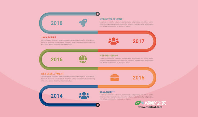

这是一款css3跑道式时间轴设计效果。该时间轴以弯曲的跑道作为时间轴的路线,以不同的颜色来区分时间点,采用响应式设计,效果非常酷。
使用方法
HTML
该css3跑道式时间轴设计的基本HTML结构如下。
<div class="container">
    <div class="row">
        <div class="col-md-12">
            <div class="main-timeline">
                <div class="timeline">
                    <a href="#" class="timeline-content">
                        <span class="timeline-year">2018</span>
                        <div class="timeline-icon">
                            <i class="fa fa-rocket"></i>
                        </div>
                        <div class="content">
                            <h3 class="title">Web Development</h3>
                            <p class="description">
                                Lorem ipsum dolor sit amet, ......
                            </p>
                        </div>
                    </a>
                </div>
                <div class="timeline">
                    <a href="#" class="timeline-content">
                        <span class="timeline-year">2017</span>
                        <div class="timeline-icon">
                            <i class="fa fa-users"></i>
                        </div>
                        <div class="content">
                            <h3 class="title">Java Script</h3>
                            <p class="description">
                                Lorem ipsum dolor sit amet, ......
                            </p>
                        </div>
                    </a>
                </div>
            </div>
        </div>
    </div>
</div>
CSS样式
然后为该时间轴添加下面的CSS样式。
.main-timeline{
    font-family: 'Roboto', sans-serif;
    padding: 20px 0;
    position: relative;
}
.main-timeline:before,
.main-timeline:after{
    content: '';
    height: 40px;
    width: 40px;
    background-color: #e7e7e7;
    border-radius: 50%;
    border: 10px solid #303334;
    transform:translateX(-50%);
    position: absolute;
    left: 50%;
    top: -15px;
    z-index: 2;
}
.main-timeline:after{
    top: auto;
    bottom:15px;
}
.main-timeline .timeline{
    padding: 35px 0;
    margin-top: -30px;
    position: relative;
    z-index: 1;
}
.main-timeline .timeline:before,
.main-timeline .timeline:after{
    content: '';
    height: 100%;
    width: 50%;
    border-radius: 100px 0 0 100px;
    border: 15px solid #46B2BC;
    border-right: none;
    position: absolute;
    left: 0;
    top: 0;
    z-index: -1;
}
.main-timeline .timeline:after{
    height: calc(100% - 30px);
    width: calc(50% - 12px);
    border-color: #65C7D0;
    left: 12px;
    top: 15px;
}
.main-timeline .timeline-content{ display:inline-block; }
.main-timeline .timeline-content:hover{ text-decoration: none; }
.main-timeline .timeline-year{
    color: #65C7D0;
    font-size: 50px;
    font-weight: 600;
    display: inline-block;
    transform:translateY(-50%);
    position: absolute;
    top: 50%;
    left: 10%;
}
.main-timeline .timeline-icon{
    color: #65C7D0;
    font-size: 80px;
    display: inline-block;
    transform: translateY(-50%);
    position: absolute;
    left: 34%;
    top: 50%;
}
.main-timeline .content{
    color: #909090;
    width: 50%;
    padding: 20px;
    display: inline-block;
    float: right;
}
.main-timeline .title{
    color: #65C7D0;
    font-size: 22px;
    font-weight: 600;
    text-transform: uppercase;
    letter-spacing: 1px;
    margin: 0 0 5px 0;
}
.main-timeline .description{
    font-size: 15px;
    letter-spacing: 1px;
    margin: 0;
}
.main-timeline .timeline:nth-child(even):before{
    left: auto;
    right: 0;
    border-radius: 0 100px 100px 0;
    border: 15px solid red;
    border-left: none;
}
.main-timeline .timeline:nth-child(even):after{
    left: auto;
    right: 12px;
    border: 15px solid green;
    border-left: none;
    border-radius: 0 100px 100px 0;
}
.main-timeline .timeline:nth-child(even) .content{ float: left; }
.main-timeline .timeline:nth-child(even) .timeline-year{
    left: auto;
    right: 10%;
}
.main-timeline .timeline:nth-child(even) .timeline-icon{
    left: auto;
    right: 32%;
}
.main-timeline .timeline:nth-child(5n+2):before{ border-color: #EA3C14; }
.main-timeline .timeline:nth-child(5n+2):after{ border-color: #EF5720; }
.main-timeline .timeline:nth-child(5n+2) .timeline-icon{ color: #EA3C14; }
.main-timeline .timeline:nth-child(5n+2) .timeline-year{ color: #EA3C14; }
.main-timeline .timeline:nth-child(5n+2) .title{ color: #EA3C14; }
.main-timeline .timeline:nth-child(5n+3):before{ border-color: #8CC63E; }
.main-timeline .timeline:nth-child(5n+3):after{ border-color: #6CAF29; }
.main-timeline .timeline:nth-child(5n+3) .timeline-icon{ color: #8CC63E; }
.main-timeline .timeline:nth-child(5n+3) .timeline-year{ color: #8CC63E; }
.main-timeline .timeline:nth-child(5n+3) .title{ color: #8CC63E; }
.main-timeline .timeline:nth-child(5n+4):before{ border-color: #F99324; }
.main-timeline .timeline:nth-child(5n+4):after{ border-color: #FBB03B; }
.main-timeline .timeline:nth-child(5n+4) .timeline-icon{ color: #F99324; }
.main-timeline .timeline:nth-child(5n+4) .timeline-year{ color: #F99324; }
.main-timeline .timeline:nth-child(5n+4) .title{ color: #F99324; }
.main-timeline .timeline:nth-child(5n+5):before{ border-color: #0071BD; }
.main-timeline .timeline:nth-child(5n+5):after{ border-color: #0050A3; }
.main-timeline .timeline:nth-child(5n+5) .timeline-icon{ color: #0071BD; }
.main-timeline .timeline:nth-child(5n+5) .timeline-year{ color: #0071BD; }
.main-timeline .timeline:nth-child(5n+5) .title{ color: #0071BD; }
@media screen and (max-width:1200px){
    .main-timeline .timeline:after{ border-radius: 88px 0 0 88px; }
    .main-timeline .timeline:nth-child(even):after{ border-radius: 0 88px 88px 0; }
}
@media screen and (max-width:767px){
    .main-timeline .timeline{ margin-top: -19px; }
    .main-timeline .timeline:before {
        border-radius: 50px 0 0 50px;
        border-width: 10px;
    }
    .main-timeline .timeline:after {
        height: calc(100% - 18px);
        width: calc(50% - 9px);
        border-radius: 43px 0 0 43px;
        border-width:10px;
        top: 9px;
        left: 9px;
    }
    .main-timeline .timeline:nth-child(even):before {
        border-radius: 0 50px 50px 0;
        border-width: 10px;
    }
    .main-timeline .timeline:nth-child(even):after {
        height: calc(100% - 18px);
        width: calc(50% - 9px);
        border-radius: 0 43px 43px 0;
        border-width: 10px;
        top: 9px;
        right: 9px;
    }
    .main-timeline .timeline-icon{ font-size: 60px; }
    .main-timeline .timeline-year{ font-size: 40px; }
}
@media screen and (max-width:479px){
    .main-timeline .timeline-icon{
        font-size: 50px;
        transform:translateY(0);
        top: 25%;
        left: 10%;
    }
    .main-timeline .timeline-year{
        font-size: 25px;
        transform:translateY(0);
        top: 65%;
        left: 9%;
    }
    .main-timeline .content{
        width: 68%;
        padding: 10px;
    }
    .main-timeline .title{ font-size: 18px; }
    .main-timeline .timeline:nth-child(even) .timeline-icon{
        right: 10%;
    }
    .main-timeline .timeline:nth-child(even) .timeline-year{
        right: 9%;
    }
}


