
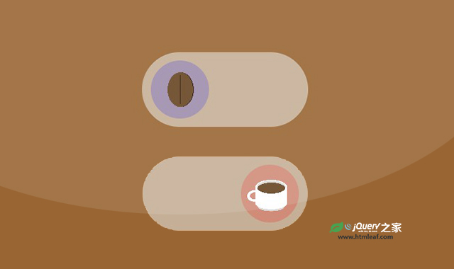

这是一款CSS咖啡创意开关按钮。该特效将开关按钮的关闭状态和开启状态分别设置为咖啡豆和一杯咖啡的形状,点击形成咖啡豆变成咖啡的动画,非常炫酷。
使用方法
HTML代码
<input type="checkbox" role="switch" class="coffee" />
CSS代码
.coffee {
  font-size: 0.75rem;
  appearance: none;
  position: relative;
  width: 20em;
  height: 9em;
  background: #eee8;
  border-radius: 20em;

  &::before {
    content: "";
    width: 7em;
    aspect-ratio: 1;
    position: absolute;
    border-radius: 50%;
    top: 50%;
    left: 23%;
    transform: translate(-50%, -50%) rotate(0);
    background-image:
      linear-gradient(#210 0 0),
      radial-gradient(farthest-side, #0000 90%, #fff 0 99%, #0000),
      radial-gradient(farthest-side, #642 99%, #0000),
      radial-gradient(farthest-side, #210 99%, #0000),
      radial-gradient(farthest-side, #ddd 99%, #0000),
      linear-gradient(#fff 0 0),
      radial-gradient(farthest-side, #fff 99%, #0000),
      radial-gradient(farthest-side, #ddd 99%, #0000),
      radial-gradient(farthest-side, #0000 60%, #fff 0 99%, #0000);
    background-repeat: no-repeat;
    background-position:
      50% 50%,
      50% 50%,
      50% 50%,
      53% 50%,
      54.5% 24.5%,
      55% 27.5%,
      55% 20%,
      45% 15%,
      50% 50%
      ;
    background-size:
      1% 50%,
      120% 120%,
      44% 60%,
      44% 60%,
      0 0, 0 0, 0 0, 0 0, 0 0
      ;
    background-color: #00f3;
    transition: all 0.75s;
  }

  &:checked {
    &::before {
      left: 77%;
      transform: translate(-50%, -50%) rotate(360deg);
      background-position:
        50% 50%,
        55% 35%,
        55% 39%,
        55% 39%,
        55% 35%,
        55% 55%,
        55% 71.5%,
        55% 77%,
        15% 55%
        ;
      background-size:
        0 0,
        55% 25%,
        48% 20%,
        0% 0%,
        54.5% 24.5%,
        55% 27.5%,
        55% 20%,
        45% 15%,
        25% 20%
        ;
      background-color: #f003;
    }
  }

  &[disabled] {
    opacity: 0.25;
  }
}

@media print {
  .coffee {
    &, &::before, &::after {
      -webkit-print-color-adjust: exact;
      print-color-adjust: exact;
    }
  }
}

@media (prefers-reduced-motion) {
  .coffee, .coffee::before, .coffee::after {
    transition: none !important;
    animation: none !important;
  }
}


