
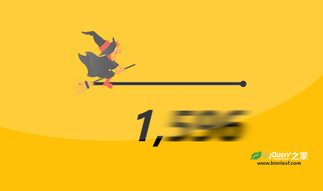

这是一款JS和CSS数字运动模糊动画效果。该效果使用CSS的filter属性来制作动态模糊效果,并结合JS来做数字运动效果,非常炫酷。
使用方法
HTML代码
<div class="wraper">
    <div class="container">
        <input id="slider" class="slider" type="range" min="0" max="20000" step="5000" list="values" value="20000">

        <datalist id="values">
            <option value="0" label="0"></option>
            <option value="5000" label="5000"></option>
            <option value="10000" label="10000"></option>
            <option value="15000" label="15000"></option>
            <option value="20000" label="20000"></option>
        </datalist>

        <div class="number" id="number">
            <div class="left" id="left"></div>
            <div class="separator" id="separator">,</div>
            <div class="right" id="right">0</div>
        </div>
    </div>
</div>

<svg class="svgFilter" xmlns="http://www.w3.org/2000/svg" version="1.1">
    <defs>
        <filter id="blurFilter">
            <feGaussianBlur id="blurFilterItem" in="SourceGraphic" stdDeviation="13,0" />
        </filter>
    </defs>
</svg>
CSS代码
.number {
  display: flex;
  align-items: center;
  font-size: 6rem;
  justify-content: flex-end;
}
.number .animate {
  filter: url("#blurFilter");
}
.number .left,
.number .right {
  min-width: 11rem;
  text-align: right;
}
.number .right {
  padding-right: 1rem;
}
.number .separator {
  opacity: 0;
  transition: opacity 0.1s ease;
}
.number .separator.show {
  opacity: 1;
}

.svgFilter {
  display: block;
  width: 0;
  height: 0;
}

.slider {
  accent-color: black;
  background: red;
  min-width: min(20rem, 60vw);
}

.container {
  display: flex;
  flex-direction: column;
  gap: 2rem;
}

.wraper {
  display: grid;
  place-items: center;
  height: 50vh;
  width: 100vw;
  background: #ffc107;
  font-style: italic;
  padding: 1;
  font-weight: bold;
}

:root {
  --labs-sys-color-on-background: black;
}

* {
  box-sizing: border-box;
}
JS代码
const number = document.getElementById("number");
const left = document.getElementById("left");
const rights = document.getElementById("right");
const slider = document.getElementById("slider");
let target = 60000;
let current = 0;
const step = 42;

const start = () => {
    right.classList.add("animate");
    update();
};

slider.addEventListener("input", event => {
    target = +event.target.value;
    start();
});

const updateValues = () => {
    const [first, ...rest] = current.toLocaleString("en-US").split(",").reverse();
    thousends = rest.reverse();

    const thousendsString = thousends.join("");
    if (+left.innerText != thousendsString) {
        left.classList.add("animate");
    } else {
        left.classList.remove("animate");
    }
    left.innerText = thousendsString;
    right.innerText = first;
};

const update = () => {
    if (target - current > 0) {
        current += step;
    } else {
        current -= step;
    }
    if (current >= 1000) {
        separator.classList.add("show");
    } else {
        separator.classList.remove("show");
    }
    updateValues();
    if (Math.abs(target - current) > step) {
        requestAnimationFrame(update);
    } else {
        requestAnimationFrame(() => {
            current = target;
            updateValues();
            left.classList.remove("animate");
            right.classList.remove("animate");
        });
    }
};

requestAnimationFrame(start);


