
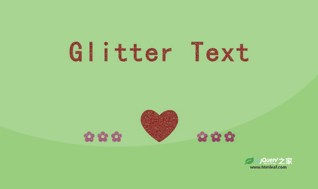

这是一款纯CSS制作文字和图标闪烁效果。该纯CSS制作文字和图标闪烁效果使用一张gif动图作为文字的背景图片,制作出文字闪烁的效果,非常炫酷。
使用方法
HTML代码
<h1 class="red glitter-text">Glitter Text</h1>
CSS代码
.blue {
  color: blue;
  background: url(../img/blue_glitter.gif)
    repeat;
}

.pink {
  color: pink;
  background: url(../img/pink_glitter.gif) repeat;
}

.gold {
  color: gold;
  background: url(../img/gold_glitter.gif)
    repeat;
}

.red {
  color: red;
  background: url(../img/red-glitter.gif) repeat;
}

/*  Set the properties for the glitter text */

.gold,
.pink,
.blue,
.green,
.red {
  -webkit-text-fill-color: transparent;
  -webkit-background-clip: text;
}

/*  Override the font size to make some things a bit smaller or bigger. */

.text-50 {
  font-size: 50%;
}
.text-150 {
  font-size: 150%;
}

/*  Set the properties for the glitter text */

.glitter-text {
  font-weight: 800;
  letter-spacing: 3px;

  font-size: 8vw;
  padding: 1.3vh;

  text-align: center;
  font-family: "Mountains of Christmas", cursive;
}

body {
  background: black;
  padding-bottom: 40vh;

  text-rendering: optimizeLegibility;
  font-smoothing: antialiased;
  -webkit-font-smoothing: antialiased;
  -moz-osx-fon-smoothing: grayscale;
}


