
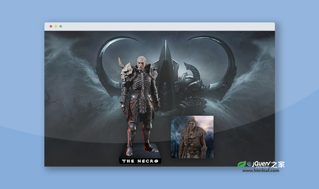

这是一款纯CSS3 3D卡片人物动画特效。该特效在鼠标悬停在人物图片上面的时候,人物从卡片中变大分离出来,卡片向后倾斜,形成强烈的3D视觉差效果,非常炫酷。
使用方法
HTML代码
<figure>
    <img src="./img/necro.png" alt="Necromancer">
    <figcaption>The Necro</figcaption>
</figure>
<figure>
    <img src="./img/druide.png" alt="Druid">
    <figcaption>The Druid</figcaption>
</figure>
CSS代码
figure {
  width: 100%;
  aspect-ratio: 1;
  margin: 0 0 60px;
  padding: 5px 20px 0;
  box-sizing: border-box;
  display: grid;
  grid-template-rows: 100%;
  cursor: pointer;
  position: relative;
  filter: drop-shadow(0 0 20px rgb(0 0 0/50%));
}
figure:before {
  content: "";
  position: absolute;
  z-index: -1;
  inset: 0;
  background: top/cover;
  transform-origin: bottom;
  filter: brightness(.9);
  transition: .5s;
}
figure:before {
  background-image: url(../img/necro-back.jpg)
}
figure + figure:before {
  background-image: url(../img/druid-bac.jpg)
}
img {
  grid-area: 1/1;
  width: 100%;
  height: 100%;
  object-fit: cover;
  object-position: top;
  filter: contrast(.8) brightness(.7);
  place-self: end center;
  transition: .5s;
}
figcaption {
  grid-area: 1/1;
  width: calc(100% + 40px);
  font-family: Exoct;
  color: #fff;
  font-size: min(32px,5vmin);
  text-align: center;
  place-self: end center;
  transform: perspective(500px) translateY(100%) rotateX(-90deg);
  backface-visibility: hidden;
  transform-origin: top;
  background: #000;
  transition: .5s;
}
figure:hover img {
  width: 130%;
  height: 255%;
  filter: contrast(1);
}
figure:hover::before {
  filter: brightness(.3);
  transform: perspective(500px) rotateX(60deg);
}
figure:hover figcaption{
  transform: perspective(500px)translateY(100%) rotateX(-30deg);
}
codepen网址:https://codepen.io/t_afif/pen/mdzxJaa


