
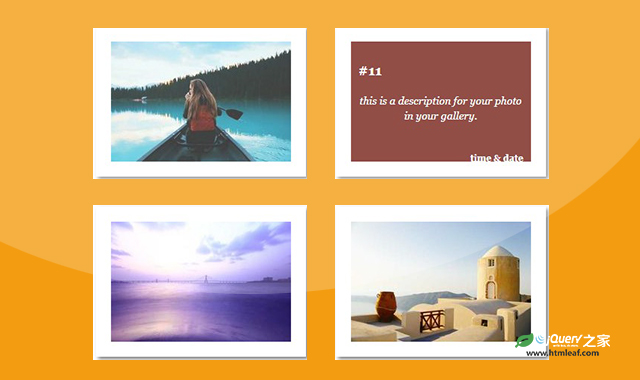

这是一款CSS鼠标滑过图片遮罩层动画效果。该效果在鼠标悬停到图片上方时,遮罩层以不同的方式出现,并在遮罩层上展示出文字,共15种不同的效果,非常实用。
使用方法
第一种遮罩层动画效果的代码如下:
HTML代码
<div class="container">
    <div class="bg-items">
        <div class="items" style="background-image : url('./img/1.jpg');">
            <div class="one"></div>
            <div class="details">
                <h3>#1</h3>
                <p>this is a description for your photo in your gallery.</p>
                <h6>time & date</h6>
            </div>
        </div>
    </div>
    ......
</div>
CSS代码
.container {
    width: 960px;
    margin: 0 auto;
}

.container:after {
    clear: both;
    display: table;
    content: '';
}

.bg-items {
    padding: 20px;
    width: 240px;
    height: 160px;
    margin: 20px;
    background-color: white;
    float: left;
    cursor: pointer;
    box-shadow: 3px 3px 5px 0px rgba(0, 0, 0, 0.5);
}

.items {
    width: 240px;
    height: 160px;
    position: relative;
    overflow: hidden;
    background-color: #102B46;
}

.details {
    background-color: rgba(0, 0, 0, 0.5);
    width: 220px;
    height: 140px;
    padding: 10px;
    top: 0;
    left: 0;
    font-family: georgia;
    color: #fff;
    opacity: 0;
    transition: opacity .8s;
}

.details h3 {
    margin-bottom: 20px;
}

.details h6 {
    text-align: right;
    margin-top: 40px;
}

.details p {
    font-size: 14px;
    font-style: italic;
    text-align: center;
    line-height: 20px;
}

.items:hover .details {
    opacity: 1;
    transition: opacity .2s .3s;
}

.items div {
    position: absolute;
}
/* one */

.one {
    left: 100%;
    bottom: 100%;
    width: inherit;
    height: inherit;
    background-color: #e43;
    transition: all .3s;
}

.items:hover .one {
    transition: all .3s;
    left: 0;
    bottom: 0;
}
codepen网址:https://codepen.io/seyedi/pen/DGroRp


