
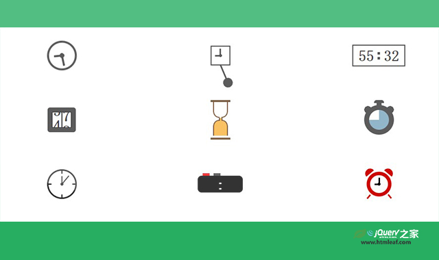

这是一款炫酷的时间计时loading动画效果。该时间计时loading动画效果通过css3的keyframes来制作,共10种不同的效果,非常炫酷。
使用方法
HTML代码
<div class="time-1"></div>
<div class="time-2"></div>
<div class="time-3"></div>
<div class="time-4"></div>
<div class="time-5"></div>
<div class="time-6"></div>
<div class="time-7"></div>
<div class="time-8"></div>
<div class="time-9"></div>
<div class="time-10"></div>
CSS代码
.time-1 {
  width: 60px;
  height: 60px;
  border:4px solid;
  border-radius: 50%;
  display: flex;
  background:
    radial-gradient(circle 5px, currentColor 95%,#0000),
    linear-gradient(currentColor 50%,#0000 0) center/4px 60% no-repeat;
  animation: t1 2s infinite linear;
}
.time-1:before {
  content: "";
  flex:1;
  background:linear-gradient(currentColor 50%,#0000 0) center/4px 80% no-repeat;
  animation: inherit;
}

@keyframes t1 {
  100% {transform: rotate(1turn)}
}

.time-2 {
  width: 40px;
  height: 40px;
  border:2px solid;
  position: relative;
  background:
    radial-gradient(circle 3px, currentColor 95%,#0000),
    linear-gradient(      currentColor 50%,#0000 0) center/3px 80% no-repeat,
    linear-gradient(90deg,currentColor 50%,#0000 0) center/60% 3px no-repeat;
}
.time-2:before {
  content: "";
  position: absolute;
  height: 50px;
  inset:100% 10% auto;
  background:
    radial-gradient(circle closest-side at 50% calc(100% - 10px), currentColor 94%,#0000),
    linear-gradient(currentColor 0 0) top/3px 80% no-repeat;
  transform-origin: top;
  animation: t2 2s infinite cubic-bezier(0.5,200,0.5,-200);
}

@keyframes t2 {
  100% {transform: rotate(0.4deg)}
}

.time-3 {
  display: flex;
  border:2px solid;
  background:
    linear-gradient(currentColor 0 0) 50% calc(50% - 5px)/5px 5px,
    linear-gradient(currentColor 0 0) 50% calc(50% + 5px)/5px 5px;
  background-repeat: no-repeat;
}
.time-3::before,
.time-3::after {
  content: "12 00 23 40 31 45 60 17 45 32 29 42 50 08 14 07 46 11 03 55";
  font-size: 30px;
  font-family: monospace;
  font-weight: bold;
  line-height: 1em;
  height: 1em;
  width:2ch;
  color: #0000;
  text-shadow:0 0 0 #000;
  overflow: hidden;
  margin:5px 10px;
  animation:t3 1s steps(20) infinite;
}
.time-3::before {
  animation-duration: 1.5s;
}

@keyframes t3 {
  100% {text-shadow:0 -20em 0 #000}
}

.time-4 {
  display: flex;
  border:10px solid;
  border-radius: 5px;
}
.time-4::before,
.time-4::after {
  content: "0 1 2 3 4 5 6 7 8 9 0";
  font-size: 30px;
  font-family: monospace;
  font-weight: bold;
  line-height: 1em;
  height: 1em;
  width:1.2ch;
  text-align: center;
  outline:1px solid #000;
  color: #0000;
  text-shadow:0 0 0 #000;
  overflow: hidden;
  animation:t4 2s infinite linear;
}
.time-4::before {
  animation-duration: 4s;
}

@keyframes t4 {
  100% {text-shadow:0 var(--t,-10em) 0 #000}
}


.time-5 {
  --c1:#673b14;
  --c2:#f8b13b;
  width:40px;
  height:80px;
  border-top:4px solid var(--c1);
  border-bottom:4px solid var(--c1);
  background: linear-gradient(90deg, var(--c1) 2px, var(--c2) 0 5px,var(--c1) 0) center/7px 8px no-repeat;
  display: grid;
  overflow: hidden;
  animation:t5-0 2s infinite linear;
}
.time-5::before,
.time-5::after {
  content: "";
  grid-area: 1/1;
  width: 75%;
  height: calc(50% - 4px);
  margin: 0 auto;
  border: 2px solid var(--c1);
  border-top: 0;
  border-radius: 0 0 40% 40%;
  -webkit-mask:
    linear-gradient(#000 0 0) bottom/4px 2px no-repeat,
    linear-gradient(#000 0 0);
  -webkit-mask-composite: destination-out;
  mask-composite:exclude;
  background:
    linear-gradient(var(--d,0deg),var(--c2) 50%,#0000 0) bottom /100% 205%,
    linear-gradient(var(--c2) 0 0) center/0 100%;
  background-repeat: no-repeat;
  animation:inherit;
  animation-name: t5-1;
}

.time-5::after {
  transform-origin: 50% calc(100% + 2px);
  transform: scaleY(-1);
  --s:3px;
  --d:180deg;
}

@keyframes t5-0 {
  80%  {transform: rotate(0)}
  100% {transform: rotate(0.5turn)}
}

@keyframes t5-1 {
  10%,70%  {background-size:100% 205%,var(--s,0) 100%}
  70%,100% {background-position: top,center}
}

.time-6 {
  width: 60px;
  height: 60px;
  border:10px solid;
  border-radius: 50%;
  animation: t6 2s infinite linear;
  position: relative;
}

.time-6:before {
  content: "";
  position: absolute;
  height: 20px;
  inset:auto calc(50% - 10px) 100%;
  border-radius: 5px 5px 0 0;
  background:
    linear-gradient(currentColor 0 0) top/100% 30%,
    linear-gradient(currentColor 0 0) top/50% 100%;
  background-repeat: no-repeat;
}
.time-6:after {
  content: "";
  position: absolute;
  inset:-8px -10px auto;
  height:15px;
  background:
    radial-gradient(farthest-side,currentColor 94%,#0000) left,
    radial-gradient(farthest-side,currentColor 94%,#0000) right;
  background-size:15px 15px;
  background-repeat: no-repeat;
}

@keyframes t6 {
  0%   {background: conic-gradient(#77a4bd 0     ,#0000 0)}
  12.5%{background: conic-gradient(#77a4bd 45deg ,#0000 46deg)}
  25%  {background: conic-gradient(#77a4bd 90deg ,#0000 91deg)}
  37.5%{background: conic-gradient(#77a4bd 135deg,#0000 136deg)}
  50%  {background: conic-gradient(#77a4bd 180deg,#0000 181deg)}
  62.5%{background: conic-gradient(#77a4bd 225deg,#0000 226deg)}
  75%  {background: conic-gradient(#77a4bd 270deg,#0000 271deg)}
  87.5%{background: conic-gradient(#77a4bd 315deg,#0000 316deg)}
  100% {background: conic-gradient(#77a4bd 360deg,#0000 360deg)}
}


.time-7 {
  width: 60px;
  height: 60px;
  border:3px solid;
  border-radius: 50%;
  display: grid;
  background:
    radial-gradient(circle 3px, currentColor 95%,#0000),
    linear-gradient(currentColor 50%,#0000 0) center/2px 60% no-repeat;
}
.time-7:before,
.time-7:after {
  content: "";
  grid-area: 1/1;
}
.time-7:before {
  background:repeating-conic-gradient(from -2deg, #000 0 4deg,#0000 0 90deg);
  -webkit-mask:radial-gradient(farthest-side,#0000 calc(100% - 6px),#000 0);
}
.time-7:after {
  background:linear-gradient(currentColor 50%,#0000 0) center/2px 80% no-repeat;
  animation: t7 1s infinite;
}

@keyframes t7 {
  0%,
  100% {transform: rotate(30deg)}
  90%  {transform: rotate(42deg)}
  95%  {transform: rotate(15deg)}
}

.time-8 {
  background:#000;
  padding:0 8px;
  font-size: 30px;
  font-family: monospace;
  color: #fff;
  font-weight: bold;
  border-radius: 8px;
  position: relative;
}
.time-8::before{
  content: "08:00";
  white-space: pre;
  animation:t8 .5s infinite;
}
.time-8::after{
   content: "";
   position: absolute;
   inset:auto auto 100% 10px;
   height:5px;
   width:40%;
   background:linear-gradient(90deg,red 40%,#0000 0 60%,#444 0);
}

@keyframes t8 {
  100% {content:"  :  "}
}

.time-9 {
  width: 50px;
  height: 50px;
  color:#ce0800;
  border:7px solid;
  border-radius: 50%;
  position: relative;
  background:
    radial-gradient(circle 3px, #000 95%,#0000),
    linear-gradient(180deg,#000 50%,#0000 0) center/3px 70%,
    linear-gradient(90deg ,#000 50%,#0000 0) center/50% 3px;
  background-repeat: no-repeat;
  animation: t9 1s infinite;
}
.time-9:before,
.time-9:after {
  content: "";
  position: absolute;
  border-radius: 20px 20px 0 0;
  inset:-20px calc(50% - 10px);
  transform: rotate(40deg);
  background:
      linear-gradient(currentColor 0 0) top   /100% 10px,
      linear-gradient(currentColor 0 0) bottom/3px  10px;
  background-repeat: no-repeat;
}
.time-9:after {
  transform: rotate(-40deg);
}

@keyframes t9 {
  0%,70%,100% {transform: translateY(0)    rotate(0)}
  75%,85%,95% {transform: translateY(-3px) rotate(10deg)}
  80%,90%     {transform: translateY(-3px) rotate(-10deg)}
}

.time-10 {
  width: 60px;
  height: 40px;
  position: relative;
}
.time-10::after {
  content: "";
  position: absolute;
  inset:0;
  --c:;
  background:
    radial-gradient(farthest-side at bottom   ,#ffc10a 92%,#0000)   top          /30px 15px,
    radial-gradient(farthest-side at top left ,#0000   92%,#ffc10a) bottom left / 15px 20px,
    radial-gradient(farthest-side at top right,#0000   92%,#ffc10a) bottom right/ 15px 20px,
    linear-gradient(#ffc10a 0 0) bottom/30px 26px;
  background-repeat: no-repeat;
  transform-origin: 50% -3px;
  animation: t10-1 .5s infinite alternate linear;
}
.time-10::before {
  content: "";
  position: absolute;
  inset:-6px calc(50% - 10px) -10px;
  background:
     radial-gradient(farthest-side,#ff9f04 90%,#0000) top   /10px 10px,
     radial-gradient(farthest-side,#ff9f04 90%,#0000) bottom/20px 20px;
  background-repeat: no-repeat;
  transform-origin: 50% 3px;
  animation: t10-2 .5s infinite alternate linear;
}

@keyframes t10-1 {
  0%   {transform: rotate(-30deg)}
  100% {transform: rotate(30deg)}
}

@keyframes t10-2 {
  0%   {transform: rotate(-20deg)}
  100% {transform: rotate(20deg)}
}


