
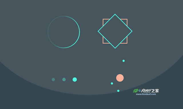

这是一款超酷CSS3 loading预加载动画特效。该loading特效共有4种不同的效果,分别通过不同的CSS3 keyframes帧动画来完成。
使用方法
HTML结构
4种loading预加载动画的HTML结构分别如下:
<!-- 效果一 -->
<div class="spinner-box">
  <div class="circle-border">
    <div class="circle-core"></div>
  </div>
</div>

<!-- 效果二 -->
<div class="spinner-box">
  <div class="configure-border-1">
    <div class="configure-core"></div>
  </div>
  <div class="configure-border-2">
    <div class="configure-core"></div>
  </div>
</div>

<!-- 效果三 -->
<div class="spinner-box">
  <div class="pulse-container">
    <div class="pulse-bubble pulse-bubble-1"></div>
    <div class="pulse-bubble pulse-bubble-2"></div>
    <div class="pulse-bubble pulse-bubble-3"></div>
  </div>
</div>

<!-- 效果四 -->
<div class="spinner-box">
  <div class="solar-system">
    <div class="earth-orbit orbit">
      <div class="planet earth"></div>
      <div class="venus-orbit orbit">
        <div class="planet venus"></div>
        <div class="mercury-orbit orbit">
          <div class="planet mercury"></div>
          <div class="sun"></div>
        </div>
      </div>
    </div>
  </div>
</div>
CSS样式
然后分别为它们添加下面的CSS样式。
/* KEYFRAMES */

@keyframes spin {
  from {
    transform: rotate(0);
  }
  to{
    transform: rotate(359deg);
  }
}

@keyframes configure-clockwise {
  0% {
    transform: rotate(0);
  }
  25% {
    transform: rotate(90deg);
  }
  50% {
    transform: rotate(180deg);
  }
  75% {
    transform: rotate(270deg);
  }
  100% {
    transform: rotate(359deg);
  }
}

@keyframes configure-xclockwise {
  0% {
    transform: rotate(45deg);
  }
  25% {
    transform: rotate(-45deg);
  }
  50% {
    transform: rotate(-135deg);
  }
  75% {
    transform: rotate(-215deg);
  }
  100% {
    transform: rotate(-305deg);
  }
}

@keyframes pulse {
  from {
    opacity: 1;
    transform: scale(1);
  }
  to {
    opacity: .25;
    transform: scale(.75);
  }
}

/* GRID STYLING */

* {
  box-sizing: border-box;
}

body {
  min-height: 100vh;
  background-color: #37474f;
  display: flex;
  justify-content: space-between;
  flex-wrap: wrap;
  align-items: flex-start;
}

.spinner-box {
  width: 300px;
  height: 300px;
  display: flex;
  justify-content: center;
  align-items: center;
  background-color: transparent;
}

/* SPINNING CIRCLE */

.circle-border {
  width: 150px;
  height: 150px;
  padding: 3px;
  display: flex;
  justify-content: center;
  align-items: center;
  border-radius: 50%;
  background: rgb(63,249,220);
  background: linear-gradient(0deg, rgba(63,249,220,0.1) 33%, rgba(63,249,220,1) 100%);
  animation: spin .8s linear 0s infinite;
}

.circle-core {
  width: 100%;
  height: 100%;
  background-color: #37474f;
  border-radius: 50%;
}

/* X-ROTATING BOXES */

.configure-border-1 {
  width: 115px;
  height: 115px;
  padding: 3px;
  position: absolute;
  display: flex;
  justify-content: center;
  align-items: center;
  background: #ffab91;
  animation: configure-clockwise 3s ease-in-out 0s infinite alternate;
}

.configure-border-2 {
  width: 115px;
  height: 115px;
  padding: 3px;
  left: -115px;
  display: flex;
  justify-content: center;
  align-items: center;
  background: rgb(63,249,220);
  transform: rotate(45deg);
  animation: configure-xclockwise 3s ease-in-out 0s infinite alternate;
}

.configure-core {
  width: 100%;
  height: 100%;
  background-color: #37474f;
}

/* PULSE BUBBLES */

.pulse-container {
  width: 120px;
  display: flex;
  justify-content: space-between;
  align-items: center;
}

.pulse-bubble {
  width: 20px;
  height: 20px;
  border-radius: 50%;
  background-color: #3ff9dc;
}

.pulse-bubble-1 {
    animation: pulse .4s ease 0s infinite alternate;
}
.pulse-bubble-2 {
    animation: pulse .4s ease .2s infinite alternate;
}
.pulse-bubble-3 {
    animation: pulse .4s ease .4s infinite alternate;
}

/* SOLAR SYSTEM */

.solar-system {
  width: 250px;
  height: 250px;
  display: flex;
  justify-content: center;
  align-items: center;
}

.orbit {
    position: relative;
    display: flex;
    justify-content: center;
    align-items: center;
    border: 1px solid #ffffffa5;
    border-radius: 50%;
}

.earth-orbit {
    width: 165px;
    height: 165px;
  -webkit-animation: spin 12s linear 0s infinite;
}

.venus-orbit {
    width: 120px;
    height: 120px;
  -webkit-animation: spin 7.4s linear 0s infinite;
}

.mercury-orbit {
    width: 90px;
    height: 90px;
  -webkit-animation: spin 3s linear 0s infinite;
}

.planet {
    position: absolute;
    top: -5px;
  width: 10px;
  height: 10px;
    border-radius: 50%;
  background-color: #3ff9dc;
}

.sun {
    width: 35px;
    height: 35px;
    border-radius: 50%;
    background-color: #ffab91;
}


