
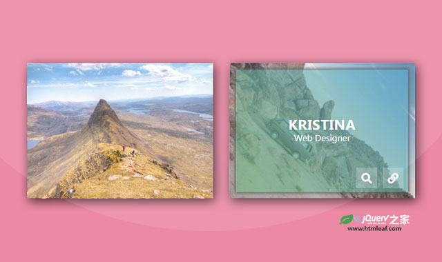

这是一款带旋转放大的CSS3鼠标悬停图片动画特效。该特效在鼠标悬停到图片上面的时候,图片会旋转放大,同时在图片上出现遮罩层和描述文字。
使用方法
在页面中引入fontawsome和bootstrap文件。
<link rel="stylesheet" href="font-awsome.min.css">
<link rel="stylesheet" href="bootstrap.min.css">
HTML结构
图片的基本HTML结构如下。
<div class="container">
    <div class="row">
        <div class="col-md-4 col-sm-6">
            <div class="box">
                <img src="images/img-1.jpg" alt="">
                <div class="box-content">
                    <h3 class="title">Steve Thomas</h3>
                    <span class="post">Web developer</span>
                </div>
                <ul class="icon">
                    <li><a href="#"><i class="fa fa-search"></i></a></li>
                    <li><a href="#"><i class="fa fa-link"></i></a></li>
                </ul>
            </div>
        </div>
        <div class="col-md-4 col-sm-6">
            <div class="box">
                <img src="images/img-2.jpg" alt="">
                <div class="box-content">
                    <h3 class="title">Kristina</h3>
                    <span class="post">Web designer</span>
                </div>
                <ul class="icon">
                    <li><a href="#"><i class="fa fa-search"></i></a></li>
                    <li><a href="#"><i class="fa fa-link"></i></a></li>
                </ul>
            </div>
        </div>
        <div class="col-md-4 col-sm-6">
            <div class="box">
                <img src="images/img-3.jpg" alt="">
                <div class="box-content">
                    <h3 class="title">Miranda Roy</h3>
                    <span class="post">Web developer</span>
                </div>
                <ul class="icon">
                    <li><a href="#"><i class="fa fa-search"></i></a></li>
                    <li><a href="#"><i class="fa fa-link"></i></a></li>
                </ul>
            </div>
        </div>
    </div>
</div>
CSS样式
然后通过下面的CSS样式来制作鼠标悬停动画特效。
.box{
    font-family: 'Ubuntu', sans-serif;
    position: relative;
    overflow: hidden;
}
.box:before{
    content: '';
    background: linear-gradient(45deg,rgba(103,178,111,0.6), rgba(76,162,205,0.6));
    height: 100%;
    width: 100%;
    opacity: 0;
    filter: blur(10px);
    transform: scale(1) rotate(180deg);
    position: absolute;
    left: 0;
    top: 0;
    z-index: 1;
    transition: all 0.4s ease-in-out;
}
.box:hover:before{
    box-shadow: 0 0 10px 2px #555;
    opacity: 1;
    filter: blur(0);
    transform: scale(0.92, 0.9) rotate(0);
}
.box img{
    width: 100%;
    height: auto;
    transition: all 0.5s ease-in-out;
}
.box:hover img{ transform: scale(1.9) rotate(45deg); }
.box .box-content{
    color: #fff;
    text-align: center;
    width: 100%;
    opacity: 0;
    transform: translateX(-50%) translateY(-50%) scale(3);
    position: absolute;
    top: 50%;
    left: 50%;
    z-index: 1;
    transition: all 0.5s ease;
}
.box:hover .box-content{
    opacity: 1;
    transform: translateX(-50%) translateY(-50%) scale(1);
}
.box .title{
    font-size: 25px;
    font-weight: 700;
    letter-spacing: 1px;
    text-transform: uppercase;
    margin: 0;
}
.box .post{
    font-size: 16px;
    text-transform: capitalize;
}
.box .icon{
    padding: 0;
    margin: 0;
    list-style: none;
    filter: blur(10px);
    transform: scale(0);
    position: absolute;
    right: 20px;
    bottom: 20px;
    z-index: 2;
    transition: all 0.5s ease 0.2s;
}
.box:hover .icon{
    transform: scale(1);
    filter: blur(0);
}
.box .icon li{ display: inline-block; }
.box .icon li a{
    color: #fff;
    background: rgba(255,255,255,0.2);
    font-size: 20px;
    text-align: center;
    line-height: 40px;
    height: 40px;
    width: 40px;
    margin: 0 3px;
    display: block;
    position: relative;
    transition: all 0.3s;
}
.box .icon li a:hover{
    text-shadow: 0 0 6px #555;
    box-shadow: 0 0 5px #555;
}
@media only screen and (max-width:990px){
    .box{ margin-bottom: 30px; }
}
@media only screen and (max-width:479px){
    .box .title{ font-size: 20px; }
}


