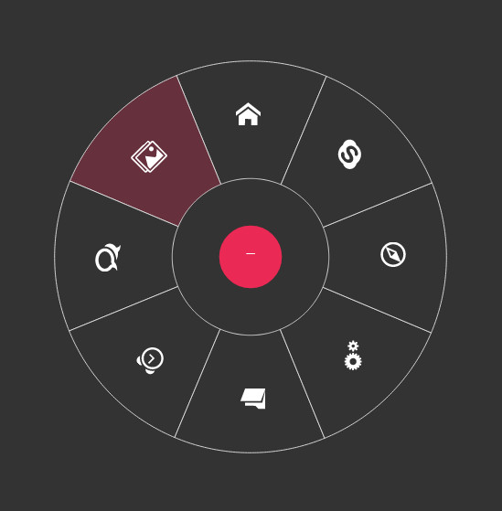
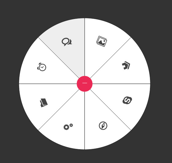
圆形菜单是一种非常酷的导航菜单特效,它是一种通过触发按钮将菜单展开为圆形或扇形的一种特效。我们提供了一个小工具可以制作最基本的SVG圆形菜单。通过这个工具,你可以定置你需要的圆形菜单的基本外观,然后将SVG文件下载到本地。
如何使用SVG圆形菜单
现在,你有了最基本的一个圆形菜单的SVG文件,让我们先来看看这个SVG文件。
解析圆形菜单的SVG文件
使用上面的工具制作和下载的SVG圆形菜单文件并不复杂,如果你不需要自定义图标和标签的话基本上不用改动就可以直接使用。
在讲述自定义图标之前,我们先来看一看下载的SVG文件。下面都是一段有5个扇形组成的半圆形菜单的SVG代码。
<svg xmlns="http://www.w3.org/2000/svg" xmlns:xlink="http://www.w3.org/1999/xlink" viewBox="-2 -2 504 504" id="menu" style="transform-origin: 50% 50% 0px; transform: translate3d(0px, 0px, 0px); touch-action: none; -webkit-user-select: none;">
<style>
#menu {
    display: block;
    margin: 0 auto;
    /*overflow: visible;*/ /* uncomment this if you are using bouncing animations*/
}

a {
    cursor: pointer; /* SVG <a> elements don't get this by default, so you need to explicitly set it */
    outline: none;
}

/* You can change these default styles any way you want */

.item .sector {
    transition: all .1s linear;
    fill: #fff;
    stroke: #111;
}

.item:hover .sector, .item:focus .sector {
    fill: #eee;
}

.menu-trigger {
    fill: #EA2A55;
    pointer-events: auto; /* KEEP THIS to make sure it stays clickable even when SVG's pointer events is disabled */
}

.menu-trigger:hover, .menu-trigger:focus {
    cursor: pointer;
}
symbol {
    overflow: visible; /* KEEP THIS so that text will not get cut off it it is wider than the icon width */
}
</style>
<g id="symbolsContainer">
    <symbol class="icon icon-" id="icon-1" viewBox="0 0 40 40"><!--Replace the contents of this symbol with the content of your icon--><rect fill="none" stroke="#111" width="100%" height="100%"></rect><text fill="#222" x="50%" y="50%" dy=".3em" text-anchor="middle" font-size="1.2em">1</text></symbol>
  ...
</g>
<g id="itemsContainer">
    <a class="item" role="link" tabindex="0" target="_parent" id="item-1" xlink:href="" xlink:title="" transform="matrix(1,0,0,1,0,0)" data-svg-origin="250 250" style=""><path fill="none" stroke="#111" stroke-width="1" class="sector" d="M250,250 l250,0 A250,250 0 0,0 452.25424859373686,103.05368692688171 z"></path><use xlink:href="#icon-1" width="40" height="40" x="391.6795959472656" y="177.4671173095703" transform="rotate(72 411.6795959472656 197.4671173095703)"></use></a>
    ...
</g>
<g id="trigger" class="trigger menu-trigger" role="button">
    <circle cx="250" cy="250" r="30"></circle>
    <!-- menu button label or icon goes here -->
</g>
</svg>
虽然代码有一点长,但是你仔细看的话会发现有许多重复代码。让我们来研究一些这些代码。
- 首先
style元素包含了该SVG图形的基本样式。代码中只是添加了一些基本的属性,你可以很容易的覆盖它们。 - 接下来的元素是一个ID为
symbolsContainer的包裹元素。<g id="symbolsContainer"> <!-- ... --> </g>该元素用于包裹一组
<symbol>元素,<symbol>元素用于放置你的自定义图标。 <symbol>元素的数量由你设置的菜单项的数量决定。每一个<symbol>都用来包装一个图标。在默认下载的SVG文件中,包含了一个rect和一个text元素。如果要使用自定义图标,这两个元素必须移除。<symbol class="icon icon-" id="icon-1" viewBox="0 0 40 40"> <!--Replace the contents of this symbol with the content of your icon--> <rect fill="none" stroke="#111" width="100%" height="100%"></rect> <text fill="#222" x="50%" y="50%" dy=".3em" text-anchor="middle" font-size="1.2em">1</text> </symbol>每一个
symbol同时也包含一个class和一个id,你可以自由改变它们。如果你想要在某个菜单项(某个扇形)中添加一个自定义图标(如一个下载图标),修改后的文件应该像下面的样子:
<symbol class="icon icon-download" id="icon-1" viewBox="0 0 40 40"><
    <path d="M16 18l8-8h-6v-8h-4v8h-6zM23.273 14.727l-2.242 2.242 8.128 3.031-13.158 4.907-13.158-4.907 8.127-3.031-2.242-2.242-8.727 3.273v8l16 6 16-6v-8z"></path>
</symbol>
注意class名称在
icon-后面添加了一个后缀download。viewBox也是使用的默认值,你也可以修改它的值来设置自定义图标的大小和位置。- 接下来是一组包含实际菜单项的元素,它们由
#itemsContainer元素包裹。每一个实际菜单项都包裹在一个<a>元素中,里面包含一个<path>元素和一个<use>元素,<use>元素通过xlink:href属性指向前面的symbol。<a class="item" role="link" tabindex="0" target="_parent" id="item-1" xlink:href="" xlink:title="" transform="matrix(1,0,0,1,0,0)" data-svg-origin="250 250" style=""> <path fill="none" stroke="#111" stroke-width="1" class="sector" d="M250,250 l250,0 A250,250 0 0,0 452.25424859373686,103.05368692688171 z"></path> <use xlink:href="#icon-1" width="40" height="40" x="391.6795959472656" y="177.4671173095703" transform="rotate(72 411.6795959472656 197.4671173095703)"></use> </a>transform属性包含了菜单项在旋转时的transformation。data-svg-origin属性只有在你使用GSAP来制作动画才用得着。<path>元素代表了实际的图形,<use>元素你只需要记住一件事情:在你修改了symbol的ID之后,<use>元素的指向要做相应的修改。<use>元素同时也指定了你的图标的宽度和高度。记住:这些坐标将被指向的<symbol>元素的viewbox作为viewport使用。 - 在代码的最后是一个ID为
#trigger的组。它是用于触发圆形菜单的按钮。<g id="trigger" class="trigger menu-trigger" role="button"> <circle cx="250" cy="250" r="30"></circle> <!-- menu button label or icon goes here --> </g>在这个组中,你可以放置一个图标、一个标签或其它东西。确保图标和标签放在触发按钮的中间,应该放在
250px 250px的地方。
自定义图标
要添加自定义图标,你需要做的事情是在<symbol>元素中将SVG图标的代码复制进去,如果需要的话,也可以修改它的class和id。
在添加了SVG图标代码之后,要使用<use>元素来指向对应的symbol。
- 如果你的图标是方形的,你可以保留或修改
viewBox的值,图标的大小取决于你在<use>元素中指定的值。 - 如果你的图标不是方形的,你同样可以在
<use>元素上保留方形坐标,这可以确保你不必调整sector内部的坐标。但是,你需要调整包含图标的symbol的viewBox的值,将它调整为与你的图标svg文件相同的值(你可以在你的图标SVG文件中找到这些值)。
如果你修改了图标的尺寸,使它们不再是一个方形,你需要在sector内轻微的调整一下它们的位置,使它们居中。如果你使用icomoon来生成图标,你不需要做任何的修改。
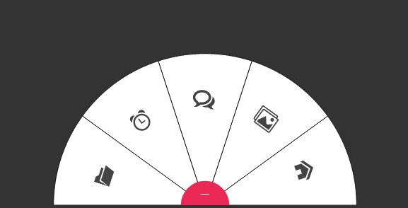
下面是一个添加了图标的半圆形菜单的例子,例子中没有添加任何鼠标滑过效果,只关注与图标的设置,只是在触发按钮上添加了一个文本。
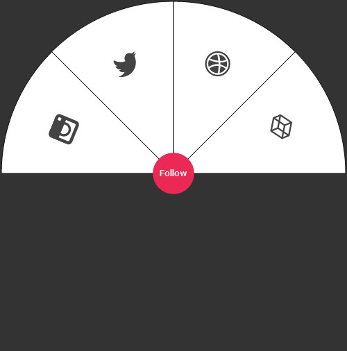
上面这个效果的代码是:
<svg xmlns="http://www.w3.org/2000/svg" xmlns:xlink="http://www.w3.org/1999/xlink" viewBox="-2 -2 504 504" id="menu" style="transform-origin: 50% 50% 0px; transform: translate3d(0px, 0px, 0px); touch-action: none; -webkit-user-select: none;">
<style>
#menu {
    display: block;
    margin: 0 auto;
    /*overflow: visible;*/ /* uncomment this if you are using bouncing animations*/
}

a {
    cursor: pointer; /* SVG <a> elements don't get this by default, so you need to explicitly set it */
    outline: none;
}

.item .sector {
    transition: all .1s linear;
    fill: #fff;
    stroke: #111;
}

/* You can change these default styles any way you want */

.item:hover .sector, .item:focus .sector {
    fill: #eee;
}

.menu-trigger {
    fill: #EA2A55;
    pointer-events: auto; /* KEEP THIS to make sure it stays clickable even when SVG's pointer events is disabled */
}

.menu-trigger:hover, .menu-trigger:focus {
    cursor: pointer;
}
symbol {
    overflow: visible; /* KEEP THIS so that text will not get cut off it it is wider than the icon width */
}
</style>
    <g id="symbolsContainer">
        <symbol class="icon icon-" id="icon-1" viewBox="0 0 40 40">
            <path d="M29.555 11.501l-14-9.333c-0.336-0.224-0.774-0.224-1.109 0l-14 9.333c-0.278 0.185-0.445 0.498-0.445 0.832v9.333c0 0.334 0.167 0.647 0.445 0.832l14 9.333c0.168 0.112 0.361 0.168 0.555 0.168s0.387-0.056 0.555-0.168l14-9.333c0.278-0.185 0.445-0.498 0.445-0.832v-9.333c0-0.334-0.167-0.647-0.445-0.832zM15 20.465l-5.197-3.465 5.197-3.465 5.197 3.465-5.197 3.465zM16 11.798v-6.93l11.197 7.465-5.197 3.465-6-4zM14 11.798l-6 4-5.197-3.465 11.197-7.465v6.93zM6.197 17l-4.197 2.798v-5.596l4.197 2.798zM8 18.202l6 4v6.93l-11.197-7.465 5.197-3.465zM16 22.202l6-4 5.197 3.465-11.197 7.465v-6.93zM23.803 17l4.197-2.798v5.596l-4.197-2.798z" fill="#444444"></path>
        </symbol>

        <symbol class="icon icon-" id="icon-2" viewBox="0 0 40 40">
            <path d="M23.927 7.073c-0.215 0.306-2.015 2.726-6.267 4.32-1.96-3.6-4.131-6.558-4.462-7 0.899-0.217 1.837-0.332 2.802-0.332 3.038 0 5.815 1.14 7.927 3.013zM16.836 16.123c-6.167 1.994-9.449 7.427-9.72 7.891-1.91-2.12-3.074-4.924-3.074-7.996 0-0.122 0.002-0.244 0.006-0.366 0.523 0.011 6.318 0.085 12.29-1.702 0.342 0.67 0.669 1.35 0.97 2.029-0.158 0.045-0.315 0.092-0.471 0.142zM16 0c-8.837 0-16 7.163-16 16s7.163 16 16 16 16-7.163 16-16-7.163-16-16-16zM16 30c-7.72 0-14-6.28-14-14s6.28-14 14-14c7.72 0 14 6.28 14 14s-6.28 14-14 14zM19.372 14.903c-0.248-0.583-0.515-1.162-0.793-1.732 4.421-1.805 6.425-4.374 6.677-4.715 1.665 2.035 2.674 4.627 2.7 7.449-0.394-0.083-4.348-0.885-8.327-0.385-0.084-0.205-0.17-0.41-0.258-0.617zM15.35 12.112c-5.594 1.485-10.52 1.464-11.055 1.457 0.775-3.711 3.276-6.795 6.622-8.373 0.315 0.432 2.452 3.394 4.434 6.916zM18.041 17.984c0.026-0.009 0.052-0.018 0.079-0.027 1.679 4.363 2.373 8.019 2.551 9.068-1.436 0.611-3.015 0.95-4.671 0.95-2.764 0-5.313-0.943-7.34-2.524 0.215-0.44 2.636-5.117 9.381-7.468zM20.358 17.405c3.747-0.6 7.040 0.382 7.449 0.511-0.533 3.327-2.443 6.201-5.126 8.015-0.123-0.727-0.759-4.228-2.323-8.526z" fill="#444444"></path>
        </symbol>

        <symbol class="icon icon-" id="icon-3" viewBox="0 0 40 40">
            <path d="M32 6.076c-1.177 0.522-2.443 0.875-3.771 1.034 1.355-0.813 2.396-2.099 2.887-3.632-1.269 0.752-2.674 1.299-4.169 1.593-1.198-1.276-2.904-2.073-4.792-2.073-3.626 0-6.565 2.939-6.565 6.565 0 0.515 0.058 1.016 0.17 1.496-5.456-0.274-10.294-2.888-13.532-6.86-0.565 0.97-0.889 2.097-0.889 3.301 0 2.278 1.159 4.287 2.921 5.465-1.076-0.034-2.088-0.329-2.974-0.821-0.001 0.027-0.001 0.055-0.001 0.083 0 3.181 2.263 5.834 5.266 6.437-0.551 0.15-1.131 0.23-1.73 0.23-0.423 0-0.834-0.041-1.235-0.118 0.835 2.608 3.26 4.506 6.133 4.559-2.247 1.761-5.078 2.81-8.154 2.81-0.53 0-1.052-0.031-1.566-0.092 2.905 1.863 6.356 2.95 10.064 2.95 12.076 0 18.679-10.004 18.679-18.68 0-0.285-0.006-0.568-0.019-0.849 1.283-0.926 2.396-2.082 3.276-3.398z" fill="#444444"></path>
        </symbol>

        <symbol class="icon icon-" id="icon-4" viewBox="0 0 40 40">
            <path d="M26.688 0h-21.375c-2.922 0-5.313 2.391-5.313 5.313v21.375c0 2.922 2.391 5.313 5.313 5.313h21.375c2.922 0 5.313-2.391 5.313-5.313v-21.375c0-2.922-2.391-5.313-5.313-5.313zM10.244 14h11.513c0.218 0.627 0.337 1.3 0.337 2 0 3.36-2.734 6.094-6.094 6.094s-6.094-2.734-6.094-6.094c0-0.7 0.119-1.373 0.338-2zM28 14.002v11.998c0 1.1-0.9 2-2 2h-20c-1.1 0-2-0.9-2-2v-12h3.128c-0.145 0.644-0.222 1.313-0.222 2 0 5.014 4.079 9.094 9.094 9.094s9.094-4.079 9.094-9.094c0-0.687-0.077-1.356-0.222-2l3.128 0.002zM28 7c0 0.55-0.45 1-1 1h-2c-0.55 0-1-0.45-1-1v-2c0-0.55 0.45-1 1-1h2c0.55 0 1 0.45 1 1v2z" fill="#444444"></path>
        </symbol>

    </g>
    <g id="itemsContainer">
        <a class="item" role="link" tabindex="0" target="_parent" id="item-1" xlink:href="" xlink:title="" transform="matrix(1,0,0,1,0,0)" data-svg-origin="250 250" style="">
            <path fill="none" stroke="#111" stroke-width="1" class="sector" d="M250,250 l250,0 A250,250 0 0,0 426.7766952966369,73.22330470336314 z"></path>
            <use xlink:href="#icon-1" width="40" height="40" x="387.05950927734375" y="164.94381713867188" transform="rotate(67.5 407.05950927734375 184.94381713867188)"></use>
        </a>
        <a class="item" role="link" tabindex="0" target="_parent" id="item-2" xlink:href="" xlink:title="" transform="matrix(0.7071,-0.7071,0.7071,0.7071,-103.55339059327378,249.99999999999997)" data-svg-origin="250 250" style="">
            <path fill="none" stroke="#111" stroke-width="1" class="sector" d="M250,250 l250,0 A250,250 0 0,0 426.7766952966369,73.22330470336314 z"></path>
            <use xlink:href="#icon-2" width="40" height="40" x="387.05950927734375" y="164.94381713867188" transform="rotate(67.5 407.05950927734375 184.94381713867188)"></use>
        </a>
        <a class="item" role="link" tabindex="0" target="_parent" id="item-3" xlink:href="" xlink:title="" transform="matrix(0,-1,1,0,0,500)" data-svg-origin="250 250" style="">
            <path fill="none" stroke="#111" stroke-width="1" class="sector" d="M250,250 l250,0 A250,250 0 0,0 426.7766952966369,73.22330470336314 z"></path>
            <use xlink:href="#icon-3" width="40" height="40" x="387.05950927734375" y="164.94381713867188" transform="rotate(67.5 407.05950927734375 184.94381713867188)"></use>
        </a>
        <a class="item" role="link" tabindex="0" target="_parent" id="item-4" xlink:href="" xlink:title="" transform="matrix(-0.7071,-0.7071,0.7071,-0.7071,249.99999999999997,603.5533905932738)" data-svg-origin="250 250" style="">
            <path fill="none" stroke="#111" stroke-width="1" class="sector" d="M250,250 l250,0 A250,250 0 0,0 426.7766952966369,73.22330470336314 z"></path>
            <use xlink:href="#icon-4" width="40" height="40" x="387.05950927734375" y="164.94381713867188" transform="rotate(67.5 407.05950927734375 184.94381713867188)"></use>
        </a>
    </g>
    <g id="trigger" class="trigger menu-trigger" role="button">
        <circle cx="250" cy="250" r="30"></circle>
        <text text-anchor="middle" x="250" y="254" fill="#fff" font-size=".7em">Follow</text>
    </g>
</svg>
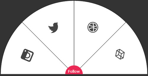
你会发现在SVG文件中有很多多余的空间,多余的空间是由于SVG的画板(由viewBox定义)是500像素宽和500像素高,而菜单只有250像素高,要去除这些多余的空间,修改viewBox的值为-2 -2 504 252 即可。
下面是经过调整的代码生成的半圆形菜单,注意由于触发按钮也被裁剪了一部分,你需要调整一下文本的位置。
为图标添加文本标签
如果你想为图标添加一些文字,你可以简单的修改一下symbol的代码,就像上面的例子中触发按钮上的文字一样,可以通过添加一个<text>标签来制作文字。
注意:你的图标有多大,文字就有多大。某些情况下,文字可能会超出<symbol>的范围,可以通过设置overflow: visible;来使所有的文字都可见。
将菜单嵌入网页
要将这个圆形菜单嵌入到你的网页中,必须使用内联模式。如果你像图片一样引入页面,菜单将不可用。将圆形菜单内联嵌入HTML中是十分简单的事情,但是你需要使用padding hack来修复一下IE的bug,否则它将使一个固定150像素的高度。
要使用padding hack,你需要将SVG包装到一个容器中,然后给这个容器和SVG一些样式如下:
<div class="menu-wrapper">
    <svg xmlns="http://www.w3.org/2000/svg" xmlns:xlink="http://www.w3.org/1999/xlink" viewBox="-2 -2 504 504" id="menu">
        <!-- ... -->
    </svg>
</div>
还记得如果你是制作半圆形的菜单,要设置viewBox为-2 -2 504 252,除非你要创建一个固定大小的菜单,否则你不需要知道它的宽度和高度。
下面是padding hack的代码:
.menu-wrapper {
    position: relative;
    height: 0;
    width: 100%; /* any width you want */
    padding-top: 100%; /* if the menu is in full circle mode. 50% if it is in semi-circle mode. */
}
#menu {
    position: absolute;
    top: 0;
    left: 0;
    width: 100%;
}
这将使得圆形菜单是响应式的。如果你想要限制菜单的宽度,不需要使用媒体查询,你可以将它在包装进一个容器中,然后设置这个容器的max-width属性。
浏览器支持
SVG能够被IE9+和所有的现代浏览器所支持。对于IE8以下的浏览器,可以使用JS来检测浏览器对SVG的支持,然后在不支持时回退为一个非圆形的菜单,也可以使用条件注释来完成。
注意,默认的圆形菜单使用了一个transform属性,大多数现代浏览器都支持这个属性,IE浏览器不支持在SVG元素上使用CSS transforms,所以建议使用javascript来制作圆形菜单动画。你可以使用snap.svg来制作圆形菜单的SVG动画,或者使用GSAP来制作SVG动画,但同样需要检查浏览器对SVG的支持和提供回退代码。
最后要注意<svg>圆形菜单的旋转使用的是CSS transforms,生成的代码没有浏览器厂商的前缀,所以你要自行添加浏览器厂商的前缀来使所有浏览器都支持圆形菜单效果。
应用举例
第一个例子使用 snap.svg 来制作SVG圆形菜单的展开和收缩动画。查看DEMO1。
第二个例子使用 GSAP 来制作SVG圆形菜单的动画特效。查看DEMO2。
第三个例子使用 TweenMax (v1.16.0) 来制作SVG圆形菜单的动画特效。查看DEMO3。