
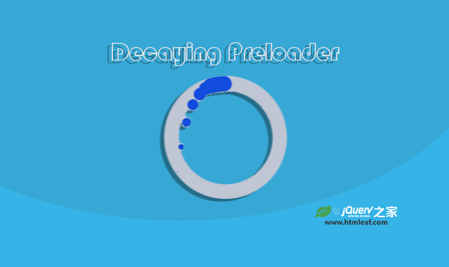

这是一款使用css3、svg和js制作的炫酷水滴Loading特效。该特效通过简单的代码,实现在页面中生成不断旋转的水滴Loading效果,非常炫酷。
使用方法
使用
Html代码
p
Css代码
* {
	border: 0;
	box-sizing: border-box;
	margin: 0;
	padding: 0;
}
:root {
	--hue: 223;
	--bg: hsl(var(--hue),90%,95%);
	--fg: hsl(var(--hue),90%,5%);
	--primary: hsl(var(--hue),90%,50%);
	--trans-dur: 0.3s;
	font-size: calc(16px + (24 - 16) * (100vw - 320px) / (1280 - 320));
}
body {
	background-color: var(--bg);
	color: var(--fg);
	font: 1em/1.5 sans-serif;
	height: 100vh;
	display: grid;
	place-items: center;
	transition: background-color var(--trans-dur);
}
main {
	padding: 1.5em 0;
}
.pl {
	display: block;
	overflow: visible;
	width: 8em;
	height: 8em;
}
.pl__ring {
	stroke: hsla(var(--hue),90%,5%,0.1);
	transition: stroke var(--trans-dur);
}
.pl__worm {
	stroke: var(--primary);
	transform-origin: 64px 64px;
	visibility: hidden;
}
.pl__worm--moving {
	animation: worm 8s linear;
	visibility: visible;
}

/* Dark theme */
@media (prefers-color-scheme: dark) {
	:root {
		--bg: hsl(var(--hue),90%,5%);
		--fg: hsl(var(--hue),90%,95%);
	}
	.pl__ring {
		stroke: hsla(var(--hue),90%,95%,0.1);
	}
}

/* Animations */
@keyframes worm {
	from {
		stroke-dasharray: 22 307.86 22;
		transform: rotate(0);
	}
	to {
		stroke-dasharray: 2 347.86 2;
		transform: rotate(4turn);
	}
}
js代码
window.addEventListener("DOMContentLoaded",() => {
	const dp = new DecayingPreloader(".pl");
});

class DecayingPreloader {
	particles = [];
	totalParticles = 120;
	replayTimeout = null;

	constructor(el) {
		this.el = document.querySelector(el);
		this.particleGroup = this.el?.querySelector("[data-particles]");
		this.worm = this.el?.querySelector("[data-worm]");

		this.init();
	}
	init() {
		this.spawnParticles(this.totalParticles);
		this.worm?.addEventListener("animationend",this.replayParticles.bind(this));
	}
	createParticle(x,y,r,delay) {
		const particle = new DecayParticle(x,y,r,delay);
		this.particleGroup?.appendChild(particle.g);
		// animation params
		particle.gAnimation = particle.g.animate(
			[
				{ transform: `translate(${particle.x}px,0)` },
				{ transform: `translate(${particle.x + particle.dx}px,0)` },
			],
			{ delay: particle.delay, duration: particle.duration, easing: "linear" }
		);
		particle.cAnimation = particle.c.animate(
			[
				{ opacity: 1, transform: `translate(0,${particle.y}px) scale(1)` },
				{ opacity: 1, transform: `translate(0,${particle.y + particle.dy}px) scale(0)` },
			],
			{ delay: particle.delay, duration: particle.duration, easing: "ease-in" }
		);
		// finally create the particle
		this.particles.push(particle);
	}
	replayParticles() {
		const movingClass = "pl__worm--moving";
		const timeout = 800;
		// retrigger the worm animation
		this.worm.classList.remove(movingClass);
		clearTimeout(this.replayTimeout);

		this.replayTimeout = setTimeout(() => {
			this.worm.classList.add(movingClass);
			// restart the particles
			this.particles.forEach(particle => {
				particle.gAnimation.finish();
				particle.gAnimation.play();
				particle.cAnimation.finish();
				particle.cAnimation.play();
			});
		},timeout);
	}
	spawnParticles(count = 1) {
		const centerXY = 64;
		const radius = 56;
		const loops = 4;
		const maxDelayPerLoop = 2000;
		const particlesPerLoop = Math.round(this.totalParticles / loops);
		const angleOffset = -2;
		const particleRadius = 7;

		for (let c = 0; c < count; ++c) {
			// place along the ring
			const percent = Utils.easeInOutCubic(c % particlesPerLoop / particlesPerLoop);
			const angle = 360 * percent + angleOffset;
			const x = centerXY + radius * Math.sin(Utils.degToRad(angle));
			const y = centerXY - radius * Math.cos(Utils.degToRad(angle));
			const loopsCompleted = Math.floor(c / particlesPerLoop);
			const delay = maxDelayPerLoop * percent + maxDelayPerLoop * loopsCompleted;

			this.createParticle(x,y,particleRadius,delay);
		}
	}
}
class DecayParticle {
	duration = 500;
	dx = Utils.randomFloat(-16,16);
	dy = Utils.randomFloat(32,64);
	// group
	gAnimation = null;
	// circle
	cAnimation = null;

	constructor(x = 0,y = 0,r = 1,delay = 0) {
		this.x = x;
		this.y = y;
		this.r = r;
		this.delay = delay;
		// namespace
		const ns = "http://www.w3.org/2000/svg";
		// group to move horizontally in the animation
		const g = document.createElementNS(ns,"g");
		g.setAttributeNS(null,"transform",`translate(${x},0)`);
		// circle to move vertically in the animation
		const circle = document.createElementNS(ns,"circle");
		circle.setAttributeNS(null,"opacity","0");
		circle.setAttributeNS(null,"r",`${this.r}`);
		circle.setAttributeNS(null,"transform",`translate(0,${y})`);
		circle.setAttributeNS(null,"fill","var(--primary)");

		this.g = g;
		this.c = circle;

		this.g.appendChild(this.c);
	}
}
class Utils {
	static degToRad(deg) {
		return deg * Math.PI / 180;
	}
	// ease methods from https://gist.github.com/gre/1650294
	static easeInOutCubic(t) {
		return t < 0.5 ? 4 * t ** 3 : (t - 1) * (2 * t - 2) * (2 * t - 2) + 1;
	}
	static randomFloat(min = 0,max = 2**32) {
		const percent = crypto.getRandomValues(new Uint32Array(1))[0] / 2**32;
		const relativeValue = (max - min) * percent;
		const plusMin = min + relativeValue;

		return +(plusMin).toFixed(3);
	}
}
codepen网址:https://codepen.io/jkantner/pen/eYjMYPo


