
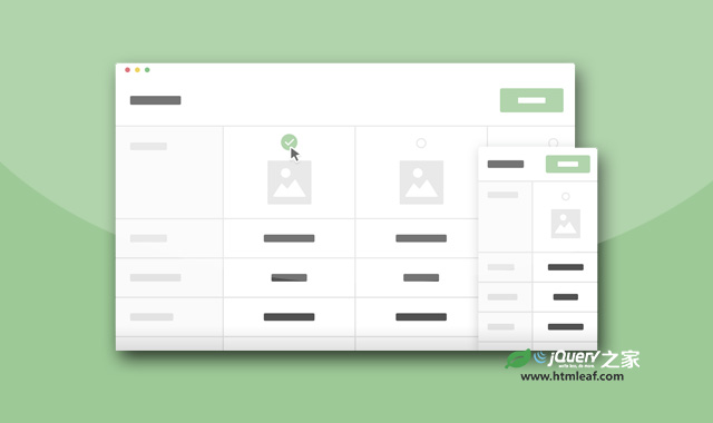

这是一款使用jQuery和CSS3制作的实用商品参数比较表格特效。如果你开发了一个在线的商城网站,你想让用户对各种商品的参数进行比较,那么使用这个商品参数比较表格是一个很好的选择。
这个商品参数比较表格在一个表格中列出了所有相似产品,用户可以选择他喜欢的2个或多个产品,点击过滤按钮来将其它产品排除,剩下的产品的各项参数一一对应,一目了然,即节省了用户的时间,也大大提升了用户体验。
使用方法
HTML结构
该表格的HTML结构使用一个section.cd-products-comparison-table来包裹一个<header>元素和一个div.cd-products-table。<header>元素中包含了“重置”和“过滤”2个按钮,div.cd-products-table用于包裹产品参数列表的标题div.features和列表详细内容div.cd-products-wrapper。
<section class="cd-products-comparison-table">
  <header>
    <h2>Compare Models</h2>

    <div class="actions">
      <a href="#0" class="reset">Reset</a>
      <a href="#0" class="filter">Filter</a>
    </div>
  </header>

  <div class="cd-products-table">
    <div class="features">
      <div class="top-info">Models</div>
      <ul class="cd-features-list">
        <li>Price</li>
        <li>Customer Rating</li>
        <li>Resolution</li>
        <!-- other features here -->
      </ul>
    </div> <!-- .features -->

    <div class="cd-products-wrapper">
      <ul class="cd-products-columns">
        <li class="product">
          <div class="top-info">
            <div class="check"></div>
            <img src="../img/product.png" alt="product image">
            <h3>Sumsung Series 6 J6300</h3>
          </div> <!-- .top-info -->

          <ul class="cd-features-list">
            <li>$600</li>
            <li class="rate"><span>5/5</span></li>
            <li>1080p</li>
            <!-- other values here -->
          </ul>
        </li> <!-- .product -->

        <li class="product">
          <!-- product content here -->
        </li> <!-- .product -->

        <!-- other products here -->
      </ul> <!-- .cd-products-columns -->
    </div> <!-- .cd-products-wrapper -->

    <ul class="cd-table-navigation">
      <li><a href="#0" class="prev inactive">Prev</a></li>
      <li><a href="#0" class="next">Next</a></li>
    </ul>
  </div> <!-- .cd-products-table -->
</section> <!-- .cd-products-comparison-table -->
CSS样式
.cd-products-wrapper元素设置了100%的宽度,overflow-x为auto,因此会有一个水平滚动条出现。.cd-products-columns元素的宽度等于所有表格列的宽度的总和,并且也是可以滚动的。div.features元素使用绝对定位,并被固定在视口的左侧。
.cd-products-wrapper {
  overflow-x: auto;
  /* this fixes the buggy scrolling on webkit browsers */
  /* - mobile devices only - when overflow property is applied */
  -webkit-overflow-scrolling: touch;
}

.cd-products-table .features {
  /* fixed left column - product properties list */
  position: absolute;
  z-index: 1;
  top: 0;
  left: 0;
  width: 120px;
}

.cd-products-columns {
  /* products list wrapper */
  width: 1200px; /* single column width * products number */
  margin-left: 120px; /* .features width */
}
在大屏幕设备上(视口宽度大于1170像素),当用户向下滚动的时候,.cd-products-table元素会被添加.top-fixed的class类,用于固定产品的头部信息(产品名称和图片)。
@media only screen and (min-width: 1170px) {
  .cd-products-table.top-fixed .cd-products-columns > li {
    padding-top: 160px;
  }

  .cd-products-table.top-fixed .top-info {
    height: 160px;
    position: fixed;
    top: 0;
  }

  .cd-products-table.top-fixed .top-info h3 {
    transform: translateY(-116px);
  }

  .cd-products-table.top-fixed .top-info img {
    transform: translateY(-62px) scale(0.4);
  }

}
JavaScript
为了实现产品参数比较表格,这里创建了一个productsTable对象,并使用bindEvents来为元素附加事件。
function productsTable( element ) {
  this.element = element;
  this.table = this.element.children('.cd-products-table');
  this.productsWrapper = this.table.children('.cd-products-wrapper');
  this.tableColumns = this.productsWrapper.children('.cd-products-columns');
  this.products = this.tableColumns.children('.product');
  //additional properties here
  // bind table events
  this.bindEvents();
}

productsTable.prototype.bindEvents = function() {
  var self = this;

  self.productsWrapper.on('scroll', function(){
    //detect scroll left inside products table
  });

  self.products.on('click', '.top-info', function(){
    //add/remove .selected class to products
  });

  self.filterBtn.on('click', function(event){
    //filter products
  });
  //reset product selection
  self.resetBtn.on('click', function(event){
    //reset products visibility
  });

  this.navigation.on('click', 'a', function(event){
    //scroll inside products table - left/right arrows
  });
}

var comparisonTables = [];
$('.cd-products-comparison-table').each(function(){
  //create a productsTable object for each .cd-products-comparison-table
  comparisonTables.push(new productsTable($(this)));
});
在.cd-products-wrapper元素中添加了一个滚动事件的监听。当.cd-products-table元素被添加.top-fixed class的时候,所有的.top-info元素都处于固定的位置上,它们不会随.cd-products-columns一起滚动。updateLeftScrolling()函数用于在用户拉动.cd-products-wrapper时水平移动这些元素。
productsTable.prototype.updateLeftScrolling = function() {
  var scrollLeft = this.productsWrapper.scrollLeft();

  if( this.table.hasClass('top-fixed') && checkMQ() == 'desktop')
    setTranformX(this.productsTopInfo, '-'+scrollLeft);
}


