
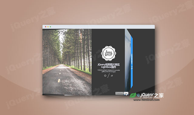

这是一款简单的jquery 3d旋转轮播图效果。该轮播图基于bootstrap网格系统,通过jquery和CSS3 transforms来制作3D旋转效果,非常炫酷。
使用方法
在页面中引入bootstrap.min.css,style.css和jquery文件。
<link href="bootstrap.min.css" rel="stylesheet">
<link href="style.css" rel="stylesheet">
<script src="js/jquery.min.js" type="text/javascript"></script>
HTML结构
该轮播图的HTML结构如下:
<div class="wrap">
  <section class="cube-container">
    <div id="cube">
      <figure class="front">
        <div class="col-md-8 col-sm-12" style="background-image: url('img/1.jpg');"></div>
        <div class="col-md-4" style="height:inherit;display:inline-block;">
      <article>
          <img src="img/profile.svg" alt="logo" class="mb-4">
      </article>
         </div>
      </figure>
      <figure class="back">
      <div class="col-md-8" style="background-image:url('img/2.jpg');"></div>
        <div class="col-md-4" style="height:inherit;display:inline-block;">
          <article>
            <img src="img/profile.svg" alt="logo" class="mb-4">

          <p class="text-center">A bootstrap compatible slider that rotates gracefully in three dimensions</p>
          </article>
        </div>
      </figure>
      <figure class="right">
        <div class="col-md-8" style="background-image:url('img/3.jpg');"></div>
        <div class="col-md-4" style="height:inherit;display:inline-block;">
          <article>
            <img src="img/profile.svg" alt="logo" class="mb-4">
          <p class="text-center">A bootstrap compatible slider that rotates gracefully in three dimensions</p>
          </article>
        </div>

        </figure>
      <figure class="left">
        <div class="col-md-8" style="background-image:url('img/4.jpg');"></div>
        <div class="col-md-4" style="height:inherit;display:inline-block;">
          <article>
            <img src="img/profile.svg" alt="logo" class="mb-4">
          <p class="text-center">A bootstrap compatible slider that rotates gracefully in three dimensions</p>
          </article>
        </div>
      </figure>
      <figure class="top">5</figure>
      <figure class="bottom">6</figure>
    </div>
  </section>

</div>

<div class="button-wrap">
  <button class="previous">Previous</button>
  <button class="next">Next</button>
</div>
JavaScript
在页面DOM元素加载完毕之后,通过下面的js代码来完成该轮播图的初始化。
var counter = 0;
$('.next').on('click', function(){
  counter -= 90;
  var rotation = 'translateZ( -50vw ) rotateY( ' + counter + 'deg )';
  $('#cube').css('transform', rotation);
});
$('.previous').on('click', function(){
  counter += 90;
  var rotation = 'translateZ( -50vw ) rotateY( ' + counter + 'deg )';
  $('#cube').css('transform', rotation);
});


