
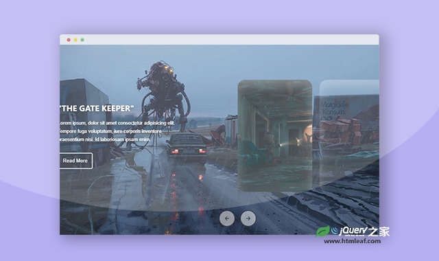

这是一款JS和CSS响应式图片轮播图效果,该图片轮播图使用CSS构建整个界面,并使用CSS实现动画效果,最后使用JS实现轮播图的切换,效果非常炫酷。
使用方法
HTML代码
<main>
    <ul class='slider'>
        <li class='item' style="background-image: url('dP3N4qnEZ4tCTCLq59iysd.jpg')">
            <div class='content'>
                <h2 class='title'>"Lossless Youths"</h2>
                <p class='description'> Lorem ipsum, dolor sit amet consectetur
                    adipisicing elit. Tempore fuga voluptatum, iure corporis inventore
                    praesentium nisi. Id laboriosam ipsam enim. </p>
                <button>Read More</button>
            </div>
        </li>
        ......
    </ul>
    <nav class='nav'>
        <ion-icon class='btn prev' name="arrow-back-outline"></ion-icon>
        <ion-icon class='btn next' name="arrow-forward-outline"></ion-icon>
    </nav>
</main>
CSS代码
* {
  margin: 0;
  padding: 0;
  box-sizing: border-box;
}

.container {
  height: 80vh;
  display: grid;
  place-items: center;
  overflow: hidden;
}

main {
  position: relative;
  width: 100%;
  height: 100%;
  box-shadow: 0 3px 10px rgba(0,0,0,0.3);
}

.item {
  width: 200px;
  height: 300px;
  list-style-type: none;
  position: absolute;
  top: 50%;
  transform: translateY(-50%);
  z-index: 1;
  background-position: center;
  background-size: cover;
  border-radius: 20px;
  box-shadow: 0 20px 30px rgba(255,255,255,0.3) inset;
  transition: transform 0.1s, left 0.75s, top 0.75s, width 0.75s, height 0.75s;

  &:nth-child(1), &:nth-child(2) {
    left: 0;
    top: 0;
    width: 100%;
    height: 100%;
    transform: none;
    border-radius: 0;
    box-shadow: none;
    opacity: 1;
  }

  &:nth-child(3) { left: 50%; }
  &:nth-child(4) { left: calc(50% + 220px); }
  &:nth-child(5) { left: calc(50% + 440px); }
  &:nth-child(6) { left: calc(50% + 660px); opacity: 0; }
}

.content {
  width: min(30vw,400px);
  position: absolute;
  top: 50%;
  left: 3rem;
  transform: translateY(-50%);
  font: 400 0.85rem helvetica,sans-serif;
  color: white;
  text-shadow: 0 3px 8px rgba(0,0,0,0.5);
  opacity: 0;
  display: none;

  & .title {
    font-family: 'arial-black';
    text-transform: uppercase;
  }

  & .description {
    line-height: 1.7;
    margin: 1rem 0 1.5rem;
    font-size: 0.8rem;
  }

  & button {
    width: fit-content;
    background-color: rgba(0,0,0,0.1);
    color: white;
    border: 2px solid white;
    border-radius: 0.25rem;
    padding: 0.75rem;
    cursor: pointer;
  }
}

.item:nth-of-type(2) .content {
  display: block;
  animation: show 0.75s ease-in-out 0.3s forwards;
}

@keyframes show {
  0% {
    filter: blur(5px);
    transform: translateY(calc(-50% + 75px));
  }
  100% {
    opacity: 1;
    filter: blur(0);
  }
}

.nav {
  position: absolute;
  bottom: 2rem;
  left: 50%;
  transform: translateX(-50%);
  z-index: 5;
  user-select: none;

  & .btn {
    background-color: rgba(255,255,255,0.5);
    color: rgba(0,0,0,0.7);
    border: 2px solid rgba(0,0,0,0.6);
    margin: 0 0.25rem;
    padding: 0.75rem;
    border-radius: 50%;
    cursor: pointer;

    &:hover {
      background-color: rgba(255,255,255,0.3);
    }
  }
}

@media (width > 650px) and (width < 900px) {
  .content {
    & .title        { font-size: 1rem; }
    & .description  { font-size: 0.7rem; }
    & button        { font-size: 0.7rem; }
  }
  .item {
    width: 160px;
    height: 270px;

    &:nth-child(3) { left: 50%; }
    &:nth-child(4) { left: calc(50% + 170px); }
    &:nth-child(5) { left: calc(50% + 340px); }
    &:nth-child(6) { left: calc(50% + 510px); opacity: 0; }
  }
}

@media (width < 650px) {
  .content {
    & .title        { font-size: 0.9rem; }
    & .description  { font-size: 0.65rem; }
    & button        { font-size: 0.7rem; }
  }
  .item {
    width: 130px;
    height: 220px;

    &:nth-child(3) { left: 50%; }
    &:nth-child(4) { left: calc(50% + 140px); }
    &:nth-child(5) { left: calc(50% + 280px); }
    &:nth-child(6) { left: calc(50% + 420px); opacity: 0; }
  }
}


