
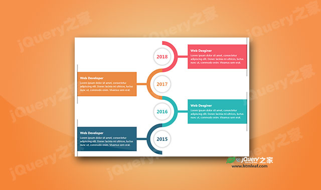

这是一款炫酷css3垂直时间轴特效。该css3垂直时间轴特效通过伪元素来制作炫酷的半圆形,所有半圆形连接为一条曲线路径,组成时间轴的线路。
使用方法
在页面中引入bootstrap.min.css文件。
<link rel="stylesheet" type="text/css" href="css/bootstrap.min.css">
HTML结构
该css3垂直时间轴的HTML结构如下:
<div class="container">
    <div class="row">
        <div class="col-md-12">
            <div class="main-timeline">
                <div class="timeline">
                    <div class="timeline-icon"><span class="year">2018</span></div>
                    <div class="timeline-content">
                        <h3 class="title">Web Desginer</h3>
                        <p class="description">
                            Lorem ipsum dolor sit amet,...
                        </p>
                    </div>
                </div>
                <div class="timeline">
                    <div class="timeline-icon"><span class="year">2017</span></div>
                    <div class="timeline-content">
                        <h3 class="title">Web Developer</h3>
                        <p class="description">
                            Lorem ipsum dolor sit amet...
                        </p>
                    </div>
                </div>
            </div>
        </div>
    </div>
</div>
CSS样式
为该css3垂直时间轴添加下面的CSS代码。
.main-timeline{
    overflow: hidden;
    position: relative;
}
.main-timeline .timeline{
    position: relative;
    margin-top: -79px;
}
.main-timeline .timeline:first-child{ margin-top: 0; }
.main-timeline .timeline:before,
.main-timeline .timeline:after{
    content: "";
    display: block;
    width: 100%;
    clear: both;
}
.main-timeline .timeline:before{
    content: "";
    width: 100%;
    height: 100%;
    box-shadow: -8px 0 5px -5px rgba(0, 0, 0, 0.5) inset;
    position: absolute;
    top: 0;
    right: 0;
    z-index: 2;
}
.main-timeline .timeline-icon{
    width: 210px;
    height: 210px;
    border-radius: 50%;
    border: 25px solid transparent;
    border-top-color: #f44556;
    border-right-color: #f44556;
    margin: auto;
    position: absolute;
    top: 0;
    left: 0;
    bottom: 0;
    right: 0;
    z-index: 1;
    transform: rotate(45deg);
}
.main-timeline .year{
    display: block;
    width: 110px;
    height: 110px;
    line-height: 110px;
    border-radius: 50%;
    background: #fff;
    box-shadow: 0 0 20px rgba(0,0,0,0.4);
    margin: auto;
    font-size: 30px;
    font-weight: bold;
    color: #f44556;
    text-align: center;
    position: absolute;
    top: 0;
    left: 0;
    bottom: 0;
    right: 0;
    transform: rotate(-45deg);
}
.main-timeline .timeline-content{
    width: 35%;
    float: right;
    background: #f44556;
    padding: 30px 20px;
    margin: 50px 0;
    z-index: 1;
    position: relative;
}
.main-timeline .timeline-content:before{
    content: "";
    width: 20%;
    height: 15px;
    background: #f44556;
    position: absolute;
    top: 50%;
    left: -20%;
    z-index: -1;
    transform: translateY(-50%);
}
.main-timeline .title{
    font-size: 20px;
    font-weight: bold;
    color: #fff;
    margin: 0 0 10px 0;
}
.main-timeline .description{
    font-size: 16px;
    color: #fff;
    line-height: 24px;
    margin: 0;
}
.main-timeline .timeline:nth-child(2n):before{ box-shadow: 8px 0 5px -5px rgba(0, 0, 0, 0.5) inset; }
.main-timeline .timeline:nth-child(2n) .timeline-icon{ transform: rotate(-135deg); }
.main-timeline .timeline:nth-child(2n) .year{ transform: rotate(135deg); }
.main-timeline .timeline:nth-child(2n) .timeline-content{ float: left; }
.main-timeline .timeline:nth-child(2n) .timeline-content:before{
    left: auto;
    right: -20%;
}
.main-timeline .timeline:nth-child(2n) .timeline-icon{
    border-top-color: #e97e2e;
    border-right-color: #e97e2e;
}
.main-timeline .timeline:nth-child(2n) .year{ color: #e97e2e; }
.main-timeline .timeline:nth-child(2n) .timeline-content,
.main-timeline .timeline:nth-child(2n) .timeline-content:before{ background: #e97e2e; }
.main-timeline .timeline:nth-child(3n) .timeline-icon{
    border-top-color: #13afae;
    border-right-color: #13afae;
}
.main-timeline .timeline:nth-child(3n) .year{ color: #13afae; }
.main-timeline .timeline:nth-child(3n) .timeline-content,
.main-timeline .timeline:nth-child(3n) .timeline-content:before{ background: #13afae; }
.main-timeline .timeline:nth-child(4n) .timeline-icon{
    border-top-color: #105572;
    border-right-color: #105572;
}
.main-timeline .timeline:nth-child(4n) .year{ color: #105572; }
.main-timeline .timeline:nth-child(4n) .timeline-content,
.main-timeline .timeline:nth-child(4n) .timeline-content:before{ background: #105572; }
@media only screen and (max-width: 1199px){
    .main-timeline .timeline{ margin-top: -103px; }
    .main-timeline .timeline-content:before{ left: -18%; }
    .main-timeline .timeline:nth-child(2n) .timeline-content:before{ right: -18%; }
}
@media only screen and (max-width: 990px){
    .main-timeline .timeline{ margin-top: -127px; }
    .main-timeline .timeline-content:before{ left: -2%; }
    .main-timeline .timeline:nth-child(2n) .timeline-content:before{ right: -2%; }
}
@media only screen and (max-width: 767px){
    .main-timeline .timeline{
        margin-top: 0;
        overflow: hidden;
    }
    .main-timeline .timeline:before,
    .main-timeline .timeline:nth-child(2n):before{
        box-shadow: none;
    }
    .main-timeline .timeline-icon,
    .main-timeline .timeline:nth-child(2n) .timeline-icon{
        margin-top: -30px;
        margin-bottom: 20px;
        position: relative;
        transform: rotate(135deg);
    }
    .main-timeline .year,
    .main-timeline .timeline:nth-child(2n) .year{ transform: rotate(-135deg); }
    .main-timeline .timeline-content,
    .main-timeline .timeline:nth-child(2n) .timeline-content{
        width: 100%;
        float: none;
        border-radius: 0 0 20px 20px;
        text-align: center;
        padding: 25px 20px;
        margin: 0 auto;
    }
    .main-timeline .timeline-content:before,
    .main-timeline .timeline:nth-child(2n) .timeline-content:before{
        width: 15px;
        height: 25px;
        position: absolute;
        top: -22px;
        left: 50%;
        z-index: -1;
        transform: translate(-50%,0);
    }
}


