
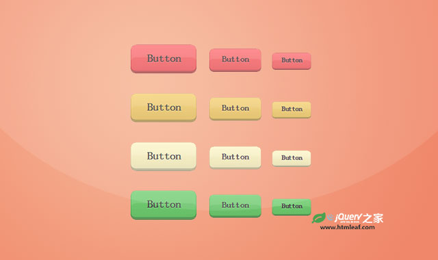

这是一款使用使用CSS3 线性渐变来制作的超酷彩色3D按钮样式。这组按钮分为不同的颜色,尺寸和圆角,使用时只需要添加相应的class类即可,简单实用。
使用方法
HTML结构
按钮的基本HTML结构非常简单,使用一个超链接<a>元素来制作。
<a class="button large regular red" href="javascript:void(0);">Button</a>
CSS样式
按钮的通用CSS样式如下。
.button {
    background-color: #999;
    background-image: -webkit-linear-gradient(hsla(0,0%,100%,.05), hsla(0,0%,0%,.1));
    background-image:    -moz-linear-gradient(hsla(0,0%,100%,.05), hsla(0,0%,0%,.1));
    background-image:     -ms-linear-gradient(hsla(0,0%,100%,.05), hsla(0,0%,0%,.1));
    background-image:      -o-linear-gradient(hsla(0,0%,100%,.05), hsla(0,0%,0%,.1));
    background-image:         linear-gradient(hsla(0,0%,100%,.05), hsla(0,0%,0%,.1));
    border: none;
    border-radius: .5em;
    box-shadow: inset 0 0 0 1px hsla(0,0%,0%,.2),
                inset 0 2px 0 hsla(0,0%,100%,.1),
                inset 0 1.2em 0 hsla(0,0%,100%,0.1),
                inset 0 -.2em 0 hsla(0,0%,100%,.1),
                inset 0 -.25em 0 hsla(0,0%,0%,.25),
                0 .25em .25em hsla(0,0%,0%,.05);
    color: #444;
    cursor: pointer;
    display: inline-block;
    font-family: sans-serif;
    font-size: 1em;
    font-weight: bold;
    line-height: 1.5;
    margin: 0 .5em 1em;
    padding: .5em 1.5em .75em;
    position: relative;
    text-decoration: none;
    text-shadow: 0 1px 1px hsla(0,0%,100%,.25);
    vertical-align: middle;
}
.button:hover {
    outline: none;
}
.button:hover,
.button:focus {
    box-shadow: inset 0 0 0 1px hsla(0,0%,0%,.2),
                inset 0 2px 0 hsla(0,0%,100%,.1),
                inset 0 1.2em 0 hsla(0,0%,100%,.1),
                inset 0 -.2em 0 hsla(0,0%,100%,.1),
                inset 0 -.25em 0 hsla(0,0%,0%,.25),
                inset 0 0 0 3em hsla(0,0%,100%,.2),
                0 .25em .25em hsla(0,0%,0%,.05);
}
.button:active {
    box-shadow: inset 0 0 0 1px hsla(0,0%,0%,.2),
                inset 0 2px 0 hsla(0,0%,100%,.1),
                inset 0 1.2em 0 hsla(0,0%,100%,.1),
                inset 0 0 0 3em hsla(0,0%,100%,.2),
                inset 0 .25em .5em hsla(0,0%,0%,.05),
                0 -1px 1px hsla(0,0%,0%,.1),
                0 1px 1px hsla(0,0%,100%,.25);
    margin-top: .25em;
    outline: none;
    padding-bottom: .5em;
}
按钮上的文本样式如下。
.lightText {
    box-shadow: inset 0 0 0 1px hsla(0,0%,0%,.25),
                inset 0 2px 0 hsla(0,0%,100%,.1),
                inset 0 1.2em 0 hsla(0,0%,100%,.05),
                inset 0 -.2em 0 hsla(0,0%,100%,.1),
                inset 0 -.25em 0 hsla(0,0%,0%,.5),
                0 .25em .25em hsla(0,0%,0%,.1);
    color: #fff;
    text-shadow: 0 -1px 1px hsla(0,0%,0%,.25);
}
.lightText:hover,
.lightText:focus {
    box-shadow: inset 0 0 0 1px hsla(0,0%,0%,.25),
                inset 0 2px 0 hsla(0,0%,100%,.1),
                inset 0 1.2em 0 hsla(0,0%,100%,.05),
                inset 0 -.2em 0 hsla(0,0%,100%,.1),
                inset 0 -.25em 0 hsla(0,0%,0%,.5),
                inset 0 0 0 3em hsla(0,0%,100%,.2),
                0 .25em .25em hsla(0,0%,0%,.1);
}
.lightText:active {
    box-shadow: inset 0 0 0 1px hsla(0,0%,0%,.25),
                inset 0 2px 0 hsla(0,0%,100%,.1),
                inset 0 1.2em 0 hsla(0,0%,100%,.05),
                inset 0 0 0 3em hsla(0,0%,100%,.2),
                inset 0 .25em .5em hsla(0,0%,0%,.05),
                0 -1px 1px hsla(0,0%,0%,.1),
                0 1px 1px hsla(0,0%,100%,.25);
}
按钮的各种尺寸,圆角和颜色的CSS样式如下。
/* Large */
.large {font-size: 1.25em;}

/* Medium */
.medium {font-size: 1em;}

/* Small */
.small {font-size: .75em;}

/* Regular */
.regular {border-radius: .5em;}

/* Square */
.square {border-radius: .25em;}

/* Round */
.round {border-radius: 1.25em;}

/* Red */
.red {background-color: #ff6c6f;}

/* Orange */
.orange {background-color: #f6cf6f;}

/* Yellow */
.yellow {background-color: #fff6c6;}

/* Green */
.green {background-color: #6fcf6f;}

/* Blue */
.blue {background-color: #6fc6ff;}

/* Purple */
.purple {background-color: #f6c6ff;}

/* White */
.white {background-color: #eee;}

/* Grey */
.grey {background-color: #999;}

/* Black */
.black {background-color: #444;}


