
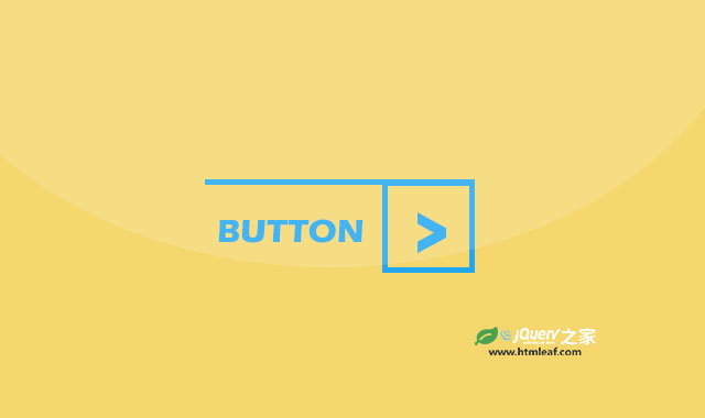

这是一款使用CSS3来制作的创意按钮设计效果。这组按钮分为4种颜色和3种尺寸大小,并且在鼠标滑过按钮时带有炫酷的翻转效果。
使用方法
该CSS3按钮依赖于Bootstrap和font-awesome字体图标。
<link rel="stylesheet" href="dist/font-awesome.css" type="text/css">
<link rel="stylesheet" href="dist/bootstrap.min.css" type="text/css">
HTML结构
这组按钮使用Bootstrap预定义的尺寸作为按钮的尺寸,分为btn-lg、btn-sm和btn-xs3种。颜色分为red、green、blue和orange4种。例如一个红色大按钮的HTML代码如下:
<div class="col-sm-3">
    <a href="#" class="btn btn-lg red">button</a>
</div>
CSS样式
为按钮添加如下的CSS样式:
.btn{
    border: none;
    border-radius: 0;
    text-transform: uppercase;
    padding-top: 0;
    padding-bottom: 0;
    position: relative;
    transition: all 0.3s ease 0s;
}
.btn:before{
    content: "";
    display: block;
    width: 100%;
    position: absolute;
    top: 0;
    left: 0;
    border-top: 2px solid transparent;
    transition: all 0.3s ease 0s;
}
.btn:hover:before{
    transform: translateY(42px);
}
.btn:after{
    content: "\f105";
    font-family:fontawesome;
    display: inline-block;
    width: 44px;
    height: 44px;
    border: 2px solid transparent;
    font-size: 24px;
    line-height: 40px;
    position: relative;
    top: 0;
    right: -16px;
    transition: all 0.43s ease 0s;
}
.btn:hover:after{
    transform: rotateX(180deg);
}
.btn.btn-sm:hover:before{
    transform: translateY(32px);
}
.btn.btn-sm:after{
    width: 34px;
    height: 34px;
    line-height: 30px;
    font-size: 20px;
    right: -10px;
}
.btn.btn-xs:hover:before{
    transform: translateY(22px);
}
.btn.btn-xs:after{
    width: 24px;
    height: 24px;
    line-height: 20px;
    font-size: 16px;
    right: -5px;
}
.btn.red{
    color: #ff6e6e;
}
.btn.red:before,
.btn.red:after{
    border-color: #ff6e6e;
}
.btn.blue{
    color: #5cbcf7;
}
.btn.blue:before,
.btn.blue:after{
    border-color: #5cbcf7;
}
.btn.orange{
    color: #ef965b;
}
.btn.orange:before,
.btn.orange:after{
    border-color: #ef965b;
}
.btn.green{
    color: #7ad79a;
}
.btn.green:before,
.btn.green:after{
    border-color: #7ad79a;
}
@media only  screen and (max-width: 767px){
    .btn{ margin-bottom: 20px; }
}


