
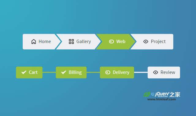

这是一组非常漂亮的纯CSS3响应式面包屑导航和分步导航指示器UI设计效果。这组UI设计中有5个面包屑导航和4个分步导航指示器效果。它们都使用相同的HTML结构,并带有一组预定义的CSS样式,使用上非常方便。
制作方法
HTML结构
这组UI的HTML结构非常简单:在一个<nav>元素中嵌套一个有序列表。
<nav>
  <ol class="cd-breadcrumb">
    <li><a href="#0">Home</a></li>
    <li><a href="#0">Gallery</a></li>
    <li><a href="#0">Web</a></li>
    <li class="current"><em>Project</em></li>
  </ol>
</nav>
CSS样式
在CSS样式中,<ol>元素有两种主要的样式:.cd-breadcrumb和.cd-multi-steps。它们一个是面包屑样式,一个是分步指示器样式。
在基本样式中,列表项使用::after伪元素来创建分隔元素。
.cd-breadcrumb li::after, .cd-multi-steps li::after {
  display: inline-block;
  content: '\00bb';
  margin: 0 .6em;
  color: #959fa5;
}
在特效中创建了一些预设的CSS样式,这些样式可以直接添加到<ol>元素上,它们可以非常方便的添加一些组件元素。
例如,如果你想在两个元素之间使用一个自定义图标来作为分割线,你可以使用.custom-separator class。
<nav>
  <ol class="cd-breadcrumb custom-separator">
    <li><a href="#0">Home</a></li>
    <li><a href="#0">Gallery</a></li>
    <li><a href="#0">Web</a></li>
    <li class="current"><em>Project</em></li>
  </ol>
</nav>
然后你需要更新列表项元素::after伪元素的背景图片。
.cd-breadcrumb.custom-separator li::after,
.cd-multi-steps.custom-separator li::after {
  /* replace the default separator with a custom icon */
  content: '';
  height: 16px;
  width: 16px;
  background: url(../img/cd-custom-separator.svg) no-repeat center center;
  vertical-align: middle;
}
.custom-icons class可以在每个列表项之前添加自定义的图标。同样在使用这个class的时候,你也需要更新相应::after伪元素的背景图片。
.cd-breadcrumb.custom-icons li > *::before,
.cd-multi-steps.custom-icons li > *::before {
  /* add a custom icon before each item */
  content: '';
  display: inline-block;
  height: 20px;
  width: 20px;
  margin-right: .4em;
  margin-top: -2px;
  background: url(../img/cd-custom-icons-01.svg) no-repeat 0 0;
  vertical-align: middle;
}
.cd-breadcrumb.custom-icons li:not(.current):nth-of-type(2) > *::before,
.cd-multi-steps.custom-icons li:not(.current):nth-of-type(2) > *::before {
  /* change custom icon using image sprites */
  background-position: -20px 0;
}
.cd-breadcrumb.custom-icons li:not(.current):nth-of-type(3) > *::before,
.cd-multi-steps.custom-icons li:not(.current):nth-of-type(3) > *::before {
  background-position: -40px 0;
}
.cd-breadcrumb.custom-icons li:not(.current):nth-of-type(4) > *::before,
.cd-multi-steps.custom-icons li:not(.current):nth-of-type(4) > *::before {
  background-position: -60px 0;
}
.cd-breadcrumb.custom-icons li.current:first-of-type > *::before,
.cd-multi-steps.custom-icons li.current:first-of-type > *::before {
  /* change custom icon for the current item */
  background-position: 0 -20px;
}
.cd-breadcrumb.custom-icons li.current:nth-of-type(2) > *::before,
.cd-multi-steps.custom-icons li.current:nth-of-type(2) > *::before {
  background-position: -20px -20px;
}
.cd-breadcrumb.custom-icons li.current:nth-of-type(3) > *::before,
.cd-multi-steps.custom-icons li.current:nth-of-type(3) > *::before {
  background-position: -40px -20px;
}
.cd-breadcrumb.custom-icons li.current:nth-of-type(4) > *::before,
.cd-multi-steps.custom-icons li.current:nth-of-type(4) > *::before {
  background-position: -60px -20px;
}
.triangle class可以在每一个列表项之后生成一个CSS三角形。在两个列表项之间创建一个分隔符,这里使用了一个小技巧。
.cd-breadcrumb.triangle li::after,
.cd-breadcrumb.triangle li > *::after {
  /*
    li > *::after is the colored triangle after each item
    li::after is the white separator between two items
  */
  content: '';
  position: absolute;
  top: 0;
  left: 100%;
  content: '';
  height: 0;
  width: 0;
  /* 48px is the height of the <a> element */
  border: 24px solid transparent;
  border-right-width: 0;
  border-left-width: 20px;
}
.cd-breadcrumb.triangle li::after {
  /* this is the white separator between two items */
  z-index: 1;
  -webkit-transform: translateX(4px);
  -moz-transform: translateX(4px);
  -ms-transform: translateX(4px);
  -o-transform: translateX(4px);
  transform: translateX(4px);
  border-left-color: #ffffff;
  /* reset style */
  margin: 0;
}
.cd-breadcrumb.triangle li > *::after {
  /* this is the colored triangle after each element */
  z-index: 2;
  border-left-color: inherit;
}
.cd-breadcrumb.triangle li:last-of-type::after,
.cd-breadcrumb.triangle li:last-of-type > *::after {
  /* hide the triangle after the last step */
  display: none;
}
还有其它一些可用的class:.text-center,.text-top和.text-bottom和.cd-multi-steps class一起使用,用于设置文本标签的位置。.count class用于在分步指示器中添加一个计数。
<nav>
  <ol class="cd-multi-steps text-bottom count">
    <li class="visited"><a href="#0">Cart</a></li>
    <li class="visited" ><a href="#0">Billing</a></li>
    <li class="current"><em>Delivery</em></li>
    <li><em>Review</em></li>
  </ol>
</nav>
具体的应用请查看DEMO中的各个例子。


