
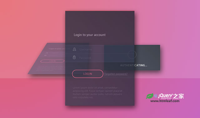

这是一款非常时尚的jQuery和CSS3登录界面UI设计。该登录界面采用扁平化风格,在用户点击登录按钮之后,界面会分为两个部分:一部分将原来的界面3D倾斜,另一部分是弹出一个带光波效果的loading指示器。该设计非常时尚和协调。
制作方法
该登录界面特效依赖于jQueryUI,使用时要引入相关依赖文件。
<link rel='stylesheet prefetch' href='http://libs.useso.com/js/jqueryui/1.10.4/css/jquery-ui.min.css'>
<script src='http://libs.useso.com/js/jqueryui/1.10.4/jquery-ui.min.js'></script>
HTML结构
该登录界面的HTML结构分为2个部分:一个是登录界面div.login,另一个是显示登录进度的界面div.authent。登录成功之后的界面包含在登录界面中。
<div class='login'>
  <div class='login_title'>
    <span>Login to your account</span>
  </div>
  <div class='login_fields'>
    <div class='login_fields__user'>
      <div class='icon'>
        <img src='img/user_icon_copy.png'>
      </div>
      <input placeholder='Username' type='text'>
        <div class='validation'>
          <img src='img/tick.png'>
        </div>
      </input>
    </div>
    <div class='login_fields__password'>
      <div class='icon'>
        <img src='img/lock_icon_copy.png'>
      </div>
      <input placeholder='Password' type='password'>
      <div class='validation'>
        <img src='img/tick.png'>
      </div>
    </div>
    <div class='login_fields__submit'>
      <input type='submit' value='Log In'>
      <div class='forgot'>
        <a href='#'>Forgotten password?</a>
      </div>
    </div>
  </div>
  <div class='success'>
    <h2>Authentication Success</h2>
    <p>Welcome back</p>
  </div>
  <div class='disclaimer'>
    <p>...</p>
  </div>
</div>
<div class='authent'>
  <img src='img/puff.svg'>
  <p>Authenticating...</p>
</div>
CSS样式
在CSS样式中,整个login登录界面设置了各种过渡动画transition属性,并修改了它的transform原点位置。刚开始的时候它的旋转角度为0度。登录界面的大小设置了一个固定值,宽度为240像素,高度为300像素。初始透明度设置为1。
body .login {
  opacity: 1;
  top: 20px;
  -webkit-transition-timing-function: cubic-bezier(0.68, -0.25, 0.265, 0.85);
  -webkit-transition-property: -webkit-transform,opacity,box-shadow,top,left;
          transition-property: transform,opacity,box-shadow,top,left;
  -webkit-transition-duration: .5s;
          transition-duration: .5s;
  -webkit-transform-origin: 161px 100%;
      -ms-transform-origin: 161px 100%;
          transform-origin: 161px 100%;
  -webkit-transform: rotateX(0deg);
          transform: rotateX(0deg);
  position: relative;
  width: 240px;
  border-top: 2px solid #D8312A;
  height: 300px;
  position: absolute;
  left: 0;
  right: 0;
  margin: auto;
  top: 0;
  bottom: 0;
  padding: 100px 40px 40px 40px;
  background: #35394a;
  /* Old browsers */
  /* FF3.6+ */
  background: -webkit-gradient(linear, left bottom, right top, color-stop(0%, #35394a), color-stop(100%, #1f222e));
  /* Chrome,Safari4+ */
  background: -webkit-linear-gradient(45deg, #35394a 0%, #1f222e 100%);
  /* Chrome10+,Safari5.1+ */
  /* Opera 11.10+ */
  /* IE10+ */
  background: linear-gradient(45deg, #35394a 0%, #1f222e 100%);
  /* W3C */
  filter: progid:DXImageTransform.Microsoft.gradient( startColorstr='#35394a', endColorstr='#1f222e',GradientType=1 );
  /* IE6-9 fallback on horizontal gradient */
}
在用户点击了登录提交按钮之后,.login元素被添加了class test。这个class将登录界面绕X轴旋转70度,并缩小0.8倍,最后使用CSS过滤器将它进行模糊处理。
body .test {
  box-shadow: 0px 20px 30px 3px rgba(0, 0, 0, 0.55);
  pointer-events: none;
  top: -100px !important;
  -webkit-transform: rotateX(70deg) scale(0.8) !important;
          transform: rotateX(70deg) scale(0.8) !important;
  opacity: .6 !important;
  -webkit-filter: blur(1px);
          filter: blur(1px);
}
在300毫秒延迟之后,在为它添加testtwo class。这个class将它向左移动320像素。
body .testtwo {
  left: -320px !important;
}
接下来的动画效果主要在jQuery代码中完成:在500毫秒延迟之后,登录loading指示器界面出现,并向右移动一段距离。
setTimeout(function () {
    $('.authent').show().animate({ right: -320 }, {
        easing: 'easeOutQuint',
        duration: 600,
        queue: false
    });
    $('.authent').animate({ opacity: 1 }, {
        duration: 200,
        queue: false
    }).addClass('visible');
}, 500);
在2500毫秒延迟之后,登录loading指示器界面往回移动,并通过设置透明度为0将它隐藏。同时登录界面上移除class testtwo,登录界面也会从左向右移动一段距离。
setTimeout(function () {
    $('.authent').show().animate({ right: 90 }, {
        easing: 'easeOutQuint',
        duration: 600,
        queue: false
    });
    $('.authent').animate({ opacity: 0 }, {
        duration: 200,
        queue: false
    }).addClass('visible');
    $('.login').removeClass('testtwo');
}, 2500);
在2800毫秒之后,登录界面的test class被移除,它会旋转回0度,模糊效果也被移除。.login下面的所有<div>元素在123毫秒时间内淡出隐藏。3200毫秒延迟之后登录成功界面.success淡入显示。
setTimeout(function () {
    $('.login').removeClass('test');
    $('.login div').fadeOut(123);
}, 2800);
setTimeout(function () {
    $('.success').fadeIn();
}, 3200);
整个登录界面的动画效果基本上就是这样,具体的代码请参考下载文件。


