
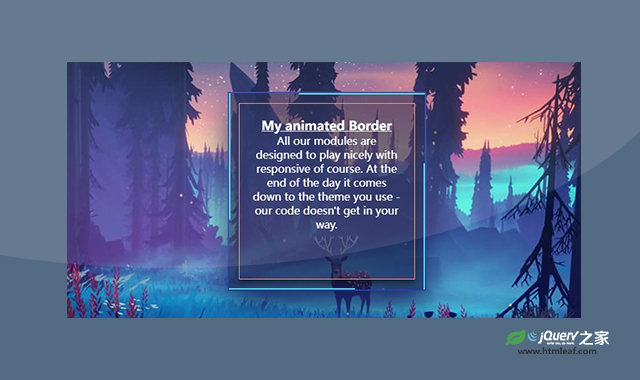

这是一款纯CSS3超酷边框线条动画特效。该特效中,使用html span元素作为边框线条,并通过CSS使其完美的运动起来,非常炫酷。
使用方法
HTML代码
<a href="#" target="_blank">
    <section>
        <div class="container">
            <div class="background-img">
                <div class="box">
                    <span></span>
                    <span></span>
                    <span></span>
                    <span></span>
                    <div class="content">
                        <h2>My animated Border </h2>
                        <p><a>All our modules are designed to play nicely with responsive of course. At the end of the day it comes down to the theme you use - our code doesn't get in your way.</a></p>
                    </div>
                </div>
            </div>
        </div>
    </section>
</a>
CSS代码
* {
    margin: 0;
    padding: 0;
}

.container {
    padding-top: 20px;
    padding-bottom: 20px;
    color: white;
}

body {
    background-color: #111845;
}

.background-img {
    background-image: url("../img/among_trees_night.jpg");
    height: 400px;
    width: 800px;
    background-repeat: no-repeat;
    background-size: cover;
    margin: 5% auto;
    padding: 20px;
    border: 1px solid #2a3cad;
    border-radius: 4px;
    box-shadow: 0px 0px 5px #2a3cad;
    position: relative;
}

.content h2 {
    font-size: 19px;
    color: white;
}

.box {
    position: absolute;
    top: 50%;
    left: 50%;
    transform: translate(-50%, -50%);
    width: 300px;
    height: 300px;
    background: #111845a6;
    box-sizing: border-box;
    overflow: hidden;
    box-shadow: 0 20px 50px rgb(23, 32, 90);
    border: 2px solid #2a3cad;
    color: white;
    padding: 20px;
}

.box:before {
    content: '';
    position: absolute;
    top: 0;
    left: -100%;
    width: 100%;
    height: 100%;
    background: rgba(255, 255, 255, 0.1);
    transition: 0.5s;
    pointer-events: none;
}

.box:hover:before {
    left: -50%;
    transform: skewX(-5deg);
}


.box .content {
    position: absolute;
    top: 15px;
    left: 15px;
    right: 15px;
    bottom: 15px;
    border: 1px solid #f0a591;
    padding: 20px;
    text-align: center;
    box-shadow: 0 5px 10px rgba(9, 0, 0, 0.5);
    color: white;
}

.box .content a {
    color: white;
}

.box span {
    position: absolute;
    top: 0;
    left: 0;
    width: 100%;
    height: 100%;
    display: block;
    box-sizing: border-box;

}

.box span:nth-child(1) {
    transform: rotate(0deg);
}

.box span:nth-child(2) {
    transform: rotate(90deg);
}

.box span:nth-child(3) {
    transform: rotate(180deg);
}

.box span:nth-child(4) {
    transform: rotate(270deg);
}

.box span:before {
    content: '';
    position: absolute;
    width: 100%;
    height: 2px;
    background: #50dfdb;
    animation: animate 4s linear infinite;
}

@keyframes animate {
    0% {
        transform: scaleX(0);
        transform-origin: left;
    }

    50% {
        transform: scaleX(1);
        transform-origin: left;
    }

    50.1% {
        transform: scaleX(1);
        transform-origin: right;

    }

    100% {
        transform: scaleX(0);
        transform-origin: right;

    }
}
codepen网址:https://codepen.io/uiswarup/pen/RBByzW


