
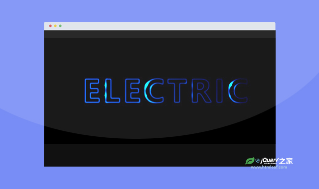

这是一款炫酷纯CSS蓝色流光文字动画效果。该纯CSS蓝色流光文字动画通过简单的CSS代码,生成非常漂亮的蓝色文字流光效果,非常炫酷。
使用方法
HTML代码
<main class="main">
    <div class="text__container">
        <h1 class="text" data-text="Electric">
            Electric
        </h1>
        <div class="text__gradient"></div>
        <div class="text__spotlight"></div>
    </div>
</main>
CSS代码
html, body {
  padding: 0;
  margin: 0;
}

html {
  font-size: 62.5%;
}

body {
  font-size: 1.4rem;
}

.main {
  display: flex;
  width: 100%;
  height: 100vh;
  align-items: center;
  justify-content: center;
  background-color: #000;
}

.text__container {
  overflow: hidden;
  position: relative;
  filter: contrast(120%) brightness(250%);
}
.text__container .text {
  position: relative;
  background: #000;
  font-family: "Roboto", sans-serif;
  font-size: 10rem;
  text-transform: uppercase;
  font-weight: 700;
  text-align: center;
  letter-spacing: 1rem;
  margin: 0;
  color: transparent;
  -webkit-user-select: none;
     -moz-user-select: none;
      -ms-user-select: none;
          user-select: none;
}
.text__container .text::before, .text__container .text::after {
  position: absolute;
  top: 0;
  left: 0;
  content: attr(data-text);
  color: #fff;
  filter: blur(0.2rem);
  pointer-events: none;
}
.text__container .text::after {
  mix-blend-mode: difference;
}
.text__container .text__gradient, .text__container .text__spotlight {
  position: absolute;
  top: 0;
  left: 0;
  bottom: 0;
  right: 0;
  z-index: 10;
  pointer-events: none;
}
.text__container .text__gradient {
  background: linear-gradient(45deg, #007ffe, #001c3d);
  mix-blend-mode: multiply;
}
.text__container .text__spotlight {
  top: -100%;
  left: -100%;
  background: radial-gradient(circle, #fff, transparent 25%) 0 0/25% 25%, radial-gradient(circle, #fff, #000 25%) 50% 50%/12.5% 12.5%;
  transform: translate3d(0, 0, 0);
  will-change: transform;
  transform-style: preserve-3d;
  mix-blend-mode: color-dodge;
  -webkit-animation: light--translate 5s infinite linear;
          animation: light--translate 5s infinite linear;
}

@-webkit-keyframes light--translate {
  0% {
    transform: translate3d(0, 0, 0);
  }
  100% {
    transform: translate3d(50%, 50%, 0);
  }
}

@keyframes light--translate {
  0% {
    transform: translate3d(0, 0, 0);
  }
  100% {
    transform: translate3d(50%, 50%, 0);
  }
}
codepen网址:https://codepen.io/alexdevio/pen/mdmPemN


