
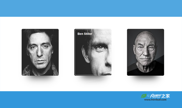

这是一款炫酷CSS3鼠标悬停卡片动画特效。该CSS3鼠标悬停卡片动画特效在鼠标悬停在卡片上方时,卡片中的背景图片通过修改background-size属性,形成非常炫酷的动画效果。
使用方法
HTML代码
<div class="container">
    <div class="card card0">
        <div class="border">
            <h2>Al Pacino</h2>
            <div class="icons">
                <i class="fa fa-codepen" aria-hidden="true"></i>
                <i class="fa fa-instagram" aria-hidden="true"></i>
                <i class="fa fa-dribbble" aria-hidden="true"></i>
                <i class="fa fa-twitter" aria-hidden="true"></i>
                <i class="fa fa-facebook" aria-hidden="true"></i>
            </div>
        </div>
    </div>
    <div class="card card1">
        <div class="border">
            <h2>Ben Stiller</h2>
            <div class="icons">
                <i class="fa fa-codepen" aria-hidden="true"></i>
                <i class="fa fa-instagram" aria-hidden="true"></i>
                <i class="fa fa-dribbble" aria-hidden="true"></i>
                <i class="fa fa-twitter" aria-hidden="true"></i>
                <i class="fa fa-facebook" aria-hidden="true"></i>
            </div>
        </div>
    </div>
    <div class="card card2">
        <div class="border">
            <h2>Patrick Stewart</h2>
            <div class="icons">
                <i class="fa fa-codepen" aria-hidden="true"></i>
                <i class="fa fa-instagram" aria-hidden="true"></i>
                <i class="fa fa-dribbble" aria-hidden="true"></i>
                <i class="fa fa-twitter" aria-hidden="true"></i>
                <i class="fa fa-facebook" aria-hidden="true"></i>
            </div>
        </div>
    </div>
    </div>
CSS代码
.container {
  height: 100vh;
  width: 100vw;
  max-height: 800px;
  max-width: 1280px;
  min-height: 600px;
  min-width: 1000px;
  display: flex;
  justify-content: space-around;
  align-items: center;
  margin: 0 auto;
}
.border {
  height: 369px;
  width: 290px;
  background: transparent;
  border-radius: 10px;
  transition: border 1s;
  position: relative;
}
.border:hover {
  border: 1px solid #fff;
}
.card {
  height: 379px;
  width: 300px;
  background: #808080;
  border-radius: 10px;
  transition: background 0.8s;
  overflow: hidden;
  background: #000;
  box-shadow: 0 70px 63px -60px #000;
  display: flex;
  justify-content: center;
  align-items: center;
  position: relative;
}
.card0 {
  background: url("../img/1.jpg") center center no-repeat;
  background-size: 300px;
}
.card0:hover {
  background: url("../img/1.jpg") left center no-repeat;
  background-size: 600px;
}
.card0:hover h2 {
  opacity: 1;
}
.card0:hover .fa {
  opacity: 1;
}
.card1 {
  background: url("../img/2.jpg") center center no-repeat;
  background-size: 300px;
}
.card1:hover {
  background: url("../img/2.jpg") left center no-repeat;
  background-size: 600px;
}
.card1:hover h2 {
  opacity: 1;
}
.card1:hover .fa {
  opacity: 1;
}
.card2 {
  background: url("../img/3.jpg") center center no-repeat;
  background-size: 300px;
}
.card2:hover {
  background: url("../img/3.jpg") left center no-repeat;
  background-size: 600px;
}
.card2:hover h2 {
  opacity: 1;
}
.card2:hover .fa {
  opacity: 1;
}
h2 {
  font-family: 'Helvetica Neue', Helvetica, Arial, sans-serif;
  color: #fff;
  margin: 20px;
  opacity: 0;
  transition: opacity 1s;
}
.fa {
  opacity: 0;
  transition: opacity 1s;
}
.icons {
  position: absolute;
  fill: #fff;
  color: #fff;
  height: 130px;
  top: 226px;
  width: 50px;
  display: flex;
  flex-direction: column;
  align-items: center;
  justify-content: space-around;
}
codepen网址:https://codepen.io/ainalem/pen/OJRLRPO


