
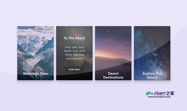

这是一款纯CSS3超酷卡片鼠标hover动画效果。该特效中,当用户鼠标悬停在卡片上方时,卡片的背景图片产生轻微的位移,描述文字快速从下方升起,形成强烈的视觉差效果。
使用方法
HTML代码
<main class="page-content">
    <div class="card">
        <div class="content">
            <h2 class="title">Mountain View</h2>
            <p class="copy">Check out all of these gorgeous mountain trips with beautiful views of, you guessed it, the mountains</p>
            <button class="btn">View Trips</button>
        </div>
    </div>
    <div class="card">
        <div class="content">
            <h2 class="title">To The Beach</h2>
            <p class="copy">Plan your next beach trip with these fabulous destinations</p>
            <button class="btn">View Trips</button>
        </div>
    </div>
    <div class="card">
        <div class="content">
            <h2 class="title">Desert Destinations</h2>
            <p class="copy">It's the desert you've always dreamed of</p>
            <button class="btn">Book Now</button>
        </div>
    </div>
    <div class="card">
        <div class="content">
            <h2 class="title">Explore The Galaxy</h2>
            <p class="copy">Seriously, straight up, just blast off into outer space today</p>
            <button class="btn">Book Now</button>
        </div>
    </div>
</main>
CSS代码
:root {
  --d: 700ms;
  --e: cubic-bezier(0.19, 1, 0.22, 1);
  --font-sans: "Rubik", sans-serif;
  --font-serif: "Cardo", serif;
}

* {
  box-sizing: border-box;
}

html, body {
  height: 100%;
}

body {
  display: grid;
  place-items: center;
}

.page-content {
  display: grid;
  grid-gap: 1rem;
  padding: 1rem;
  max-width: 1024px;
  margin: 0 auto;
  font-family: var(--font-sans);
}
@media (min-width: 600px) {
  .page-content {
    grid-template-columns: repeat(2, 1fr);
  }
}
@media (min-width: 800px) {
  .page-content {
    grid-template-columns: repeat(4, 1fr);
  }
}

.card {
  position: relative;
  display: flex;
  align-items: flex-end;
  overflow: hidden;
  padding: 1rem;
  width: 100%;
  text-align: center;
  color: whitesmoke;
  background-color: whitesmoke;
  box-shadow: 0 1px 1px rgba(0, 0, 0, 0.1), 0 2px 2px rgba(0, 0, 0, 0.1), 0 4px 4px rgba(0, 0, 0, 0.1), 0 8px 8px rgba(0, 0, 0, 0.1), 0 16px 16px rgba(0, 0, 0, 0.1);
}
@media (min-width: 600px) {
  .card {
    height: 350px;
  }
}
.card:before {
  content: "";
  position: absolute;
  top: 0;
  left: 0;
  width: 100%;
  height: 110%;
  background-size: cover;
  background-position: 0 0;
  transition: transform calc(var(--d) * 1.5) var(--e);
  pointer-events: none;
}
.card:after {
  content: "";
  display: block;
  position: absolute;
  top: 0;
  left: 0;
  width: 100%;
  height: 200%;
  pointer-events: none;
  background-image: linear-gradient(to bottom, rgba(0, 0, 0, 0) 0%, rgba(0, 0, 0, 0.009) 11.7%, rgba(0, 0, 0, 0.034) 22.1%, rgba(0, 0, 0, 0.072) 31.2%, rgba(0, 0, 0, 0.123) 39.4%, rgba(0, 0, 0, 0.182) 46.6%, rgba(0, 0, 0, 0.249) 53.1%, rgba(0, 0, 0, 0.32) 58.9%, rgba(0, 0, 0, 0.394) 64.3%, rgba(0, 0, 0, 0.468) 69.3%, rgba(0, 0, 0, 0.54) 74.1%, rgba(0, 0, 0, 0.607) 78.8%, rgba(0, 0, 0, 0.668) 83.6%, rgba(0, 0, 0, 0.721) 88.7%, rgba(0, 0, 0, 0.762) 94.1%, rgba(0, 0, 0, 0.79) 100%);
  transform: translateY(-50%);
  transition: transform calc(var(--d) * 2) var(--e);
}
.card:nth-child(1):before {
  background-image: url(../images/1.jpg);
}
.card:nth-child(2):before {
  background-image: url(../images/2.jpg);
}
.card:nth-child(3):before {
  background-image: url(../images/3.jpg);
}
.card:nth-child(4):before {
  background-image: url(../images/4.jpg);
}

.content {
  position: relative;
  display: flex;
  flex-direction: column;
  align-items: center;
  width: 100%;
  padding: 1rem;
  transition: transform var(--d) var(--e);
  z-index: 1;
}
.content > * + * {
  margin-top: 1rem;
}

.title {
  font-size: 1.3rem;
  font-weight: bold;
  line-height: 1.2;
}

.copy {
  font-family: var(--font-serif);
  font-size: 1.125rem;
  font-style: italic;
  line-height: 1.35;
}

.btn {
  cursor: pointer;
  margin-top: 1.5rem;
  padding: 0.75rem 1.5rem;
  font-size: 0.65rem;
  font-weight: bold;
  letter-spacing: 0.025rem;
  text-transform: uppercase;
  color: white;
  background-color: black;
  border: none;
}
.btn:hover {
  background-color: #0d0d0d;
}
.btn:focus {
  outline: 1px dashed yellow;
  outline-offset: 3px;
}

@media (hover: hover) and (min-width: 600px) {
  .card:after {
    transform: translateY(0);
  }

  .content {
    transform: translateY(calc(100% - 4.5rem));
  }
  .content > *:not(.title) {
    opacity: 0;
    transform: translateY(1rem);
    transition: transform var(--d) var(--e), opacity var(--d) var(--e);
  }

.card:hover,
.card:focus-within {
    align-items: center;
  }
.card:hover:before,
.card:focus-within:before {
    transform: translateY(-4%);
  }
.card:hover:after,
.card:focus-within:after {
    transform: translateY(-50%);
  }
.card:hover .content,
.card:focus-within .content {
    transform: translateY(0);
  }
.card:hover .content > *:not(.title),
.card:focus-within .content > *:not(.title) {
    opacity: 1;
    transform: translateY(0);
    transition-delay: calc(var(--d) / 8);
  }

.card:focus-within:before, .card:focus-within:after,
.card:focus-within .content,
.card:focus-within .content > *:not(.title) {
    transition-duration: 0s;
  }
}


