
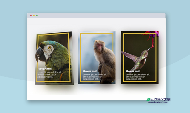

这是一款js和CSS3超酷3D立体卡片。该特效中的卡片使用多层png图片堆叠在一起,当鼠标滑过卡片时,通过js代码使各层图片进行移动,从而制作出3D立体的视觉差效果,非常炫酷。
使用方法
HTML代码
<div class="centered">
    <div class="card border-left-behind">
        <div class="shadow" style="--url: url('../images/full.png')"></div>
        <div class="image background" style="--url: url('../images/Background.png')"></div>
        <div class="image cutout" style="--url: url('../images/cutout.png')"></div>
        <div class="content">
            <h2 class="title">Hover me!</h2>
            <p class="desc">Lorem, ipsum dolor sit amet consectetur adipisicing elit.</p>
        </div>
    </div>
    <div class="card border-right-behind border-bottom-behind">
        <div class="shadow" style="--url: url('../images/m-full.png')"></div>
        <div class="image background" style="--url: url('../images/m-background.png')"></div>
        <div class="image cutout" style="--url: url('../images/m-cutout.png')"></div>
        <div class="content">
            <h2 class="title">Hover me!</h2>
            <p class="desc">Lorem, ipsum dolor sit amet consectetur adipisicing elit.</p>
        </div>
    </div>
    <div class="card border-left-behind">
        <div class="shadow" style="--url: url('../images/b-full.png')"></div>
        <div class="image background" style="--url: url('../images/b-background.png')"></div>
        <div class="image cutout" style="--url: url('../images/b-cutout.png')"></div>
        <div class="content">
            <h2 class="title">Hover me!</h2>
            <p class="desc">Lorem, ipsum dolor sit amet consectetur adipisicing elit.</p>
        </div>
    </div>
</div>
CSS代码
html,
body {
  width: 100%;
  height: 100%;
  font-family: "Montserrat", sans-serif;
}

.centered {
  display: flex;
  align-items: center;
  justify-content: center;
  gap: 3rem;
  height: 100%;
}

.card {
  position: relative;
  height: 28rem;
  width: 20rem;
  aspect-ratio: 5/7;
  color: #ffffff;
  perspective: 50rem;
}
.card .shadow {
  position: absolute;
  inset: 0;
  background: var(--url);
  background-size: cover;
  background-position: center;
  opacity: 0.8;
  filter: blur(2rem) saturate(0.9);
  box-shadow: 0 -1.5rem 2rem -0.5rem rgba(0, 0, 0, 0.7);
  transform: rotateX(var(--rotateX)) rotateY(var(--rotateY)) translate3d(0, 2rem, -2rem);
}
.card .image {
  position: absolute;
  inset: 0;
  background: linear-gradient(to top, rgba(0, 0, 0, 0.5), transparent 40%), var(--url);
  background-size: cover;
  background-position: center;
  -webkit-mask-image: var(--url);
          mask-image: var(--url);
  -webkit-mask-size: cover;
          mask-size: cover;
  -webkit-mask-position: center;
          mask-position: center;
}
.card .image.background {
  transform: rotateX(var(--rotateX)) rotateY(var(--rotateY)) translate3d(0, 0, 0rem);
}
.card .image.cutout {
  transform: rotateX(var(--rotateX)) rotateY(var(--rotateY)) translate3d(0, 0, 4rem) scale(0.92);
  z-index: 3;
}
.card .content {
  position: absolute;
  display: flex;
  flex-direction: column;
  justify-content: flex-end;
  inset: 0;
  padding: 3.5rem;
  transform: rotateX(var(--rotateX)) rotateY(var(--rotateY)) translate3d(0, 0, 6rem);
  z-index: 4;
}
.card::after, .card::before {
  content: "";
  position: absolute;
  inset: 1.5rem;
  border: #e2c044 0.5rem solid;
  transform: rotateX(var(--rotateX)) rotateY(var(--rotateY)) translate3d(0, 0, 2rem);
}
.card::before {
  z-index: 4;
}
.card.border-left-behind::before {
  border-left: transparent;
}
.card.border-right-behind::before {
  border-right: transparent;
}
.card.border-bottom-behind::before {
  border-bottom: transparent;
}

h2.title {
  font-size: 1.25rem;
  font-weight: 700;
  margin-bottom: 0.5rem;
  text-shadow: 0 0 2rem rgba(0, 0, 0, 0.5);
}

p.desc {
  font-weight: 300;
  text-shadow: 0 0 2rem rgba(0, 0, 0, 0.5);
}
CSS代码
const angle = 20;
const rotateCard = window;

const lerp = (start, end, amount) => {
    return (1 - amount) * start + amount * end;
};

const remap = (value, oldMax, newMax) => {
    const newValue = (value + oldMax) * (newMax * 2) / (oldMax * 2) - newMax;
    return Math.min(Math.max(newValue, -newMax), newMax);
};

window.addEventListener("DOMContentLoaded", event => {
    const cards = document.querySelectorAll(".card");
    cards.forEach(e => {
        e.addEventListener("mousemove", event => {
            const rect = e.getBoundingClientRect();
            const centerX = (rect.left + rect.right) / 2;
            const centerY = (rect.top + rect.bottom) / 2;
            const posX = event.pageX - centerX;
            const posY = event.pageY - centerY;
            const x = remap(posX, rect.width / 2, angle);
            const y = remap(posY, rect.height / 2, angle);
            e.dataset.rotateX = x;
            e.dataset.rotateY = -y;
        });

        e.addEventListener("mouseout", event => {
            e.dataset.rotateX = 0;
            e.dataset.rotateY = 0;
        });
    });

    const update = () => {
        cards.forEach(e => {
            let currentX = parseFloat(e.style.getPropertyValue('--rotateY').slice(0, -1));
            let currentY = parseFloat(e.style.getPropertyValue('--rotateX').slice(0, -1));
            if (isNaN(currentX)) currentX = 0;
            if (isNaN(currentY)) currentY = 0;
            const x = lerp(currentX, e.dataset.rotateX, 0.05);
            const y = lerp(currentY, e.dataset.rotateY, 0.05);
            e.style.setProperty("--rotateY", x + "deg");
            e.style.setProperty("--rotateX", y + "deg");
        });
    };
    setInterval(update, 1000 / 60);
});


