
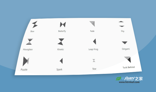

这是一款纯CSS制作的炫酷三角形变换loading加载动画特效。这一组Loading特效共有12种效果,分别通过不同的三角形变换动画组合而成。
使用方法
第一种三角形Loading动画特效的代码如下:
HTML代码
<div class="cell">
    <div class="pl pl-bow"></div>
    <div class="pl-name">Bow</div>
</div>
CSS代码
main {
	display: flex;
	flex-wrap: wrap;
    font-size: calc(16px + (24 - 16)*(100vw - 320px)/ (1920 - 320));
}
.cell {
	flex-basis: 50%;
	padding: 1.5em;
}

/** Global preloader styles **/
.pl, .pl:before, .pl:after {
	animation-duration: 2s;
	animation-timing-function: linear;
	animation-iteration-count: infinite;
}
.pl {
	margin: 0 auto 1.5em auto;
	position: relative;
	width: 3em;
	height: 3em;
}
.pl:before, .pl:after {
	background: currentColor;
	content: "";
	display: block;
	position: absolute;
	top: 0;
	left: 0;
	width: 100%;
	height: 50%;
	transform-origin: 50% 100%;
	clip-path: polygon(0 0,100% 0,50% 100%);
	-webkit-clip-path: polygon(0 0,100% 0,50% 100%);
}
.pl-name {
	text-align: center;
}

/** Styles for individual preloaders **/
/* Bow */
.pl-bow {
	animation-name: bowA;
}
.pl-bow:after {
	transform: rotate(180deg);
}
@keyframes bowA {
	from { transform: scale(1,1) rotate(0turn) }
	25%, 35%, 50% { transform: scale(1,1) rotate(0.75turn) }
	30% { transform: scale(1.25,1) rotate(0.75turn) }
	75%, 85%, to { transform: scale(1,1) rotate(1.5turn) }
	80% { transform: scale(1,1.25) rotate(1.5turn) }
}
codepen网址:https://codepen.io/jkantner/pen/YzzgWRY


