
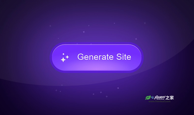

这是一款超酷CSS3和SVG流光按钮特效。该特效利用SVG和CSS3制作按钮,按钮边框有流光效果,并且在鼠标滑过按钮时,在按钮周边生成炫酷的蓝光星空效果。
使用方法
HTML代码
<div class="sparkle-button">
  <button>
    <span class="spark"></span>
    <span class="backdrop"></span>
    <svg class="sparkle" viewBox="0 0 24 24" fill="none" xmlns="http://www.w3.org/2000/svg">
      <path d="M14.187 8.096L15 5.25L15.813 8.096C16.0231 8.83114 16.4171 9.50062 16.9577 10.0413C17.4984 10.5819 18.1679 10.9759 18.903 11.186L21.75 12L18.904 12.813C18.1689 13.0231 17.4994 13.4171 16.9587 13.9577C16.4181 14.4984 16.0241 15.1679 15.814 15.903L15 18.75L14.187 15.904C13.9769 15.1689 13.5829 14.4994 13.0423 13.9587C12.5016 13.4181 11.8321 13.0241 11.097 12.814L8.25 12L11.096 11.187C11.8311 10.9769 12.5006 10.5829 13.0413 10.0423C13.5819 9.50162 13.9759 8.83214 14.186 8.097L14.187 8.096Z" fill="black" stroke="black" stroke-linecap="round" stroke-linejoin="round" />
      <path d="M6 14.25L5.741 15.285C5.59267 15.8785 5.28579 16.4206 4.85319 16.8532C4.42059 17.2858 3.87853 17.5927 3.285 17.741L2.25 18L3.285 18.259C3.87853 18.4073 4.42059 18.7142 4.85319 19.1468C5.28579 19.5794 5.59267 20.1215 5.741 20.715L6 21.75L6.259 20.715C6.40725 20.1216 6.71398 19.5796 7.14639 19.147C7.5788 18.7144 8.12065 18.4075 8.714 18.259L9.75 18L8.714 17.741C8.12065 17.5925 7.5788 17.2856 7.14639 16.853C6.71398 16.4204 6.40725 15.8784 6.259 15.285L6 14.25Z" fill="black" stroke="black" stroke-linecap="round" stroke-linejoin="round" />
      <path d="M6.5 4L6.303 4.5915C6.24777 4.75718 6.15472 4.90774 6.03123 5.03123C5.90774 5.15472 5.75718 5.24777 5.5915 5.303L5 5.5L5.5915 5.697C5.75718 5.75223 5.90774 5.84528 6.03123 5.96877C6.15472 6.09226 6.24777 6.24282 6.303 6.4085L6.5 7L6.697 6.4085C6.75223 6.24282 6.84528 6.09226 6.96877 5.96877C7.09226 5.84528 7.24282 5.75223 7.4085 5.697L8 5.5L7.4085 5.303C7.24282 5.24777 7.09226 5.15472 6.96877 5.03123C6.84528 4.90774 6.75223 4.75718 6.697 4.5915L6.5 4Z" fill="black" stroke="black" stroke-linecap="round" stroke-linejoin="round" />
    </svg>
    <span class="text">Generate Site</span>
  </button>
  <div class="bodydrop"></div>
  ...
</div>
CSS代码
...

.sparkle path {
  color: hsl(0 0% calc((var(--active, 0) * 70%) + var(--base)));
  transform-box: fill-box;
  transform-origin: center;
  fill: currentColor;
  stroke: currentColor;
  animation-delay: calc((var(--transition) * 1.5) + (var(--delay) * 1s));
  animation-duration: 0.6s;
  transition: color var(--transition);
}

button:is(:hover, :focus-visible) path {
  animation-name: bounce;
}

@keyframes bounce {
  35%, 65% {
    scale: var(--scale);
  }
}
.sparkle path:nth-of-type(1) {
  --scale: 0.5;
  --delay: 0.1;
  --base: 40%;
}

.sparkle path:nth-of-type(2) {
  --scale: 1.5;
  --delay: 0.2;
  --base: 20%;
}

.sparkle path:nth-of-type(3) {
  --scale: 2.5;
  --delay: 0.35;
  --base: 30%;
}

button:before {
  content: "";
  position: absolute;
  inset: -0.25em;
  z-index: -1;
  border: 0.25em solid hsl(260 97% 50% / 0.5);
  border-radius: 100px;
  opacity: var(--active, 0);
  transition: opacity var(--transition);
}

.spark {
  position: absolute;
  inset: 0;
  border-radius: 100px;
  rotate: 0deg;
  overflow: hidden;
  mask: linear-gradient(white, transparent 50%);
  animation: flip calc(var(--spark) * 2) infinite steps(2, end);
}

@keyframes flip {
  to {
    rotate: 360deg;
  }
}

.spark:before {
  content: "";
  position: absolute;
  width: 200%;
  aspect-ratio: 1;
  top: 0%;
  left: 50%;
  z-index: -1;
  translate: -50% -15%;
  rotate: 0;
  transform: rotate(-90deg);
  opacity: calc((var(--active)) + 0.4);
  background: conic-gradient(
    from 0deg,
    transparent 0 340deg,
    white 360deg
  );
  transition: opacity var(--transition);
  animation: rotate var(--spark) linear infinite both;
}

.spark:after {
  content: "";
  position: absolute;
  inset: var(--cut);
  border-radius: 100px;
}

.backdrop {
  position: absolute;
  inset: var(--cut);
  background: var(--bg);
  border-radius: 100px;
  transition: background var(--transition);
}

@keyframes rotate {
  to {
    transform: rotate(90deg);
  }
}


@supports(selector(:has(:is(+ *)))) {
  body:has(button:is(:hover, :focus-visible)) {
    --active: 1;
    --play-state: running;
  }
  .bodydrop {
    display: none;
  }
}

button:is(:hover, :focus-visible) ~ :is(.bodydrop, .particle-pen) {
  --active: 1;
  --play-state: runnin;
}

.bodydrop {
  background: hsl(
    260
    calc(var(--active) * 97%)
    6%
  );
  position: fixed;
  inset: 0;
  z-index: -1
}


button:is(:hover, :focus-visible) {
  --active: 1;
  --play-state: running;
}


.sparkle-button {
  position: relative;
}

.particle-pen {
  position: absolute;
  width: 200%;
  aspect-ratio: 1;
  top: 50%;
  left: 50%;
  translate: -50% -50%;
  -webkit-mask: radial-gradient(white, transparent 65%);
  z-index: -1;
  opacity: var(--active, 0);
  transition: opacity var(--transition);
}

.particle {
  fill: white;
  width: calc(var(--size, 0.25) * 1rem);
  aspect-ratio: 1;
  position: absolute;
  top: calc(var(--y) * 1%);
  left: calc(var(--x) * 1%);
  opacity: var(--alpha, 1);
  animation: float-out calc(var(--duration, 1) * 1s) calc(var(--delay) * -1s) infinite linear;
  transform-origin: var(--origin-x, 1000%) var(--origin-y, 1000%);
  z-index: -1;
  animation-play-state: var(--play-state, paused);
}

.particle path {
  fill: hsl(0 0% 90%);
  stroke: none;
}

.particle:nth-of-type(even) {
  animation-direction: reverse;
}

@keyframes float-out {
  to {
    rotate: 360deg;
  }
}

.text {
  translate: 2% -6%;
  letter-spacing: 0.01ch;
  background: linear-gradient(90deg, hsl(0 0% calc((var(--active) * 100%) + 65%)), hsl(0 0% calc((var(--active) * 100%) + 26%)));
  -webkit-background-clip: text;
  color: transparent;
  transition: background var(--transition);
}

button svg {
  inline-size: 1.25em;
  translate: -25% -5%;
}
codepen网址:https://codepen.io/jh3y/details/LYJMPBL


