
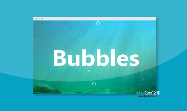

这是一款纯CSS3制作漂亮的海底气泡冒泡动画效果。该海底气泡冒泡动画效果使用CSS3 keyframes动画,制作出不同气泡从海底向上冒出的动画效果。
使用方法
HTML代码
<div class="container">

    <div class="bubbles-container">
        <svg class="bubbles" xmlns="http://www.w3.org/2000/svg" viewBox="0 0 701 1024" style="overflow: visible;">

            <g class="bubbles-large" stroke-width="7">
                <g>
                    <g transform="translate(10 940)">
                        <circle cx="35" cy="35" r="35" />
                    </g>
                </g>
                <g>
                    <g transform="translate(373 940)">
                        <circle cx="35" cy="35" r="35" />
                    </g>
                </g>
                <g>
                    <g transform="translate(408 940)">
                        <circle cx="35" cy="35" r="35" />
                    </g>
                </g>
                <g>
                    <g transform="translate(621 940)">
                        <circle cx="35" cy="35" r="35" />
                    </g>
                </g>
                <g>
                    <g transform="translate(179 940)">
                        <circle cx="35" cy="35" r="35" />
                    </g>
                </g>
            </g>

            <g class="bubbles-small" stroke-width="4">
                <g>
                    <g transform="translate(147 984)">
                        <circle cx="15" cy="15" r="15" />
                    </g>
                </g>
                <g>
                    <g transform="translate(255 984)">
                        <circle cx="15" cy="15" r="15" />
                    </g>
                </g>
                <g>
                    <g transform="translate(573 984)">
                        <circle cx="15" cy="15" r="15" />
                    </g>
                </g>
                <g>
                    <g transform="translate(429 984)">
                        <circle cx="15" cy="15" r="15" />
                    </g>
                </g>
                <g>
                    <g transform="translate(91 984)">
                        <circle cx="15" cy="15" r="15" />
                    </g>
                </g>
                <g>
                    <g transform="translate(640 984)">
                        <circle cx="15" cy="15" r="15" />
                    </g>
                </g>
                <g>
                    <g transform="translate(321 984)">
                        <circle cx="15" cy="15" r="15" />
                    </g>
                </g>
                <g>
                    <g transform="translate(376 984)">
                        <circle cx="15" cy="15" r="15" />
                    </g>
                </g>
                <g>
                    <g transform="translate(376 984)">
                        <circle cx="15" cy="15" r="15" />
                    </g>
                </g>
                <g>
                    <g transform="translate(497 984)">
                        <circle cx="15" cy="15" r="15" />
                    </g>
                </g>
            </g>

        </svg>
    </div>

    <h1>Bubbles</h1>

</div>
CSS代码
h1 {
    font-family: 'Exo 2', sans-serif;
    font-size: 8.5vw;
    color: white;
    padding: 5rem 0;
    text-shadow: 0px 4px 48px rgba(255, 255, 255, 0.2);
}

.container {
    position: relative;
    display: flex;
    align-content: center;
    justify-content: center;
    background-image: linear-gradient(to bottom, #00c9ff 0%, #92fe9d 100%), url(https://images.unsplash.com/photo-1502726299822-6f583f972e02);
    background-blend-mode: multiply;
    background-size: cover;
    overflow: hidden;
}

.bubbles-container {
    position: absolute;
    top: 0;
    left: 50%;
    width: 100%;
    max-width: 15rem;
    transform: translateX(-50%);
    opacity: 0.75;
    overflow: visible;
}

.bubbles {
    width: 100%;
    height: auto;
}

.bubbles circle {
    stroke: white;
    fill: none;
}

.bubbles>g>g:nth-of-type(3n) circle {
    stroke: #87f5fb;
}

.bubbles>g>g:nth-of-type(4n) circle {
    stroke: #8be8cb;
}

.bubbles-large {
    overflow: visible;
}

.bubbles-large>g {
    transform: translateY(2048px);
    opacity: 0;
    will-change: transform, opacity;
}

.bubbles-large g:nth-of-type(1) {
    animation: up 6.5s infinite;
}

.bubbles-large g:nth-of-type(1) g {
    transform: translateX(350px);
}

.bubbles-large g:nth-of-type(1) circle {
    animation: wobble 3s infinite ease-in-out;
}

.bubbles-large g:nth-of-type(2) {
    animation: up 5.25s 250ms infinite;
}

.bubbles-large g:nth-of-type(2) g {
    transform: translateX(450px);
}

.bubbles-large g:nth-of-type(2) circle {
    animation: wobble 3s infinite ease-in-out;
}

.bubbles-large g:nth-of-type(3) {
    animation: up 6s 750ms infinite;
}

.bubbles-large g:nth-of-type(3) g {
    transform: translateX(700px);
}

.bubbles-large g:nth-of-type(3) circle {
    animation: wobble 3s infinite ease-in-out;
}

.bubbles-large g:nth-of-type(4) {
    animation: up 5.5s 1.5s infinite;
}

.bubbles-large g:nth-of-type(4) g {
    transform: translateX(500px);
}

.bubbles-large g:nth-of-type(4) circle {
    animation: wobble 3s infinite ease-in-out;
}

.bubbles-large g:nth-of-type(5) {
    animation: up 6.5s 4s infinite;
}

.bubbles-large g:nth-of-type(5) g {
    transform: translateX(675px);
}

.bubbles-large g:nth-of-type(5) circle {
    animation: wobble 3s infinite ease-in-out;
}

.bubbles-small {
    overflow: visible;
}

.bubbles-small>g {
    transform: translateY(2048px);
    opacity: 0;
    will-change: transform, opacity;
}

.bubbles-small g circle {
    transform: scale(0);
}

.bubbles-small g:nth-of-type(1) {
    animation: up 5.25s infinite;
}

.bubbles-small g:nth-of-type(1) g {
    transform: translateX(350px);
}

.bubbles-small g:nth-of-type(1) circle {
    animation: wobble 3s infinite ease-in-out;
}

.bubbles-small g:nth-of-type(2) {
    animation: up 5.75s infinite;
}

.bubbles-small g:nth-of-type(2) g {
    transform: translateX(750px);
}

.bubbles-small g:nth-of-type(2) circle {
    animation: wobble 3s infinite ease-in-out;
}

.bubbles-small g:nth-of-type(3) {
    animation: up 5.25s 250ms infinite;
}

.bubbles-small g:nth-of-type(3) g {
    transform: translateX(350px);
}

.bubbles-small g:nth-of-type(3) circle {
    animation: wobble 3s 250ms infinite ease-in-out;
}

.bubbles-small g:nth-of-type(4) {
    animation: up 5.75s 325ms infinite;
}

.bubbles-small g:nth-of-type(4) g {
    transform: translateX(180px);
}

.bubbles-small g:nth-of-type(4) circle {
    animation: wobble 3s 325ms infinite ease-in-out;
}

.bubbles-small g:nth-of-type(5) {
    animation: up 6s 125ms infinite;
}

.bubbles-small g:nth-of-type(5) g {
    transform: translateX(350px);
}

.bubbles-small g:nth-of-type(5) circle {
    animation: wobble 3s 250ms infinite ease-in-out;
}

.bubbles-small g:nth-of-type(6) {
    animation: up 5.13s 250ms infinite;
}

.bubbles-small g:nth-of-type(6) g {
    transform: translateX(650px);
}

.bubbles-small g:nth-of-type(6) circle {
    animation: wobble 3s 125ms infinite ease-in-out;
}

.bubbles-small g:nth-of-type(7) {
    animation: up 6.25s 350ms infinite;
}

.bubbles-small g:nth-of-type(7) g {
    transform: translateX(480px);
}

.bubbles-small g:nth-of-type(7) circle {
    animation: wobble 3s 325ms infinite ease-in-out;
}

.bubbles-small g:nth-of-type(8) {
    animation: up 7s 200ms infinite;
}

.bubbles-small g:nth-of-type(8) g {
    transform: translateX(330px);
}

.bubbles-small g:nth-of-type(8) circle {
    animation: wobble 3s 325ms infinite ease-in-out;
}

.bubbles-small g:nth-of-type(9) {
    animation: up 6.25s 233ms infinite;
}

.bubbles-small g:nth-of-type(9) g {
    transform: translateX(230px);
}

.bubbles-small g:nth-of-type(9) circle {
    animation: wobble 3s 275ms infinite ease-in-out;
}

.bubbles-small g:nth-of-type(10) {
    animation: up 6s 900ms infinite;
}

.bubbles-small g:nth-of-type(10) g {
    transform: translateX(730px);
}

.bubbles-small g:nth-of-type(10) circle {
    animation: wobble 2s 905ms infinite ease-in-out;
}

@keyframes wobble {
    33% {
        transform: translateX(-50px);
    }

    66% {
        transform: translateX(50px);
    }
}

@keyframes up {
    0% {
        opacity: 0;
    }

    10%,
    90% {
        opacity: 1;
    }

    100% {
        opacity: 0;
        transform: translateY(-1024px);
    }
}


