


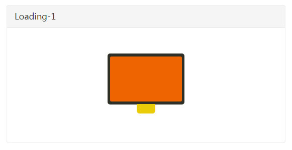
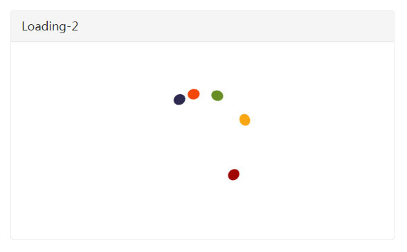
这是两款炫酷CSS3 Loading加载动画特效。该loading加载动画使用CSS3 animation来制作动画特效,可用于页面预加载时的动画效果。
使用方法
HTML结构
该CSS3 Loading加载动画特效:
<div class="loader-1">
  <div class="loader-inner"></div>
  <div class="loader-inner"></div>
  <div class="loader-inner"></div>
</div>
<div class="loader-2">
  <div class="loader-inner"></div>
  <div class="loader-inner"></div>
  <div class="loader-inner"></div>
  <div class="loader-inner"></div>
  <div class="loader-inner"></div>
</div>
CSS样式
Loading-1的CSS样式如下:
.loader-1{
    width: 220px;
    height: 200px;
    margin: 0 auto;
}
.loader-1 .loader-inner{
    width: 160px;
    height: 100px;
    border-radius: 5px;
    background: #2e2f26;
    margin: -50px 0 0 -80px;
    position: absolute;
    top: 50%;
    left: 50%;
    transform-type: preserve-3d;
    animation: loading-11 3s cubic-bezier(0.55, 0.3, 0.24, 0.99) infinite;
}
.loader-1 .loader-inner:nth-child(2){
    width: 150px;
    height: 90px;
    border-radius: 3px;
    background: #ee6400;
    margin: -45px 0 0 -75px;
    z-index: 1;
    animation-name: loading-12;
}
.loader-1 .loader-inner:nth-child(3){
    width: 40px;
    height: 20px;
    border-radius: 0 0 5px 5px;
    background: #ebcc08;
    margin: 50px 0 0 -20px;
    z-index: 2;
    animation-name: loading-13;
}
@keyframes loading-11{
    3%,
    97%{
        width: 160px;
        height: 100px;
        margin-top: -50px;
        margin-left: -80px;
    }
    30%,
    36%{
        width: 80px;
        height: 120px;
        margin-top: -60px;
        margin-left: -40px;
    }
    63%,
    69%{
        width: 40px;
        height: 80px;
        margin-top: -40px;
        margin-left: -20px;
    }
}
@keyframes loading-12{
    3%,
    97%{
        width: 150px;
        height: 90px;
        margin-top: -45px;
        margin-left: -75px;
    }
    30%,
    36%{
        width: 70px;
        height: 96px;
        margin-top: -48px;
        margin-left: -35px;
    }
    63%,
    69%{
        width: 32px;
        height: 60px;
        margin-top: -30px;
        margin-left: -16px;
    }
}
@keyframes loading-13{
    3%,
    97%{
        width: 40px;
        height: 20px;
        margin-top: 50px;
        margin-left: -20px;
    }
    30%,
    36%{
        width: 8px;
        height: 8px;
        margin-top: 49px;
        margin-left: -5px;
        border-radius: 8px;
    }
    63%,
    69%{
        width: 16px;
        height: 4px;
        margin-top: -37px;
        margin-left: -8px;
        border-radius: 10px;
    }
}
Loading-2的CSS样式如下:
.loader-2{
    width: 195px;
    height: 195px;
    margin: 30px auto;
    position: relative;
    perspective: 97px;
    transform-type: preserve-3d;
    animation: loading-3 6.9s cubic-bezierrgb(0,0,0) infinite;
}
.loader-2 .loader-inner{
    width: 20px;
    height: 20px;
    border-radius: 50%;
    background: #a10702;
    margin: -88px 0 0 -10px;
    position: absolute;
    top: 50%;
    left: 50%;
    z-index: 10;
    transform-type: preserve-3d;
    transform-origin: 50% 88px;
    transform: rotateZ(30deg);
    animation: loading-4 1.73s cubic-bezier(.6,0,.4,1) infinite;
}
.loader-2 .loader-inner:nth-child(2){
    background: #faa613;
    transform: rotateZ(15deg);
    animation-name: loading-5;
    animation-delay: 172.5ms;
}
.loader-2 .loader-inner:nth-child(3){
    background: #688e26;
    transform: rotateZ(0deg);
    animation-name: loading-6;
    animation-delay: 345ms;
}
.loader-2 .loader-inner:nth-child(4){
    background: #f44708;
    transform: rotateZ(-15deg);
    animation-name: loading-7;
    animation-delay: 517.5ms;
}
.loader-2 .loader-inner:nth-child(5){
    background: #2e294e;
    transform: rotateZ(-30deg);
    animation-name: loading-8;
    animation-delay: 690ms;
}
@keyframes loading-3{
    0%{
        transform: rotateX(30deg) rotateZ(0deg);
    }
    100%{
        transform: rotateX(30deg) rotateZ(-360deg);
    }
}
@keyframes loading-4{
    0%{
        transform: rotateZ(30deg) rotateX(10deg);
    }
    95%,100%{
        transform: rotateZ(390deg) rotateX(10deg);
    }
}
@keyframes loading-5{
    0%{
        transform: rotateZ(15deg) rotateX(10deg);
    }
    95%,100%{
        transform: rotateZ(375deg) rotateX(10deg);
    }
}
@keyframes loading-6{
    0%{
        transform: rotateZ(0deg) rotateX(10deg);
    }
    95%,100%{
        transform: rotateZ(360deg) rotateX(10deg);
    }
}
@keyframes loading-7{
    0%{
        transform: rotateZ(-15deg) rotateX(10deg);
    }
    95%,100%{
        transform: rotateZ(345deg) rotateX(10deg);
    }
}
@keyframes loading-8{
    0%{
        transform: rotateZ(-30deg) rotateX(10deg);
    }
    95%,100%{
        transform: rotateZ(330deg) rotateX(10deg);
    }
}


